11 LinkedIn post examples + templates to inspire standout content


Share 11 LinkedIn post examples + templates to inspire standout content
Explore more from
Social media guide
Make Social Media Work Smarter, Not Harder
Transform posts into lasting growth with Figma Buzz.


LinkedIn moves fast, and good design helps your posts keep up. Whether you’re growing your personal brand, showing off a new product, or giving folks a peek behind the scenes, smart design choices help your message land.
The examples below show how each template works, why key design elements like layout, color, and typography matter, and how to customize them to suit different content or brand needs
Read on to learn:
- 11 versatile LinkedIn post examples
- Best practices for creating your own standout posts
Example 1: Position hiring post

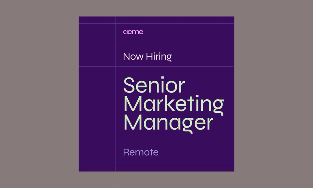
This hiring post template uses a clean, easy-to-scan layout that helps candidates quickly spot the key responsibilities and requirements. Bold headings add structure, while consistent spacing and a complementary color palette keep things polished and on-brand.
Make it yours: Swap in your brand colors, add a direct link to the application, and use bullet points to highlight what makes the role unique. When the visual design matches your company’s personality—whether playful or more buttoned-up—it gives candidates a great first impression.
Example 2: Location hiring post

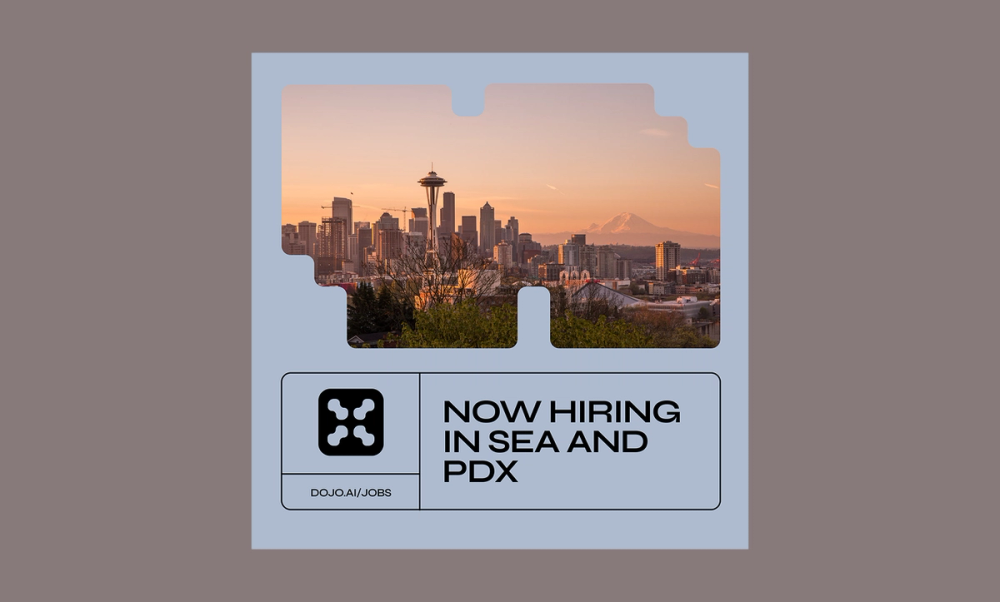
This location-specific post template uses a local photo or recognizable landmark to instantly connect with the right audience. The layout is nice and airy, which makes the post feel inviting, and the short text ensures the location gets the spotlight.
Make it yours: Drop in a photo from your office or a fun team event in that city. You can also highlight what makes the location special, whether it’s a cool neighborhood or just the company-favorite coffee shop next door.
Example 3: Product post

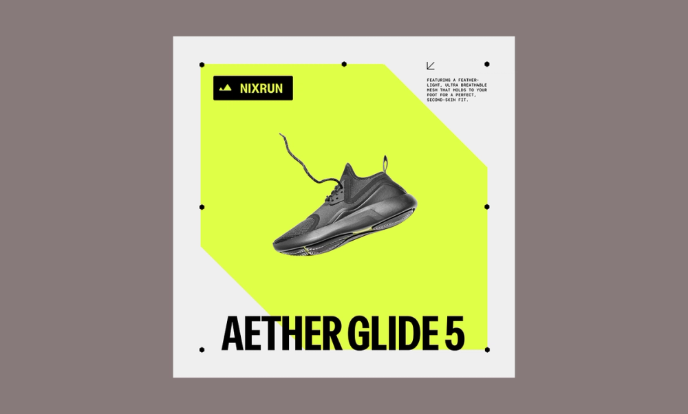
This LinkedIn product post is about grabbing attention by using a bold image and clear but simple messaging. The centered layout keeps things focused, and there’s just enough room to highlight what makes your product stand out.
Make it yours: Start with a high-quality photo or quick demo video. Then, tweak the colors to match your brand and punch up the headline with your top benefit. Just like that, you’ve got a scroll-stopper that sells without screaming ‘sales.
Example 4: Event poster post

Promoting an upcoming event on LinkedIn? This template makes it easy to share all the info at a glance. The cool color palette and photo pattern give it a polished, modern feel that grabs attention in a busy feed.
With the event image upfront and a clear hierarchy in the text, people can quickly see the who, what, when, and where—no digging required..
Make it yours: Update the visuals to reflect your brand and swap in your event’s key details. Be sure to include your logo and a direct registration link for easy conversion.
Example 5: Webinar invite post

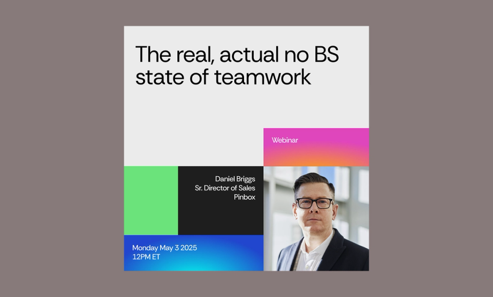
This LinkedIn post is designed to drive sign-ups for an upcoming event. The layout uses bold color blocks to create visual structure and guide the eye, while the photo adds a human touch that makes the post more engaging.
Clear typographic hierarchy helps surface key event details—like who’s speaking, when it’s happening, and why it matters—without overwhelming the viewer.
Make it yours: Swap in your speaker headshots and adjust the color palette to match your theme. Whether your vibe is bold and high-energy or chill and rejuvenating, this layout flexes with you.
Explore more LinkedIn Post templates in Figma Community
Example 6: Event invite post

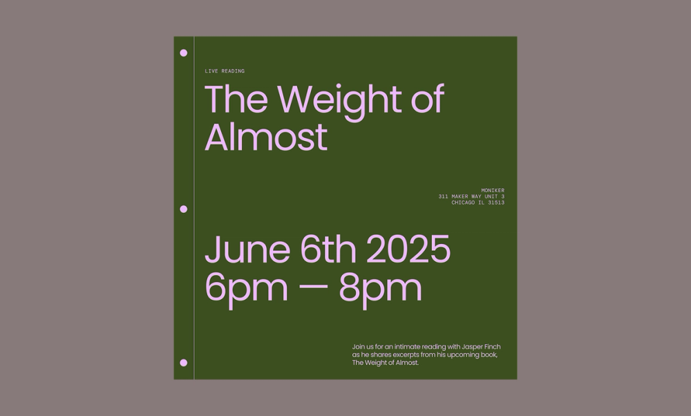
This invite template has a warm and approachable feel with its calm color palette and spacious layout. A bold headline in Poppins grabs attention, while the smaller text below shares the details. It’s a great fit for creative or professional events that call for clarity without feeling too formal.
Make it yours: Update the fonts or accent colors to better reflect your brand style and the event’s theme. It’s all about giving your audience the info they need in a way that feels true to you.
Example 7: Social media post

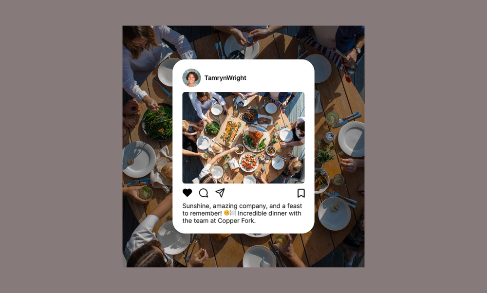
Sharing social media snapshots on LinkedIn is a simple, effective way to add authenticity to your brand. This template is ideal for showcasing genuine moments like team dinners, volunteer events, or candid behind-the-scenes glimpses. The layout mimics the look of a real social post, which helps it blend naturally into the LinkedIn feed while still feeling intentional.
Make it yours: Choose a photo that tells a real story about your team or culture. Keep the caption short and focused—maybe a quick takeaway, a core team value, or a fun detail like the location. A little authenticity goes a long way in helping your brand connect on a more personal level.
Example 8: Social media repost

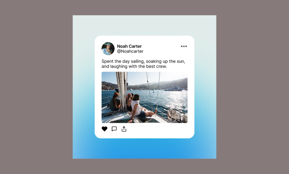
Reposts are a great way to show personality, and this layout makes them feel fresh and intentional. The subtle blue gradient adds visual interest without overpowering the content, giving the post a polished, modern feel.
Whether you’re highlighting an employee’s post or reacting to something interesting in your industry, this format keeps it approachable and real.
Make it yours: Choose a post that aligns with your tone, and tweak the design—adjust the gradient, switch up the layout, or update the typography to match your visual identity. You can also add a brief comment to give it context or a personal spin.
Example 9: Software development webinar post

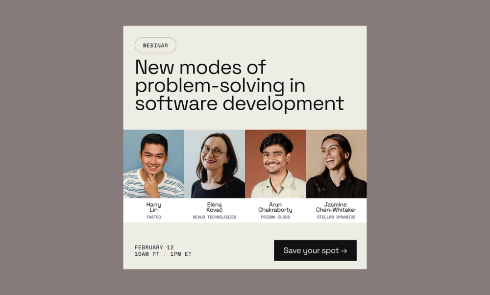
This webinar post template is designed to do one thing: get people to sign up. The layout uses a clean, neutral background that minimizes distractions and keeps the focus on the content. A clear text hierarchy guides the viewer’s eye, starting with a bold headline highlighting the topic, followed by well-organized sections for speakers and key details.
Professional headshots paired with short bios build trust and credibility, while generous spacing and consistent alignment create a balanced, easy-to-scan design. A bold CTA—like ‘Save your spot’—draws attention and drives quick action..
Make it yours: Swap in your speakers’ photos, update the color palette to match your event branding, and highlight one benefit that’ll hook your target audience, like what they'll walk away knowing.
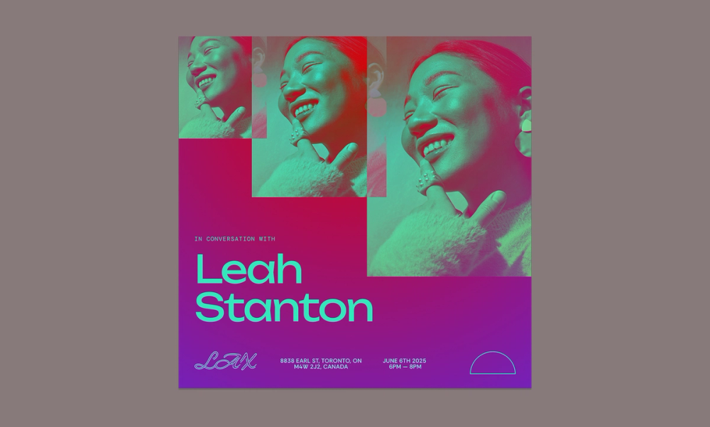
Example 10: Customer stories

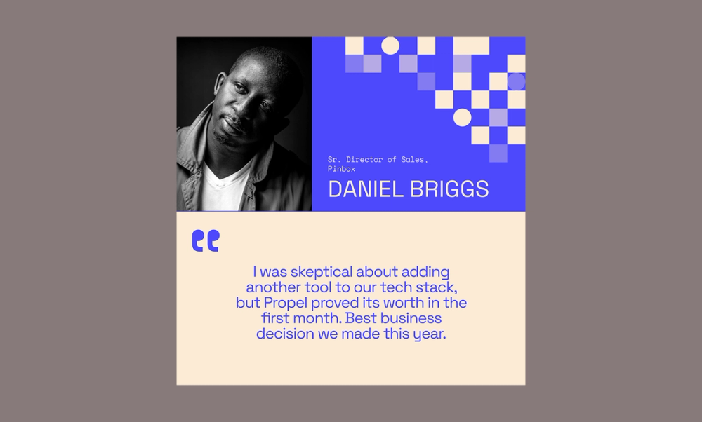
Customer stories build trust, and this template supports that with smart design. Calm, professional colors convey reliability, while geometric shapes add a modern touch without distraction.
A centered pull quote highlights a key testimonial, reinforcing authenticity. A clear, well-sized photo and bold name emphasize the customer’s identity, making the story personal and credible.
Make it yours: Swap out the photo for a headshot or candid shot of your featured customer. Keep the story honest and focused by including a short quote or meaningful blurb. Use your brand colors to make it feel cohesive, and when possible, include a concrete result to help the impact resonate.
Example 11: Customer quote

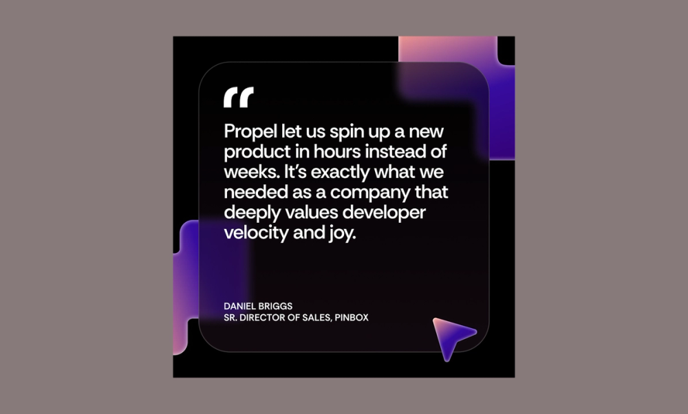
This quote post makes great feedback shine. The bold layout uses contrast to grab attention, while the quote overlay paired with colorful geometric shapes adds depth and visual interest. It includes everything you need to build credibility: name, title, company, and a short, powerful quote.
Make it yours: Pull a concise testimonial that speaks to a specific win or solves a common pain point. Keep the design striking and don’t be afraid to play with background colors or typography to give it more visual impact.
Best practices for creating LinkedIn posts

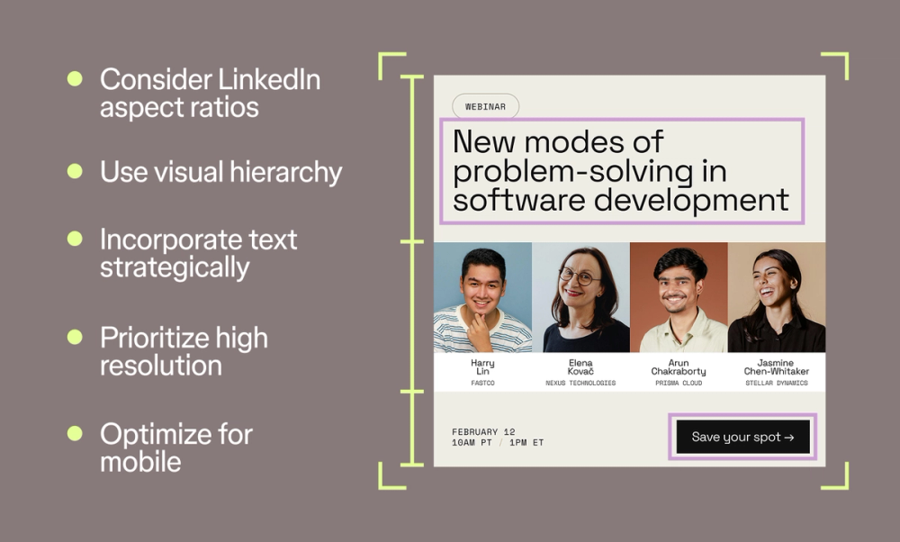
Here are five ways to make your LinkedIn posts more eye-catching and effective:
- Use visual hierarchy. Make the most important parts of your image or text stand out with size and weight to help guide the reader’s eye.
- Follow LinkedIn aspect ratios. The shape of your picture or video matters on LinkedIn. Using the right LinkedIn size (1080 x 1080 pixels for square, 1920 x 1080 pixels for portrait, and 1200 x 626 pixels for landscape) will fill the screen better and won’t look stretched or cut off.
- Incorporate text strategically. Keep text clear and easy to read. Use text to highlight key information or clarify your message.
- Prioritize high resolution. Crisp, high-quality pictures and videos will make your posts stand out.
- Optimize for mobile. Make sure your visuals and text stay clear and scannable on small screens.
Craft your next LinkedIn post with Figma
Creating standout LinkedIn posts is easier with the right tools. Figma helps you craft engaging images, layouts, and designs that elevate your presence. Here’s how:
- Use Figma’s design tools to create engaging images and layouts for your posts.
- Explore ready-to-use LinkedIn templates in the Figma Community.
- Browse Figma’s social media size guide library to build your personal brand or business and design images for other platforms like YouTube or Facebook.
Ready to create a captivating LinkedIn post?
Build your next LinkedIn Post with Figma Buzz.
Keep reading


7 key UI design principles + how to use them
Learn the most common UI design best practices to incorporate into your design.

24 best fonts for websites
Uncover which fonts to use to build the best website.


LinkedIn banner and post image size guide
Learn how to optimize your LinkedIn profile with the correct sizes.