17 Instagram ad examples + ready-to-use templates
Share 17 Instagram ad examples + ready-to-use templates
Explore more from
Social media guide
Make Social Media Work Smarter, Not Harder
Transform posts into lasting growth with Figma Buzz.

A good Instagram ad starts with a clear idea of what you're promoting and who you're talking to. The design is what gets someone to stop and look.
Creating an ad that stands out in a person’s feed means using design that's recognizably yours while making the offer impossible to miss. These Instagram ad examples ensure your brand doesn’t get lost in a sea of sameness while maintaining the human touch users still crave.
Browse our templates and discover how to make Instagram ads that convert.
Read on to learn:
- 17 Instagram ad examples with editable templates
- Tips for customizing each template
- Best practices for designing Instagram ads
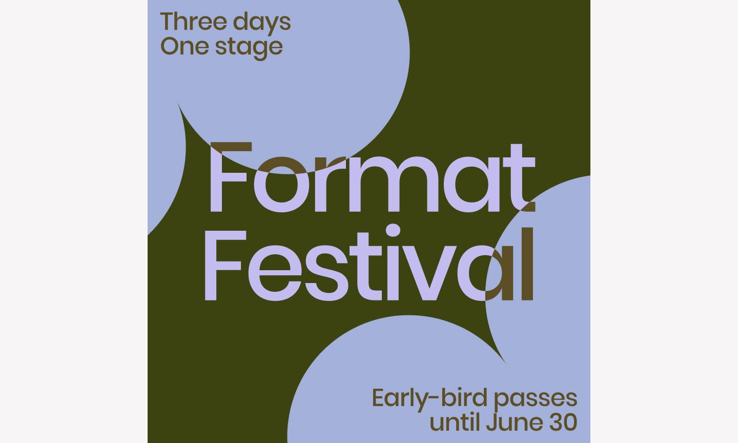
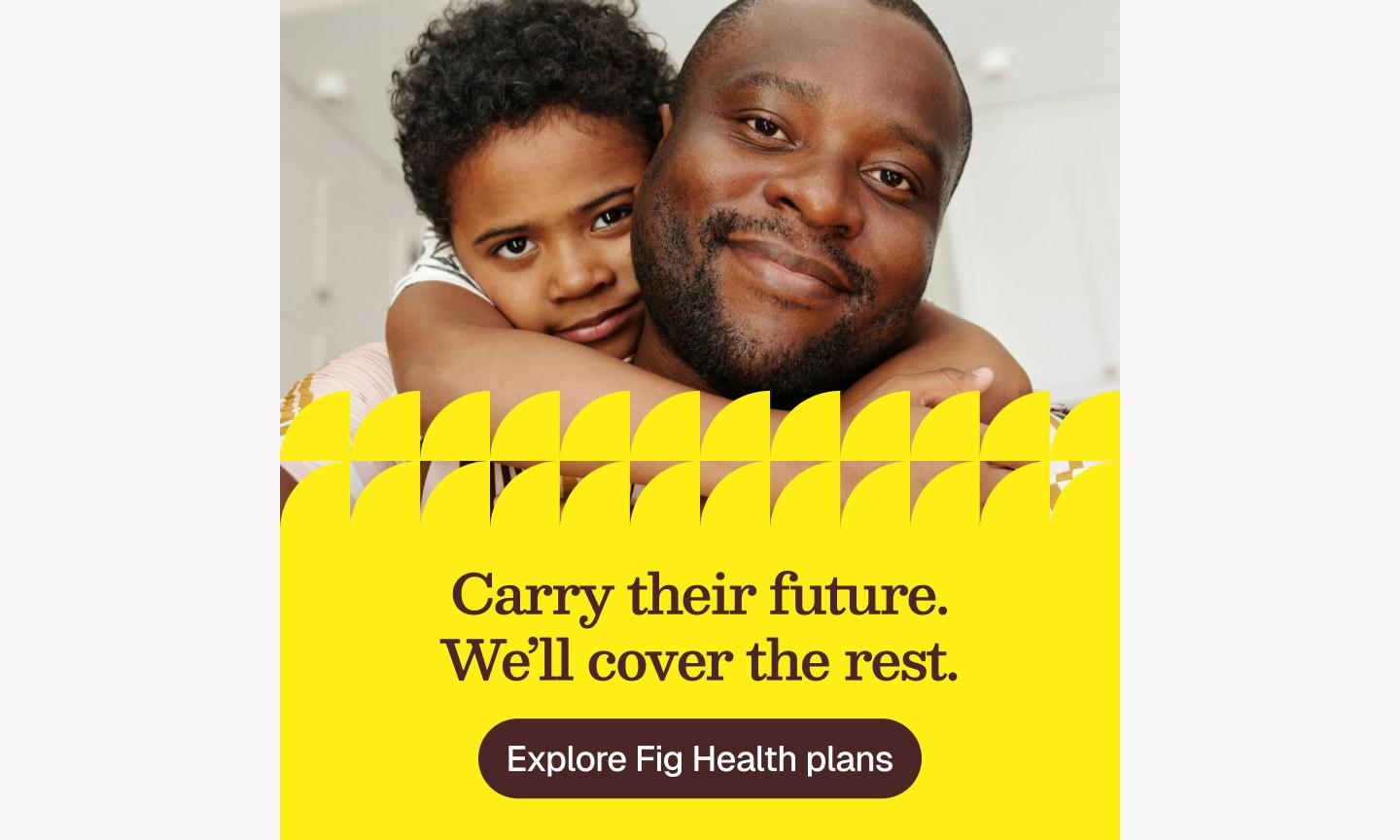
Example 1: Pink playful doodle event flyer

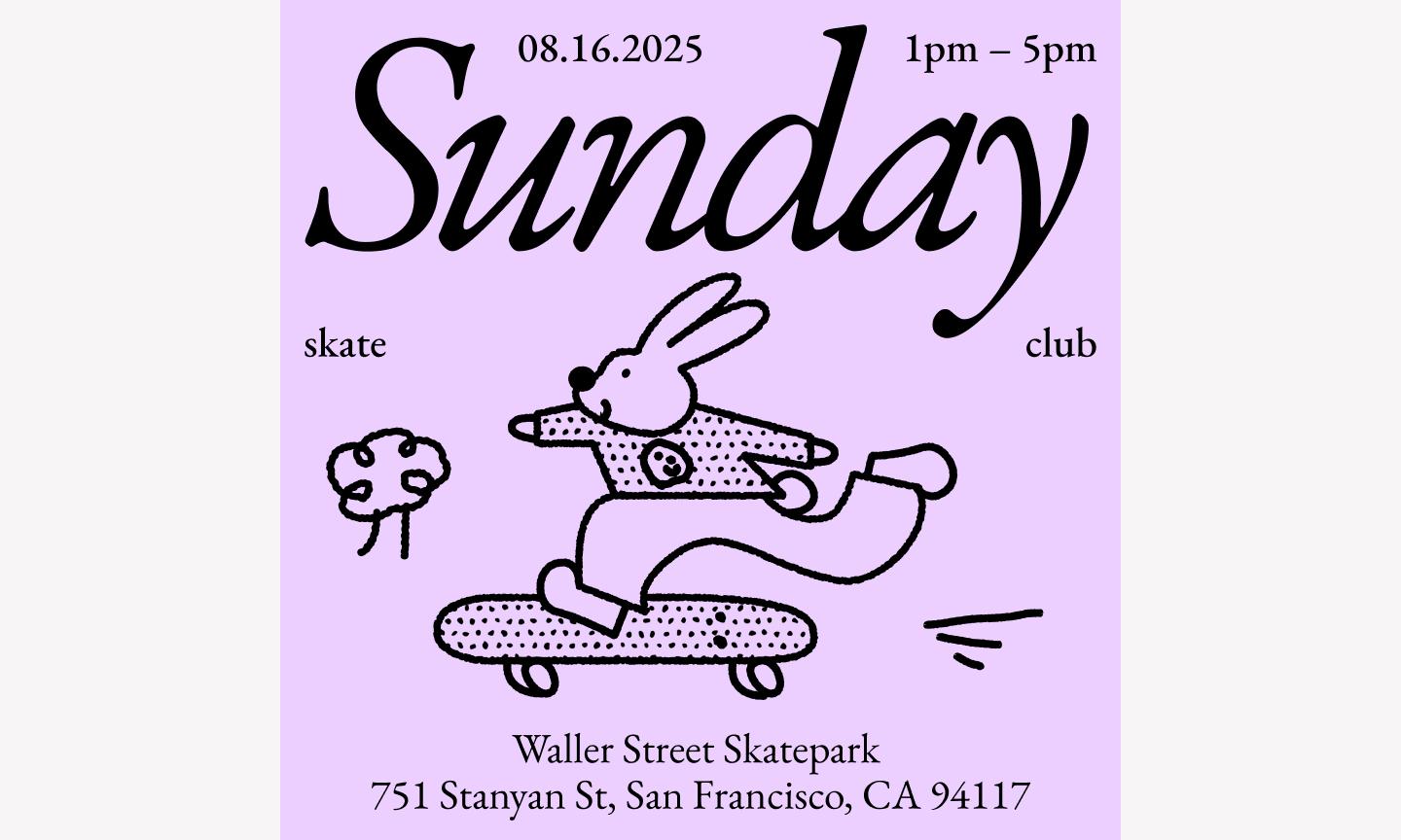
This template is a good antidote to overly corporate-looking ads. The mix of bold, chunky typography and lighthearted illustrations signals that your brand doesn't take itself too seriously but still means business.
Best for: Creative workshops, community meetups, pop-up shops, or brands with a youthful, DIY-inspired identity
Make it yours: Swap the pink background for one of your brand’s secondary colors to keep it recognizable while staying fresh. Replace the generic doodles with your team’s custom brand stickers or icons, and ensure your “Register” button uses a high-contrast color.
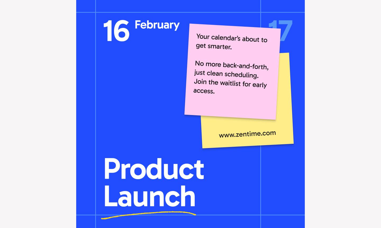
Example 2: Colorful workshop announcement ad

This workshop template leads with color—a vibrant multi-color palette that demands attention without feeling chaotic. It uses a vibrant, multi-color palette that demands attention without feeling chaotic, thanks to a very structured grid. By leaning into bold blocks of color and clean lines, it feels professional without being stiff—exactly what you want for an event that’s both educational and fun.
Best for: Educational webinars, professional development bootcamps, or tech conferences looking to stand out
Make it yours: Swap the default color blocks for your specific brand palette to keep your marketing assets consistent. To make it conversion-ready, add a clear, high-contrast call-to-action (CTA) button in the bottom-right corner and replace the placeholder image with a photo of your actual speaker.
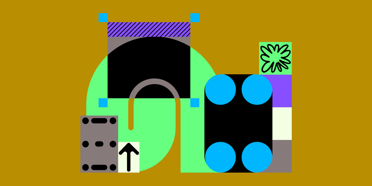
Example 3: Bold curved frame ad

This bold template uses flow to guide the eye. The star of the show is the large, sweeping, curved frame that cuts through the layout, creating a dynamic window for your imagery. This Instagram post idea works because the curve creates natural space for your copy without crowding the frame.. By placing the text in the open space created by the curve, the message feels like it’s part of the image rather than just floating on top of it.
Best for: Lifestyle brands, high-end real estate, or fashion retailers who want their photography to lead while keeping the layout polished.
Make it yours: Open the file in Figma Design and use auto layout on your text layers so they adjust automatically when you update your seasonal messaging. To boost conversions, use a photo where the subject’s gaze or a lead line points toward your CTA button, so scrollers can’t miss your “Shop Now” link.
Design your Instagram ad with Figma Buzz
Get easy-to-use, eye-catching templates.
Example 4: Warm webinar ad

This warm template uses soft, earthy tones to build immediate trust. The layout uses a structured grid to separate the “who, what, and when” without cluttering the frame. The inclusion of a dedicated spot for a speaker's headshot is an essential detail—it makes the brand feel approachable before the webinar even starts.
Best for: Coaches, consultants, B2B service providers, or anyone hosting an online session where building rapport is the top priority
Make it yours: Drop in your brand’s specific colors from your style guide so the ad's warmth still feels like you. To make it conversion-ready, make sure your “Register” button is the most saturated color on the page, and consider using a speaker photo with direct eye contact to build that one-on-one feel.
Example 5: Sleek job posting ad

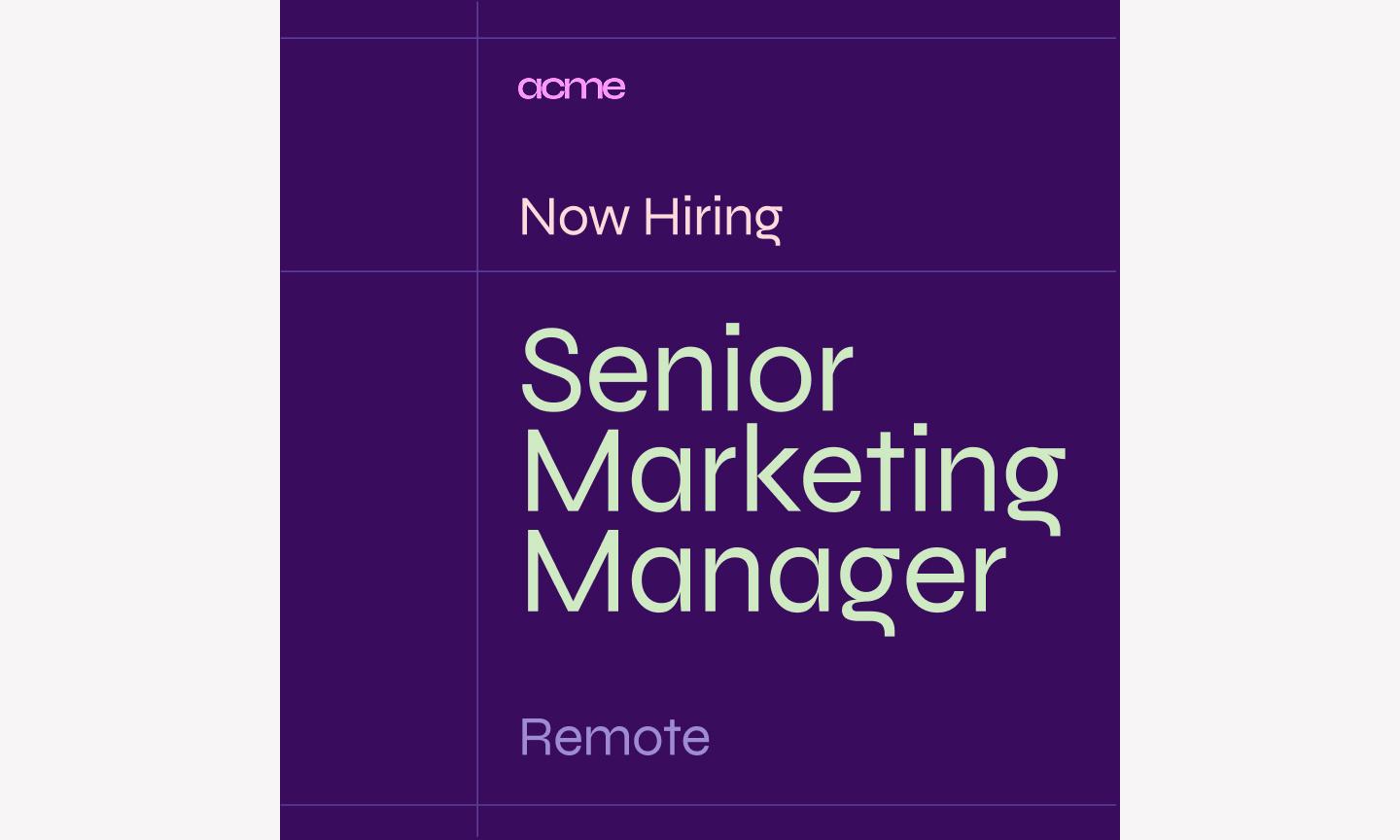
This job posting template shows that hiring ads can have a point of view. It uses a clean, editorial layout that feels more like a magazine cover than a standard “we’re hiring” post. The high-contrast typography and structured use of white space give the ad a professional, sleek edge, signaling to candidates that your company cares about design and quality.
Best for: Tech startups, creative agencies, and design-led companies looking to attract top-tier talent in a competitive feed
Make it yours: Swap out the background image for a shot of your actual office or a candid team photo to give candidates a real feel for your culture. To make the ad conversion-ready, make sure your “Apply now” call-to-action stands out with a bold fill color, and consider adding a small QR code in the corner to take people straight to your application page.
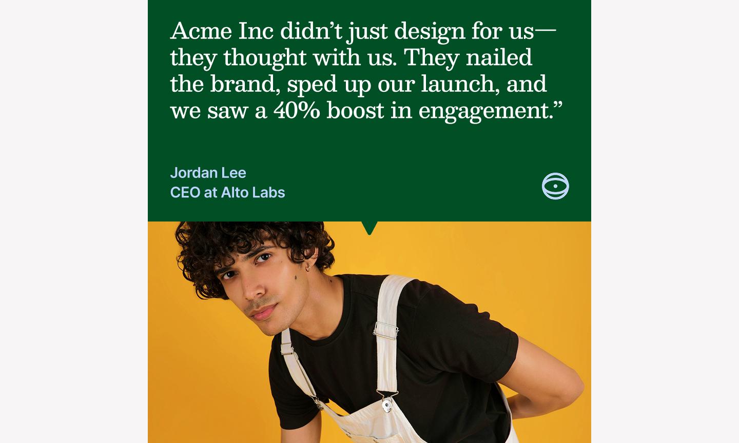
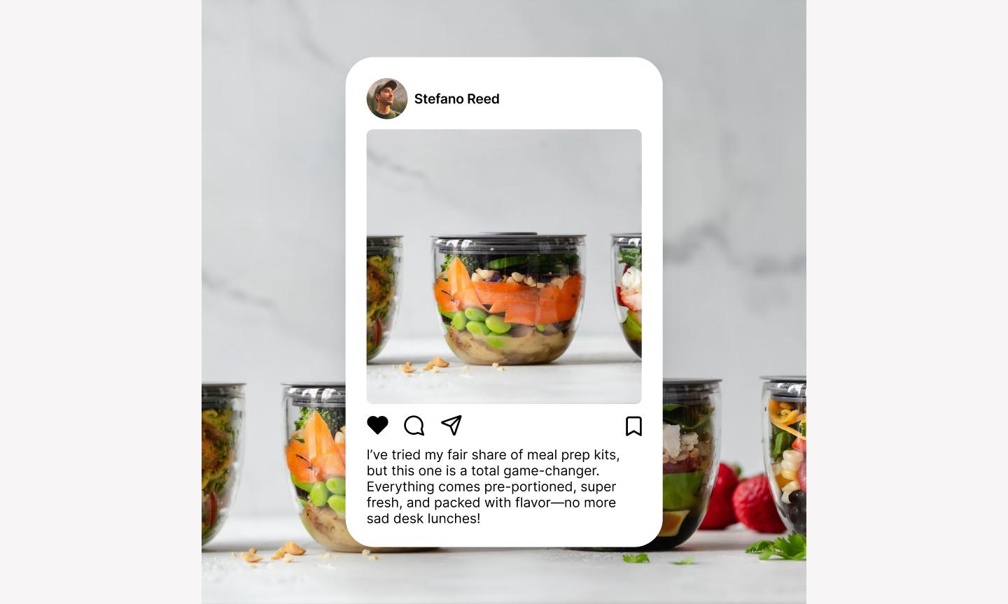
Example 6: Gradient social proof ad

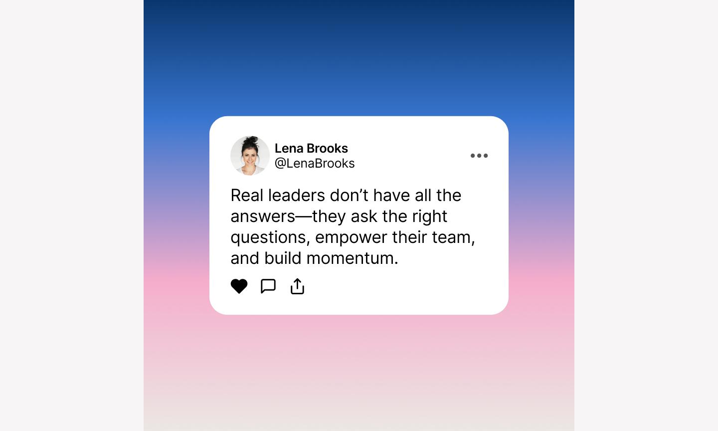
Social proof works, and this template gets out of its way. It uses a soft, modern gradient background that adds depth without distracting from the star of the show: the customer testimonial.
By placing the quote inside a clean, rounded container, the design mimics the familiar UI of a message or a review bubble.
Best for: SaaS companies, e-commerce brands, or service-based businesses looking to build credibility through customer success stories and testimonials
Make it yours: Pull in your brand’s specific gradient styles or a signature background texture to keep the look consistent with your website. To make it conversion-ready, replace the placeholder avatar with a high-quality photo of a real customer and add a “Try it for free” button at the bottom.
Example 7: High-performance sneaker ad

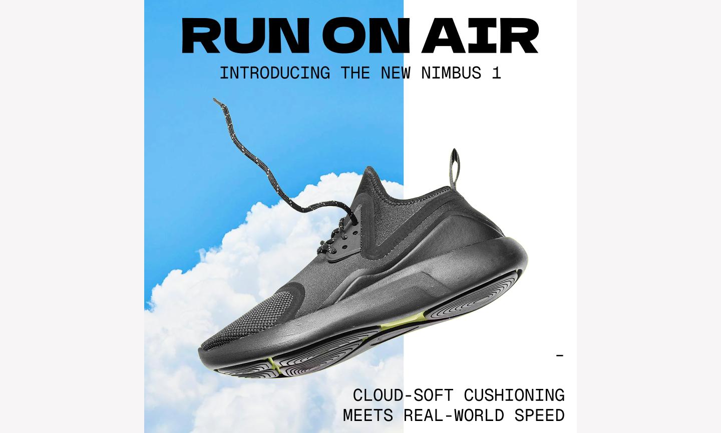
This ad template uses a high-action composition, with the product angled to create a sense of forward motion and speed. By layering bold, italicized typography behind the main image, the design creates a sense of depth that gives the product a sense of motion..
Best for: Fitness brands, athletic retailers, or tech gadget companies that want to highlight speed, durability, and performance
Make it yours: Swap the background textures for something that fits your specific brand—like a sleek carbon fiber pattern for tech or a dusty trail for outdoor gear. To make it conversion-ready, add a “Shop the drop” button and use Figma Design to ensure your product cutout has a sharp, clean edge for a premium, professional finish.
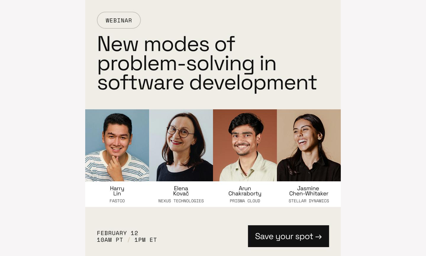
Example 8: Modern event ad

This event ad template uses a dark theme and a tight grid system to give the layout a high-end, editorial feel. The window effect keeps the event photography contained, so you get atmosphere without the photo competing with the logistics.
Best for: Tech conferences, gallery openings, networking mixers, or any professional event where a polished first impression is key
Make it yours: Play around with the fonts to align with your brand and provide greater emphasis on the different details of the event. Consider using a bolded font or bright color to draw the eye to the registration information.
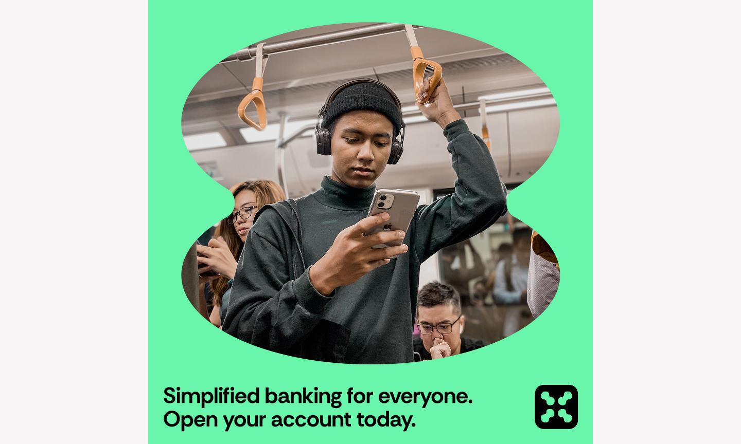
Example 9: Mobile app ad

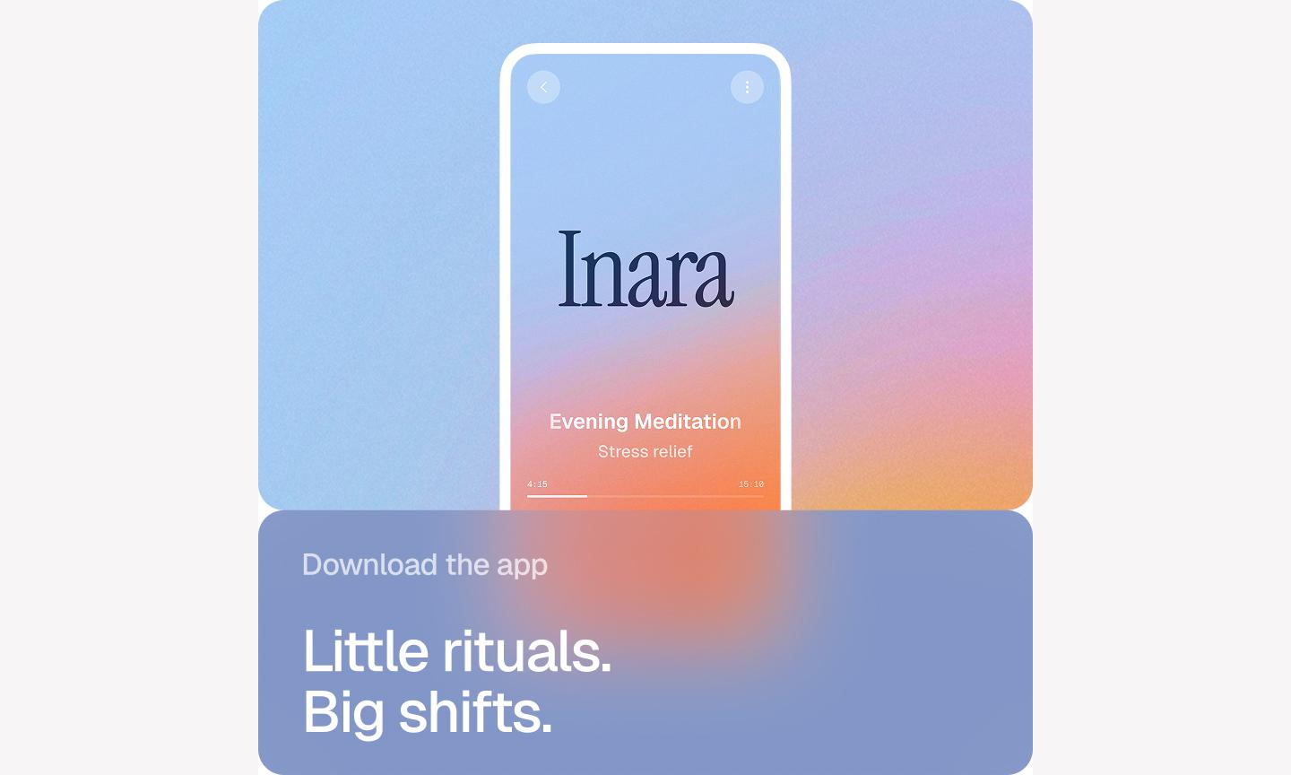
This app ad template is a great example of “show, don’t tell” how your product works. By placing a high-fidelity mobile mockup right in the center of a vibrant gradient, it shows exactly what your app’s UX design looks like. The gradient background acts as a spotlight. It pushes the phone forward so the features you're highlighting are the first thing someone sees.
Best for: SaaS startups, mobile app developers, or fintech companies looking to showcase a new feature or a redesigned interface
Make it yours: To get it conversion-ready, use a high-contrast color for the “Download” button and try adding a subtle “Available on the App Store” badge.
Example 10: Nostalgic sales announcement ad

This nostalgic template leans into retro aesthetics, featuring a 90s-inspired design that feels both familiar and incredibly fresh. With its pixelated accents, bright primary colors, and Windows-style windows, it stands out in a feed full of minimalist, modern ads
Best for: Streetwear brands, vintage shops, tech-adjacent startups, or any business targeting Gen Z and Millennial audiences with a sense of humor
Make it yours: Switch out the default brights for your brand’s specific colors—this keeps the retro feel while making sure it’s unmistakably yours. To get it conversion-ready, update the button text to a specific action like “Claim discount” and use Figma Design to drop in a sticker-style PNG of your top-selling product.
Example 11: Expressive event poster

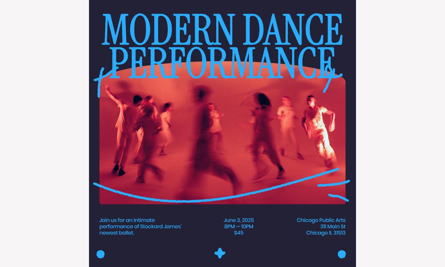
This event template makes the event title a design element, not just a headline. By overlapping bold, expressive text with vibrant graphic design shapes, it creates a sense of movement that fits a high-energy event.
Best for: Music or film festivals, art gallery openings, design conferences, or any brand looking to signal a creative, boundary-pushing aesthetic
Make it yours: To make it conversion-ready, add a bold “Get tickets” button using a high-contrast color and use auto layout in Figma Design to ensure your event details stay perfectly aligned even if your title length changes.
H2: Example 12: Creative product launch

This product launch template is perfect for showcasing your product’s unique shape and texture. It uses a centered, circular frame that draws the viewer’s eye directly to the center of the screen. By layering geometric shapes and subtle shadows around the product, the design creates a sense of depth that makes your latest launch feel tactile and premium.
Best for: Industrial designers, beauty brands, or consumer electronics companies launching a single, hero product
Make it yours: Replace the feature labels with your product’s biggest selling points and add a clear “Shop now” button in a high-contrast color at the bottom of the frame.
Example 13: Editorial podcast launch ad

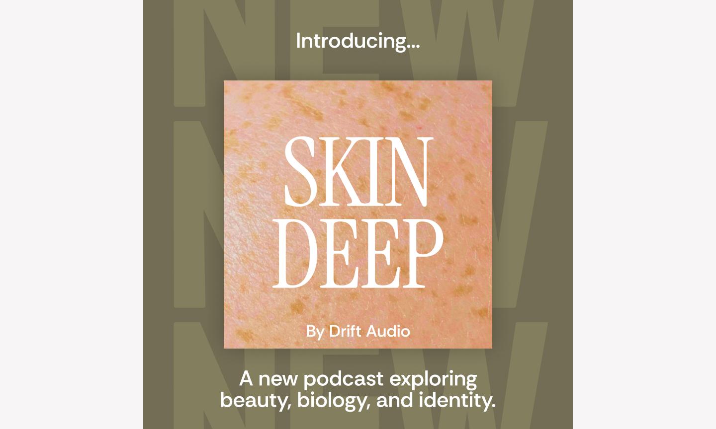
This editorial template uses a structured, magazine-style layout that signals high-quality production and deep-dive conversations. By balancing a large, personality-driven headshot with clean, justified typography, the design makes your podcast look less like a casual hobby and more like a serious production.
Best for: Thought leaders, B2B brands, or creators launching an interview-style podcast where the guest's expertise is the main draw
Make it yours: Include your specific podcast cover art to maintain a consistent flow across platforms. Add a “Listen now” button that mimics the look of a play icon and ensure your guest’s headshot is high-resolution to build instant trust and connection with your followers.
Example 14: Green client testimonial ad

This testimonial template takes a clear and empathetic approach, using a refreshing green palette that reads as calm and trustworthy. By using a clean, open layout with a focus on a single, impactful quote, you create a moment of calm in a busy feed, letting the quote land without competition.
Best for: Sustainability-focused brands, health and wellness services, or high-touch consulting firms that want to showcase deep client satisfaction
Make it yours: Use your brand’s own calm, secondary tones to keep your feed looking cohesive. Add a small, high-contrast “Read the full story” button at the bottom, and make sure to include a real photo of your client.
Example 15: Elegant sale alert ad

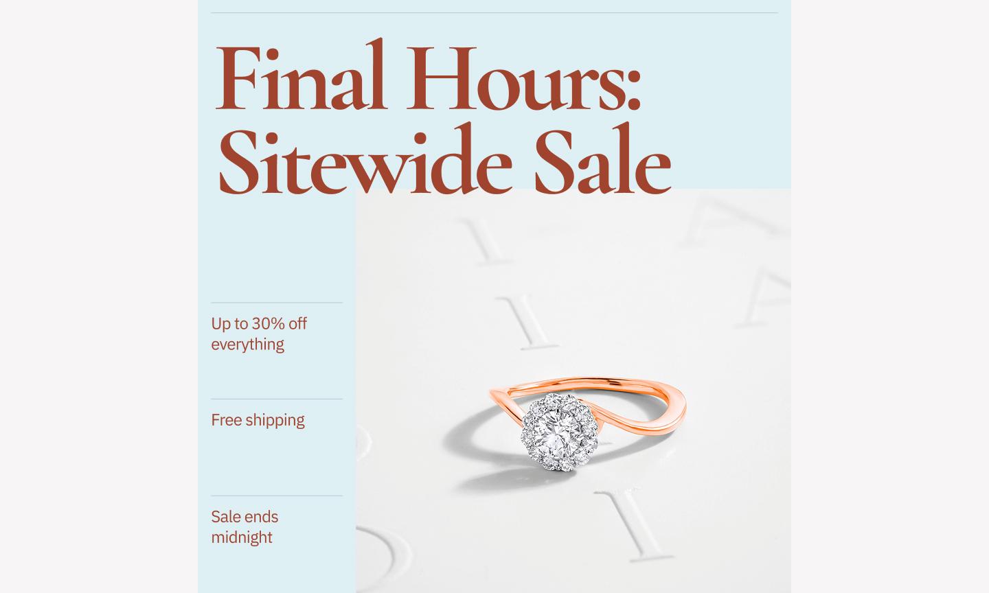
This elegant template is for a brand that wants to announce a sale without losing its sleek, sophisticated edge. It moves away from the loud, neon “SALE” signs we often see and instead uses a muted, elegant palette that feels considered rather than urgent. The use of negative space around the central product image gives the product room, signaling to your community that your brand values quality over quantity.
Best for: Luxury boutiques, high-end skincare brands, or home decor studios that want to maintain a premium tone during promotional periods
Make it yours: Swap the background for a soft, textured paper style or your brand’s signature neutral tone to keep the look consistent. To make it conversion-ready, make sure your “Shop the collection” button uses a subtle but contrasting color, and use Figma Design to drop in a high-resolution photo with soft lighting to match the template’s mood.
Example 16: Warm health service ad

This health service ad template creates an immediate sense of safety and professional care. Soft tones and rounded UI elements make the service feel approachable rather than clinical.
Best for: Telehealth startups, mental health practitioners, wellness clinics, or any service-based business where trust and empathy are the core of the brand story
Make it yours: Pull in your brand’s specific warm palette to make sure the colors feel intentional and aligned with your other assets. Replace the placeholder image with a photo of your actual team or office, and use a high-contrast color for the “Book now” button so it’s the first thing someone sees.
Example 17: Simple social proof ad

While the previous social proof examples used gradients or editorial layouts, this simple social proof template strips it back. It uses a structured, multi-card layout that mimics the swipeable nature of a carousel even within a single frame. Showing multiple bite-sized reviews at once, it shows consensus.
Best for: Consumer apps, subscription services, or e-commerce brands with a high volume of short, punchy customer shout-outs
Make it yours: Use your brand’s specific brand shapes or custom emojis to add some personality in place of the generic stars. Pick three reviews that each highlight a different benefit of your product, and use a bold, high-contrast footer to house your “Get started” call-to-action.
Best practices for Instagram ad design
A few habits make a real difference when you're designing at volume. Here are some top tips for building Instagram ads that stop the scroll and drive action:
- Design for A/B testing. Create multiple versions of your ad by swapping headlines or background colors to see what resonates most with your community.
- Watch out for overlays. Keep your most important info away from the very top and bottom of the frame where Instagram’s sizing UI—like your profile handle or the CTA button—might cover it up.
- Use master components. Build your ad elements as components in Figma Design so that a single update to your logo or button style instantly reflects across every size and version.
- Organize your exports. Use clear naming conventions for your frames (like Campaign_Date_Size) to make life easier for your social media manager. It’s a habit that saves everyone from the “Final_FINAL_v2” file name nightmare.
- Keep flow in mind. Use visual cues like arrows, leading lines in photos, or high-contrast buttons to guide the viewer’s eye exactly where you want it to go.
Build your ad creative workflow with Figma
The best Instagram ads are specific to your brand, your offer, and your audience. Whether your brand opts for retro pixels or leans into something clearer and simpler, starting with these Instagram ad examples will help you get to a finished ad faster.
Here’s how Figma can help:
- Use FigJam to collaborate on ad concepts, copy, and mood boards with your entire marketing team in real time.
- Jump into Figma Design to customize these templates, using features like Auto-Layout to resize text quickly without breaking your layout.
- Use Figma Slides to present your ad creatives in an interactive deck when pitching campaign concepts to stakeholders.
- Explore our full library of social media templates to adapt your high-performing ads for LinkedIn, X (Twitter), and beyond.
Ready to create your Instagram ad?
Use one of our customizable templates.
Keep reading

11 scroll-stopping Instagram post ideas + templates
Need to freshen up your feed? Explore 11 Instagram post ideas with stylish, editable templates from Figma to help you craft visually stunning posts with ease.

21 Instagram story ideas + templates to inspire your next post
Discover 21 Instagram story ideas with customizable templates from Figma, design tips, and best practices to help you post with confidence and creativity.