Ecru is a rich, warm, neutral shade with yellow and brown undertones. Its lightness and lack of vibrancy offer a soft and comforting feeling, while its natural tones evoke a sense of groundedness and simplicity.
Color variations
Shades
Tints
Tones
Hues
Color Harmonies
Complementary
Split
Monochromatic
Analogous
Triadic
Square
Custom Palettes
Earthly Elegance
Sandcastle
Wilderness
Ecru is defined by the following color codes and values to ensure consistency across various digital platforms and devices.
- HEX code: #E0CD95
- RGB value: 87.8% red, 80.4% green, and 58.4% blue
Accessibility considerations play a crucial role in UX and UI design color choices. Figma offers plugins in the Community to make sure your designs meet Web Content Accessibility Guidelines.
Here are some ways to use ecru in your designs:
- Create a clean, minimalist aesthetic. Ecru’s soft, neutral tone creates a calming backdrop for your UI elements, allowing them to stand out without overwhelming the user.
- Evoke a sense of luxury and comfort. Ecru’s neutral tone makes it versatile for designs targeting upscale fashion and wellness products, or brands emphasizing natural elements, like organic skincare or eco-friendly home goods.
- Enhance readability. If using ecru as a background color, be sure to pair it with colors that offer enough contrast for text and other UI elements, like darker shades of gray, navy, or black.
Keep in mind that color and its meaning can change from culture to culture—and at any given time. If you are designing for a global audience, research color considerations for your specific regions.
For variations within the same neutral spectrum as ecru, consider:
- Sand (#CBBD93) offers a warmer, earthier tone with a subtle yellow undertone reminiscent of coastal dunes.
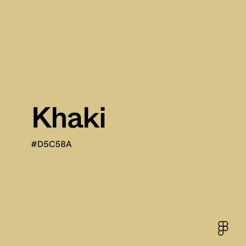
- Khaki (#D5C58A) provides a slightly greener cast.
- Beige (#EDE8D0) is a lighter, softer option, creating an airy atmosphere with a hint of warmth.
- Cream (#FDFBD4) is a milky white with a subtle yellow undertone.
To complement ecru, consider pairing it with:
- Army green (#5D6532) creates a natural, earthy contrast, grounding the palette.
- Crimson red (#B22222) offers a bold contrast that energizes ecru and creates a striking look.
- Charcoal (#4A4A4A) provides a modern contrast.
- Blush pink (#FF7782) complements ecru with a soft, romantic touch.
- Midnight blue (#272757) contrasts dramatically, resulting in a luxurious and elegant vibe.
Other colors worth considering include pastel hues like lavender or mint green for a playful or unexpected twist and sophisticated colors like gold or silver to add a touch of glamor.
While ecru is neutral, it may clash with:
- Electric blue (#00F0FF) creates a jarring contrast with ecru’s soft nature.
- Neon pink (#FF13F0) is too vibrant and overpowering for ecru, creating a visually distracting combination.
- Bright yellow (#FFED29) can clash with ecru’s subtlety, creating a harsh and unbalanced look.
- Violet (#7F00FF) is a bright color that can overwhelm ecru’s soft, neutral quality.
Ecru symbolizes simplicity, purity, and natural elegance. It’s reminiscent of unbleached linen and creamy textures, giving a sense of warmth and comfort. Ecru can also represent understated luxury and sophistication.
In color psychology, ecru evokes relaxation and well-being. Its neutral quality also promotes balance and harmony.
In UI design, ecru creates a clean, minimalist look. It serves as a neutral backdrop, allowing other elements to stand out. Its warmth and refinement make it perfect for conveying a natural sensibility or for premium brands.
The term “ecru” derives from the French word meaning “raw” or “unbleached.” Historically, it described the natural color of unprocessed linen or silk, linking it to textile production and the evolution of dyeing and bleaching techniques.
Achieving vibrant colors was complex and costly during this time, so natural, unbleached fabrics like linen became popular for their simplicity and affordability.
Over the centuries, ecru’s popularity has fluctuated with fashion and design trends. Its enduring appeal comes from its versatility and connection to natural beauty. While its origins are practical, the color has evolved to represent simplicity and sophistication.
Contrast 1.57
- Large Text
#E0CD95
- Normal Text
How you design, align, and build matters. Do it together with Figma.
| Category | ||
|---|---|---|
Fail | Fail | |
Fail | Fail | |
Fail | Fail |
Contrast 13.34
- Large Text
#E0CD95
- Normal Text
How you design, align, and build matters. Do it together with Figma.
| Category | ||
|---|---|---|
Pass | Pass | |
Pass | Pass | |
Pass | Pass |
Color simulations
Protanopia
Deuteranopia
Tritanopia
Achromatopsia
The hexadecimal color #E0CD95, known as ecru, has RGB values of R:224, G:205, B:149 and CMYK values of C:0, M:0.08, Y:0.33, K:0.12.
| VALUE | CSS | |
|---|---|---|
| HEX | E0CD95 | #E0CD95 |
| RGB DECIMAL | 224, 205, 149 | RGB(224,205,149) |
| RGB PERCENTAGE | 87.8, 80.4, 58.4 | RGB(87.8%,80.4%,58.4%) |
| CMYK | 0, 8, 33, 12 | |
| HSL | 44.8°, 54.7, 73.1 | HSL(44.8°,54.7%,73.1%) |
| HSV (OR HSB) | 44.8°, 33.5, 87.8 | |
| WEB SAFE | CCCC99 | #CCCC99 |
| CIE-LAB | 82.744, -1.53, 30.328 | |
| XYZ | 57.996, 61.681, 37.283 | |
| xyY | 0.369, 0.393, 61.681 | |
| CIE-LCH | 82.744, 30.366, 92.888 | |
| CIE-LUV | 82.744, 15.066, 41.524 | |
| HUNTER-LAB | 78.537, -5.627, 26.83 | |
| BINARY | 11100000, 11001101, 10010101 | |
| iOS - SwiftUI | Color(red: 0.878, green: 0.804, blue: 0.584) | |
| iOS - UIKit | UIColor(red: 0.878, green: 0.804, blue: 0.584, alpha: 1) | |
| Android - Compose | Color(0xFFE0CD95) |