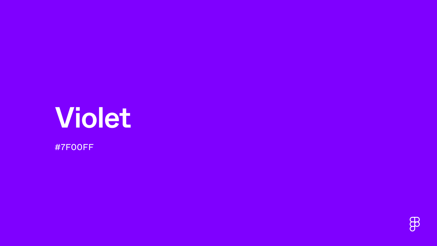
Violet is a vivid and enchanting color that sits between blue and red on the color wheel. This intense hue captures the depth and mystique of violet, often associated with creativity, magic, and luxury. Its rich and vibrant aesthetic can add a touch of drama and sophistication to projects.

Color variations
Shades
Tints
Tones
Hues
Color harmonies
Complementary
Split
Monochromatic
Analogous
Triadic
Square
Custom palettes
Violet Veil
Nightshade Harvest
Ultraviolet Enigma
Violet is defined by the following color codes and values to ensure consistency across various digital platforms and devices.
- HEX code: #7F00FF
- RGB value: 49.8% red, 0% green and 100% blue
Accessibility considerations play a crucial role in UX and UI design color choices. Figma offers plugins in the Community to make sure your designs meet Web Content Accessibility Guidelines.
Violet offers UI designers a versatile color that evokes creativity, luxury, and sophistication. Here's how to effectively integrate it into your designs:
- Evoke creativity and imagination. Violet is known for stimulating creativity and imagination, making it an excellent choice for art, design, and innovation platforms.
- Accentuate luxury. Use violet to convey a sense of luxury and sophistication in your UI, perfect for high-end brands and services that aim to offer a premium user experience.
- Lean into color psychology. Violet also connects with sensitivity and compassion, making it a strong choice for websites that feature humanitarian issues and social justice causes.
- Pair for impact. Combine violet with complementary colors, like yellow or soft gold, to create a vibrant contrast that grabs attention and enhances user engagement.
- Highlight key features. Use violet strategically for buttons, links, and other interactive elements to draw the user's eye to important features, improving website or app navigation.
- Consider the shade. Lighter violets evoke airiness and whimsy, while darker tones like plum exude luxury and mystery. Consider your target audience and the message you want to convey when choosing a specific shade.
Keep in mind that color and its meaning can change from culture to culture—and at any given time. If you are designing for a global audience, research color considerations for your specific regions.
For variations within the same enchanting and mystical spectrum as violet, consider:
- Purple (#9D00FF) shares violet's rich and vibrant quality but with a slightly redder tone, evoking a sense of royal elegance and creativity.
- Indigo (#560591) is darker and closer to blue, offering a deep, introspective variation that still retains violet's mystical and contemplative qualities.
- Electric violet (#8F00FF) turns up the brightness, offering a luminous, almost neon version that captures violet's energy and vibrancy.
- Lavender (#D3D3FF) provides a much lighter, softer hue, maintaining the essence of violet while introducing a tranquil and serene quality.
To complement violet's dynamic tones, consider pairing it with:
- Soft silver (#C0C0C0) provides a modern, neutral background that allows violet's richness to stand out, offering a sophisticated and contemporary look.
- Mint green (#ADEBB3) introduces a fresh, light contrast, balancing violet's intensity with a hint of cool, soothing calmness.
- Creamy white (#FDFBD4) is warm and light, creating a gentle contrast that enhances violet's depth for a cozy, inviting atmosphere.
- Gold (#EFBF04) adds a touch of opulence, creating a luxurious balance with violet's depth for a regal and sophisticated palette.
- Burnt orange (#BE5103) offers a warm, earthy contrast, grounding the vibrancy of violet with its rich, autumnal tones.
Other colors worth considering include charcoal gray for a grounded, chic contrast, turquoise for a vibrant, energetic mix, and pale pink for a soft, romantic vibe.
While violet is highly versatile, it may clash with:
- Lime green (#89F336) can be too bright and may overshadow the depth of violet, leading to a visually jarring contrast.
- Bright red (#FF0000), while a complementary color in some contexts, can create a too-bold contrast that distracts from violet's inherent sophistication.
- Neon yellow (#FFFF00) offers a high-intensity hue that can detract from violet's depth, resulting in a combination that may be too stark or glaring.
- Dark brown (#654321), though neutral, might dull violet's vibrancy, potentially leading to a muddled and less appealing aesthetic.
- Bright orange (#FFA500), while energetic, can compete too directly with violet, creating a palette that lacks harmony and balance.
Violet conveys creativity, luxury, and spirituality. It’s also linked to royalty and wealth, suggesting extravagance and opulence. Culturally and religiously, violet holds deep cultural and spiritual significance, symbolizing enlightenment, sacred wisdom, and the allure of the mystical.
In color psychology, violet stimulates intuition, deep thought, and introspection. Its use in color therapy is well-documented, with applications to soothe emotions, foster harmony, and boost creativity. Its color encourages individuals to look beyond the surface, promoting a sense of peace and a deeper understanding.
Violet can imbue digital spaces with a sense of luxury and exclusivity, making it an excellent choice for brands that aim to stand apart. Incorporating violet into UI elements can elevate the aesthetic and resonate with users on a deeper, more emotional level, fostering engagement and loyalty.
In ancient Rome, violet hues held somber connotations, signifying mourning. However, the Byzantine Empire rewrote the story, associating violet with royalty and the imperial class.
For centuries, creating violet dyes was expensive and laborious, making violet fabrics a coveted luxury worn by European nobility. This association with wealth and power lasted until the 19th century, when synthetic dyes democratized the color. No longer confined to the elite, violet found new life in the worlds of fashion and art.
In the 20th century, violet took on another new role—the symbol of women's empowerment. The suffragette movement adopted violet, signifying dignity and the fight for women's rights. This association with progress continues to resonate today. In 2018, Pantone named Ultraviolet the color of the year, calling it “a dramatic and thought-provoking” shade.
Contrast Checker
Contrast 6.28
- Large Text
#7F00FF
- Normal Text
How you design, align, and build matters. Do it together with Figma.
| Category | ||
|---|---|---|
Pass | Fail | |
Pass | Pass | |
Pass | Pass |
Contrast 3.35
- Large Text
#7F00FF
- Normal Text
How you design, align, and build matters. Do it together with Figma.
| Category | ||
|---|---|---|
Fail | Fail | |
Pass | Fail | |
Pass | Fail |
Color simulations
Protanopia
Deuteranopia
Tritanopia
Achromatopsia
The hexadecimal color #7F00FF, known as violet, has RGB values of R:127, G:0, B:255 and CMYK values of C:0.5, M:1, Y:0, K:0.
| VALUE | CSS | |
|---|---|---|
| HEX | 7F00FF | #7F00FF |
| RGB DECIMAL | 127, 0, 255 | rgb(127,0,255) |
| RGB PERCENTAGE | 49.8, 0, 100 | rgb(49.8%,0%,100%) |
| CMYK | 50, 100, 0, 0 | |
| HSL | 269.9°, 100, 50 | hsl(269.9,100%,50%) |
| HSV (OR HSB) | 269.9°, 100, 100 | |
| WEB SAFE | 6600ff | #6600ff |
| CIE-LAB | 40.787, 83.098, -93.507 | |
| XYZ | 26.799, 11.732, 95.455 | |
| xyY | 0.2, 0.088, 11.732 | |
| CIE-LCH | 40.787, 125.095, 311.627 | |
| CIE-LUV | 40.787, 11.302, -133.869 | |
| HUNTER-LAB | 34.252, 79.722, -141.257 | |
| BINARY | 01111111, 00000000, 11111111 | |
| iOS - SwiftUI | Color(red: 127/255, green: 0/255, blue: 255/255) | |
| iOS - UIKit | UIColor(red: 127/255.0, green: 0/255.0, blue: 255/255.0, alpha: 1.0) | |
| Android - Compose | Color(0xFF7F00FF) |