Midnight blue is a deep, dark shade that evokes the night sky's quiet and mystique. This color sits on the darker end of the blue spectrum, cooler in tone, and often associated with sophistication and tranquility. It’s a perfect color for creating an atmosphere of calm and reflective serenity.

Color variations
Shades
Tints
Tones
Hues
Color harmonies
Complementary
Split
Monochromatic
Analogous
Triadic
Square
Custom palettes
Blue Eclipse
Twilight Zone
Cosmic
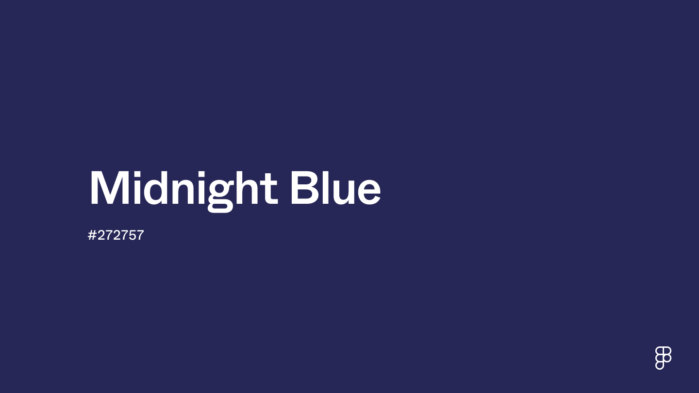
Midnight blue is defined by the following color codes and values to ensure consistency across various digital platforms and devices.
- HEX code: #272757
- RGB value: 15.3% red, 15.3% green and 34.1% blue
Accessibility considerations play a crucial role in UX and UI design color choices. Figma offers plugins in the Community to make sure your designs meet Web Content Accessibility Guidelines.
Midnight blue's depth and sophistication make it a versatile color for UI design. Here's how to integrate it strategically to enhance user experience:
- Enhance contrast. Apply midnight blue for backgrounds or headers to establish a deep, professional base that makes lighter UI elements like text or icons stand out. This contrast improves readability and creates a visually engaging interface.
- Communicate trustworthiness. Leverage midnight blue's association with reliability and professionalism in navigation bars, menus, or footers.
- Accentuate elements. Highlight key information or buttons with midnight blue to subtly draw attention without overwhelming the user experience.
- Enhance readability. Apply midnight blue in typography, especially headings or key text elements, to improve visibility and contrast against lighter backgrounds.
- Optimize data visualization. Consider midnight blue for charts and graphs. Its rich tone creates a visually appealing contrast that helps users understand complex information quickly and effectively.
Keep in mind that color and its meaning can change from culture to culture—and at any given time. If you are designing for a global audience, be sure to research color considerations for your specific regions.
For variations within the same deep and contemplative spectrum as midnight blue, consider:
- Navy blue (#000080) shares midnight blue's deep blue essence and adds a touch of extra darkness.
- Indigo (#560591) offers a blend of deep blue with a subtle hint of purple.
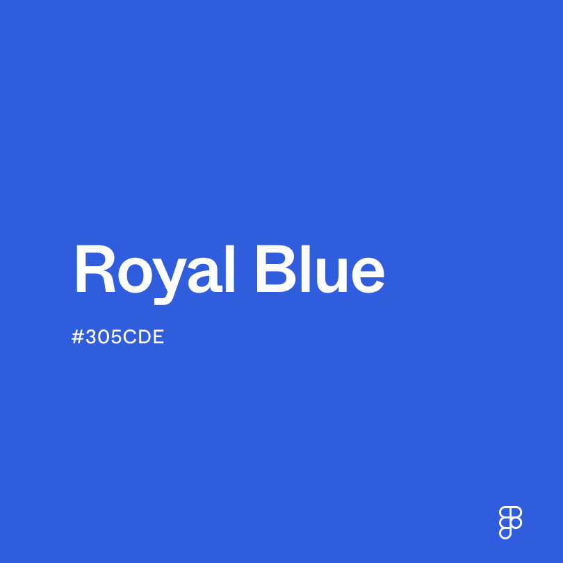
- Royal blue (#305CDE) is lighter and more vibrant yet retains the noble essence.
- Prussian blue (#003153), which is darker and leans towards green, evokes a feeling of deep waters.
To complement midnight blue's profound tones, consider pairing it with:
- Silver (#C0C0C0) adds a shimmering touch, reflecting light and enriching the deep elegance of midnight blue.
- Soft peach (#FFE5B4) is a gentle, warm hue that subtly highlights the depth of midnight blue.
- Cream (#FDFBD4) offers a soft, soothing contrast to midnight blue's intensity, perfect for a refined palette.
- Copper (#B87333) introduces a metallic warmth, creating a luxurious and earthy counterbalance to the coolness of midnight blue.
- Teal (#069494) merges blue and green tones to complement midnight blue's depth with its vibrant character.
Other colors worth considering include dusky pink for a romantic and soft contrast, forest green for a harmonious natural palette, and light gray for a modern, minimalist look.
While midnight blue is versatile, it may clash with:
- Bright yellow (#FFFF00) can create a jarring visual effect, overly contrasting and detracting from midnight blue's subtlety.
- Neon pink (#FF6EC7) offers an intense vibrancy that can overshadow the refined depth of midnight blue.
- Chartreuse (#CCFF00) presents a high-intensity hue that disrupts midnight blue's serene, sophisticated vibe.
- Bright purple (#9B30FF) competes with midnight blue by introducing a bold, playful energy that might not align with midnight blue's elegance.
- Orange red (#FF4500), with its fiery intensity, can clash with midnight blue's cool, tranquil depth, creating visual tension.
Midnight blue evokes mystery and contemplation, bridging the gap between traditional blue's calmness and black's authoritative strength. It's a color that invites deeper thought and sparks curiosity.
In color psychology, blue is widely recognized for conveying reliability and trustworthiness. Midnight blue, with its deeper tone, enhances these qualities. It commands respect and fosters a calm, reflective thought, making it ideal for environments that encourage focus and peace.
In UI/UX design, midnight blue can enhance the user experience by creating a visually compelling interface that promotes engagement. It can also communicate a brand's core values of trustworthiness and sophistication. Its ability to convey strength and tranquility makes midnight blue ideal for brands and interfaces that want to project confidence, serenity, and depth.
The term "midnight blue" first emerged in English in 1915, drawing inspiration from the moonlit night sky. This rich, dark blue predates the iconic works of Vincent van Gogh (think "Starry Night" and "Cafe Terrace at Night").
In the 1920s, the Duke of Windsor popularized midnight blue for formal wear over the traditional black, revolutionizing the appearance of suits and tuxedos in photographs. He argued that midnight blue maintained its depth under artificial light and better showcased the details of men's formal attire.
In 1958, Crayola recognized midnight blue's allure by renaming their 'Prussian blue' crayon. Today, midnight blue continues to be a popular choice in design and technology, evident in the selection of colors for gadgets and luxury cars. Its deep hue is associated with reliability and professionalism, making it a go-to color for branding and corporate identity.
Contrast checker
Contrast 13.87
- Large Text
#272757
- Normal Text
How you design, align, and build matters. Do it together with Figma.
| Category | ||
|---|---|---|
Pass | Pass | |
Pass | Pass | |
Pass | Pass |
Contrast 1.51
- Large Text
#272757
- Normal Text
How you design, align, and build matters. Do it together with Figma.
| Category | ||
|---|---|---|
Fail | Fail | |
Fail | Fail | |
Fail | Fail |
Color simulations
Protanopia
Deuteranopia
Tritanopia
Achromatopsia
The hexadecimal color #272757, known as midnight blue, has RGB values of R:39, G:39, B:87 and CMYK values of CMYK values of C:0.55, M:0.55, Y:0, K:0.66.
| VALUE | CSS | |
|---|---|---|
| HEX | 272757 | #272757 |
| RGB DECIMAL | 39, 39, 87 | rgb(39, 39, 87) |
| RGB PERCENTAGE | 15.3, 15.3, 34.1 | rgb(15.3%, 15.3%, 34.1%) |
| CMYK | 55, 55, 0, 66 | |
| HSL | 240°, 38.1, 24.7 | hsl(240, 38.1%, 24.7%) |
| HSV (OR HSB) | 240°, 55.2, 34.1 | |
| WEB SAFE | 333366 | #333366 |
| CIE-LAB | 18.234, 15.261, -29.179 | |
| XYZ | 3.282, 2.57, 9.339 | |
| xyY | 0.216, 0.169, 2.57 | |
| CIE-LCH | 18.234, 32.929, 297.61 | |
| CIE-LUV | 18.234, -2.347, -32.517 | |
| HUNTER-LAB | 16.032, 8.486, -23.316 | |
| BINARY | 00100111, 00100111, 01010111 | |
| iOS - SwiftUI | Color(red: 39/255, green: 39/255, blue: 87/255) | |
| iOS - UIKit | UIColor(red: 39/255.0, green: 39/255.0, blue: 87/255.0, alpha: 1.0) | |
| Android - Compose | Color(0xFF272757) |