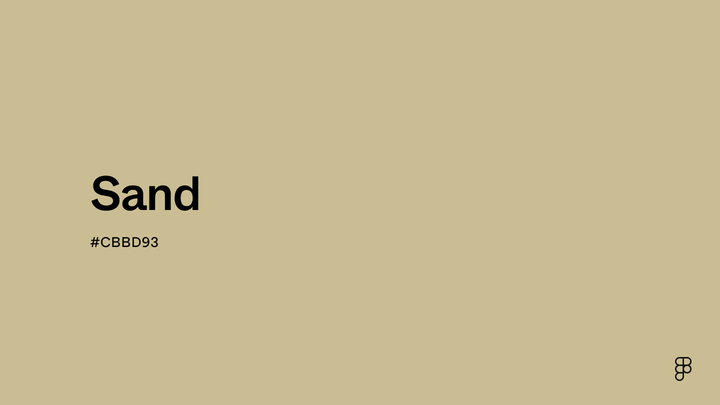
Sand is a warm, pale neutral that perfectly captures the essence of a natural, earthy environment. It sits on the color wheel's lighter and warmer side of the brown spectrum and ranges from pale cream to golden beige. Its soft and inviting hue imbues a touch of understated elegance.

Color variations
Shades
Tints
Tones
Hues
Color Harmonies
Complementary
Split
Monochromatic
Analogous
Triadic
Square
Custom Palettes
Night Sands
Tourmaline
Siltstone
Sand is defined by the following color codes and values to ensure consistency across various digital platforms and devices.
- HEX code: #CBBD93
- RGB value: 79.6% red, 74.1% green and 57.6% blue
Accessibility considerations play a crucial role in UX and UI design color choices. Figma offers plugins in the Community to make sure your designs meet Web Content Accessibility Guidelines.
Here are a few ways to leverage the natural and calming qualities of sand to create a user-friendly and visually appealing design:
- Create a neutral background. Sand’s soft and neutral tone creates a calm, unobtrusive backdrop that helps content stand out without overwhelming the eyes.
- Enhance readability. Pair sand with deeper tones like navy, forest green, or charcoal for text to ensure readability while maintaining an aesthetically pleasing contrast.
- Promote a relaxing atmosphere. Sand is perfect for apps or websites focused on wellness, meditation, travel, or leisure. It helps set a relaxed mood that aligns with leisurely or peaceful activities.
- Complement with earth tones. To create a harmonious and cohesive design, pair sand with other earth tones such as greens, browns, and creams. This palette is pleasing to the eye and reinforces a connection to the natural world, which can enhance the thematic elements of eco-friendly or organic brands.
- Highlight interactive elements. Pair sand with more vibrant colors to draw attention to elements like buttons or links, or use variations of sand shades to create a subtle hierarchy in your design.
Keep in mind that color and its meaning can change from culture to culture—and at any given time. If you are designing for a global audience, research color considerations for your specific regions.
For variations within the same earthy spectrum as sand, consider:
- Khaki (#C3B091) offers a slightly darker shade, retaining the warm and neutral feel of sand.
- Beige (#F5F5DC) is lighter and provides a softer appearance while maintaining the natural vibe.
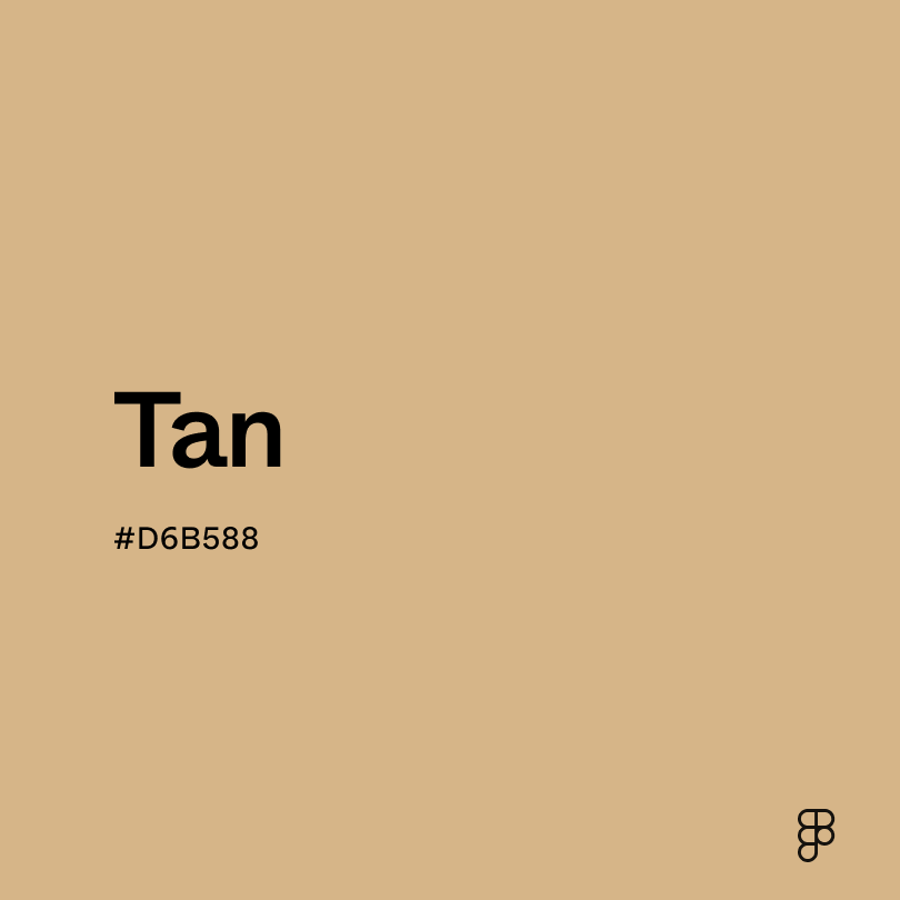
- Tan (#D6B588) has a bit more brown, echoing sand's warm, understated elegance.
- Cream (#FDFBD4) introduces a paler, more soothing tone that complements the subtle hue of sand.
To complement sand’s subdued tones, consider pairing it with:
- Navy blue (#000080) creates a classic contrast, enhancing the understated elegance of sand.
- Forest green (#228B22) offers a rich, natural contrast that harmonizes with sand’s earthiness.
- Burgundy (#660033) provides a deep, rich contrast that makes the muted tones of sand pop.
- Warm gray (#D3D3D3) aligns closely with sand’s neutral properties, offering a modern, chic palette.
- Soft peach (#FFE5B4) complements sand with gentle, inviting warmth.
Additional colors worth considering include deep teal to emphasize a sophisticated contrast, light coral for a soft, inviting look, and pale lilac for a subtle, playful interaction.
While sand is versatile, it may clash with:
- Bright pink (#FF69B4) can overshadow sand's subtle, muted nature with its vibrancy.
- Electric blue (#00F0FF) might be too striking, creating a discordant look against sand’s softness.
- Lemon yellow (#FFF44F) tends to contrast too sharply, potentially overpowering the gentle nature of sand.
- Silver (#C4C4C4) can appear too cool and metallic against sand's warm, earthy tone.
- Charcoal gray (#4A4A4A) may be too bold and dark, which can diminish the soothing quality of sand.
Sand evokes feelings of calmness, relaxation, and stability. Color psychology views sand as conservative, symbolizing comfort, simplicity, and a natural connection. It conveys openness and tranquility.
In UI/UX design, sand offers a clean, uncluttered background, signaling reliability and practicality. It suits designs that aim to feel warm and welcoming, making users feel at ease.
Various cultures and historical contexts have long favored the color sand due to its widespread natural occurrence and versatile applications. The choice to use sand-colored materials in clothing and architecture often came from the resources at hand. For example, buildings and garments in desert regions often match the sandy landscape to blend with the natural environment and reflect sunlight, reducing heat absorption.
For centuries, sand has remained a popular color in fashion because of its neutral tone, which pairs easily with other colors. Its recurrent popularity in military uniforms also stems from its functional benefits in deserts and other light-colored environments, where sand-colored camo offers an advantage.
Contrast 1.87
- Large Text
#CBBD93
- Normal Text
How you design, align, and build matters. Do it together with Figma.
| Category | ||
|---|---|---|
Fail | Fail | |
Fail | Fail | |
Fail | Fail |
Contrast 11.24
- Large Text
#CBBD93
- Normal Text
How you design, align, and build matters. Do it together with Figma.
| Category | ||
|---|---|---|
Pass | Pass | |
Pass | Pass | |
Pass | Pass |
Color simulations
Protanopia
Deuteranopia
Tritanopia
Achromatopsia
The hexadecimal color #CBBD93, known as sand, has RGB values of R:203, G:189, B:147 and CMYK values of C:0, M:0.07, Y:0.28, K:0.2.
| VALUE | CSS | |
|---|---|---|
| HEX | CBBD93 | #CBBD93 |
| RGB DECIMAL | 203, 189, 147 | rgb(203,189,147) |
| RGB PERCENTAGE | 79.6, 74.1, 57.6 | rgb(79.6%,74.1%,57.6%) |
| CMYK | 0, 7, 28, 20 | |
| HSL | 45°, 35, 68.6 | hsl(45,35%,68.6%) |
| HSV (OR HSB) | 45°, 27.6, 79.6 | |
| WEB SAFE | CCCC99 | #CCCC99 |
| CIE-LAB | 76.799, -1.571, 23.059 | |
| XYZ | 48.092, 51.199, 34.951 | |
| xyY | 0.358, 0.381, 51.199 | |
| CIE-LCH | 76.799, 23.112, 93.898 | |
| CIE-LUV | 76.799, 11.026, 31.966 | |
| HUNTER-LAB | 71.554, -5.247, 21.127 | |
| BINARY | 11001011, 10111101, 10010011 | |
| iOS - SwiftUI | Color(red: 203/255, green: 189/255, blue: 147/255) | |
| iOS - UIKit | UIColor(red: 203/255.0, green: 189/255.0, blue: 147/255.0, alpha: 1.0) | |
| Android - Compose | Color(0xFFCBBD93) |