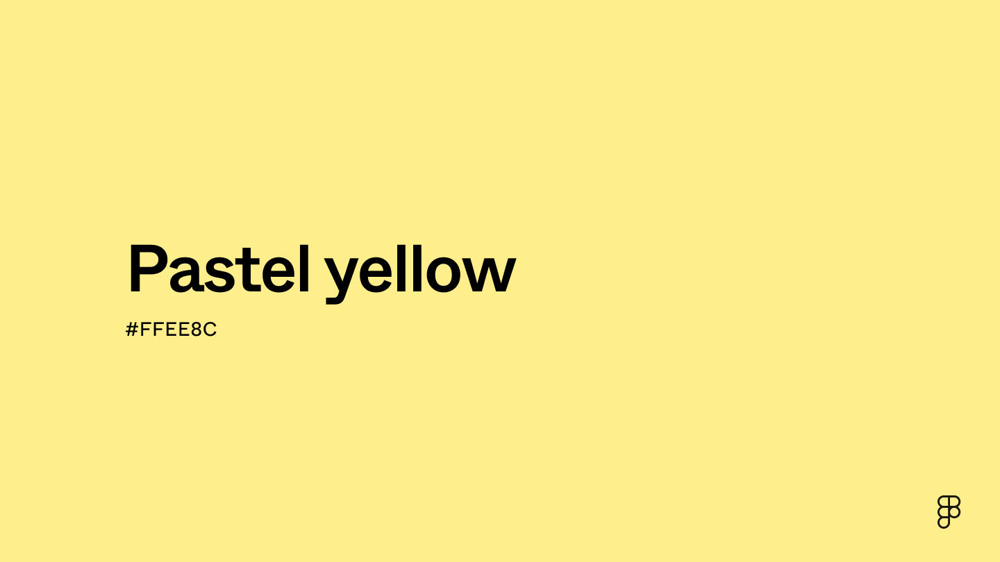
Pastel yellow is positioned close to yellow on the color wheel and with the addition of white, appears lighter and far less saturated than true yellow. This washed-out shade of the primary color yellow creates a soft and muted hue, similar to many of its pastel counterparts. Pastel yellow embodies joy and sunshine and includes an array of different tones like cream and canary.

Color variations
Shades
Tints
Tones
Hues
Color harmonies
Complementary
Split
Monochromatic
Analogous
Triadic
Square
Custom palettes
Wheatfield
Fairy Glen
Sorbet Sunrise
Pastel yellow is defined by the following color codes and values to ensure consistency across various digital platforms and devices.
- HEX code: #FFEE8C
- RGB value: 100% red, 93.3% green, and 54.9% blue
Accessibility considerations play a crucial role in UX and UI design color choices. Figma offers plugins in the Community to make sure your designs meet Web Content Accessibility Guidelines.
Here are some ways to use pastel yellow in your designs:
- Add depth. The softness of pastel yellow can be an accent color or used within different textures and patterns on a page. This can help create visual depth without being too distracting.
- Convey warmth. Pastel yellow’s warmth can help communicate a friendly, cheerful, and positive tone within UI designs.
- Create clean designs. Design styles like flat design often use pastel colors to create simple and minimalistic user interfaces.
Remember that color and its meaning can change from culture to culture—and at any given time. If you are designing for a global audience, research color considerations for your specific regions.
For variations within the same soft and cheery spectrum as pastel yellow, consider:
To complement pastel yellow, consider pairing it with:
- Periwinkle (#CCCCFF) pairs well with pastel yellow for a whimsical touch.
- Baby blue (#8FD9FB) creates a serene and calming color scheme reminiscent of a sunny spring day.
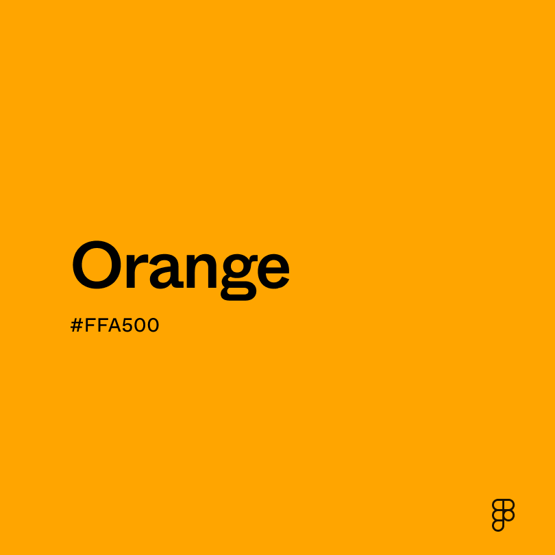
- Orange (#FFA500) makes a bright and citrusy color combination.
- Rosewater (#FFD6D1) creates a soft and feminine color palette.
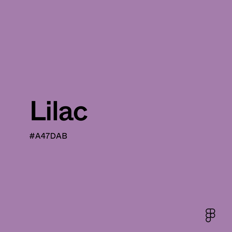
Other colors that complement pastel yellow include white for a timeless and clean design, lilac to play up pastel yellow’s softness, and black for a bold and sophisticated contrast.
While pastel yellow is soft and subtle, it may clash with:
- Mustard yellow (#E1AD01) may make pastel yellow look washed out due to its warmth.
- Maroon (#550000) may overpower pastel yellows’ delicate hue.
- Lime green (#89F336) can diminish the softness of pastel yellow, creating a visually overwhelming color scheme.
- Dark green (#013220) may feel too heavy next to pastel yellow, overpowering its light and airy feel.
- Purple (#9D00FF) may be visually jarring due to its boldness and intensity.
In color psychology, pastel yellow evokes feelings of calmness and joy. This innocent and light shade is often a symbol of happiness and optimism. Its closeness to yellow carries the same warmth, but its muted hue brings about a softer look. Pastel shades in general can induce feelings of peace and serenity.
In different cultures, the color yellow has many symbolic meanings. In China, yellow is a symbol of royalty and prosperity. In the Hispanic culture, yellow symbolizes life and death, prominently seen in the marigolds used to decorate altars for loved ones who have passed away.
Pastel yellow brings forth tranquility and adds freshness and cheerfulness to modern designs.
Pastel yellow comes from the primary color yellow. Yellow’s history goes back to ancient times when yellow ochre pigment was used to paint the sun and stars on cave walls. Historically, yellow has been a sacred color and is associated with gold.
The word “pastel” entered the English language during the 1660s and referred to chalk-like pigments. Eventually, the meaning of pastel evolved to encompass pale or light colors. Pastels became more prominent during the 18th century, as artists used them to create portraits and other art.
In American culture, pastel colors became popular in the 1950s, with pastel yellow being an influential color in interior design. The show “Miami Vice” also sparked another pastel trend during the ‘80s, showcasing Miami’s use of these tropical but muted hues in fashion and architecture. Today, pastel yellow is often used when designing products for babies or decorating kids’ bedrooms due to its gentle and tranquil hue.
Contrast checker
Contrast 1.18
- Large Text
#FFEE8C
- Normal Text
How you design, align, and build matters. Do it together with Figma.
| Category | ||
|---|---|---|
Fail | Fail | |
Fail | Fail | |
Fail | Fail |
Contrast 17.86
- Large Text
#FFEE8C
- Normal Text
How you design, align, and build matters. Do it together with Figma.
| Category | ||
|---|---|---|
Pass | Pass | |
Pass | Pass | |
Pass | Pass |
Color simulations
Protanopia
Deuteranopia
Tritanopia
Achromatopsia
The hexadecimal color #FFEE8C, known as pastel yellow, has RGB values of R:255 G:238, B:140 and CMYK values of C:0, M:7, Y:45, K:0.
| VALUE | CSS | |
|---|---|---|
| HEX | #FFEE8C | #FFEE8C |
| RGB DECIMAL | 255, 238, 140 | RGB(255,238,140) |
| RGB PERCENTAGE | 100, 93.3, 54.9 | RGB(100%,93.3%,54.9%) |
| CMYK | 0, 7, 45, 0 | |
| HSL | 51.1°, 100, 77.5 | HSL(51.1,100%,77.5%) |
| HSV (OR HSB) | 51.1°, 45.1, 100 | |
| WEB SAFE | #FFFF99 | #FFFF99 |
| CIE-LAB | 93.582, -7.143, 49.308 | |
| XYZ | 76.548, 84.304, 37.05 | |
| xyY | 0.387, 0.426, 84.304 | |
| CIE-LCH | 93.582, 49.822, 98.243 | |
| CIE-LUV | 93.582, 15.813, 65.837 | |
| HUNTER-LAB | 91.817, -11.865, 40.348 | |
| BINARY | 11111111, 11101110, 10001100 | |
| iOS - SwiftUI | Color(red: 1, green: 0.933, blue: 0.549) | |
| iOS - UIKit | UIColor(red: 1, green: 0.933, blue: 0.549, alpha: 1) | |
| Android - Compose | Color(0xFFFFEE8C) |