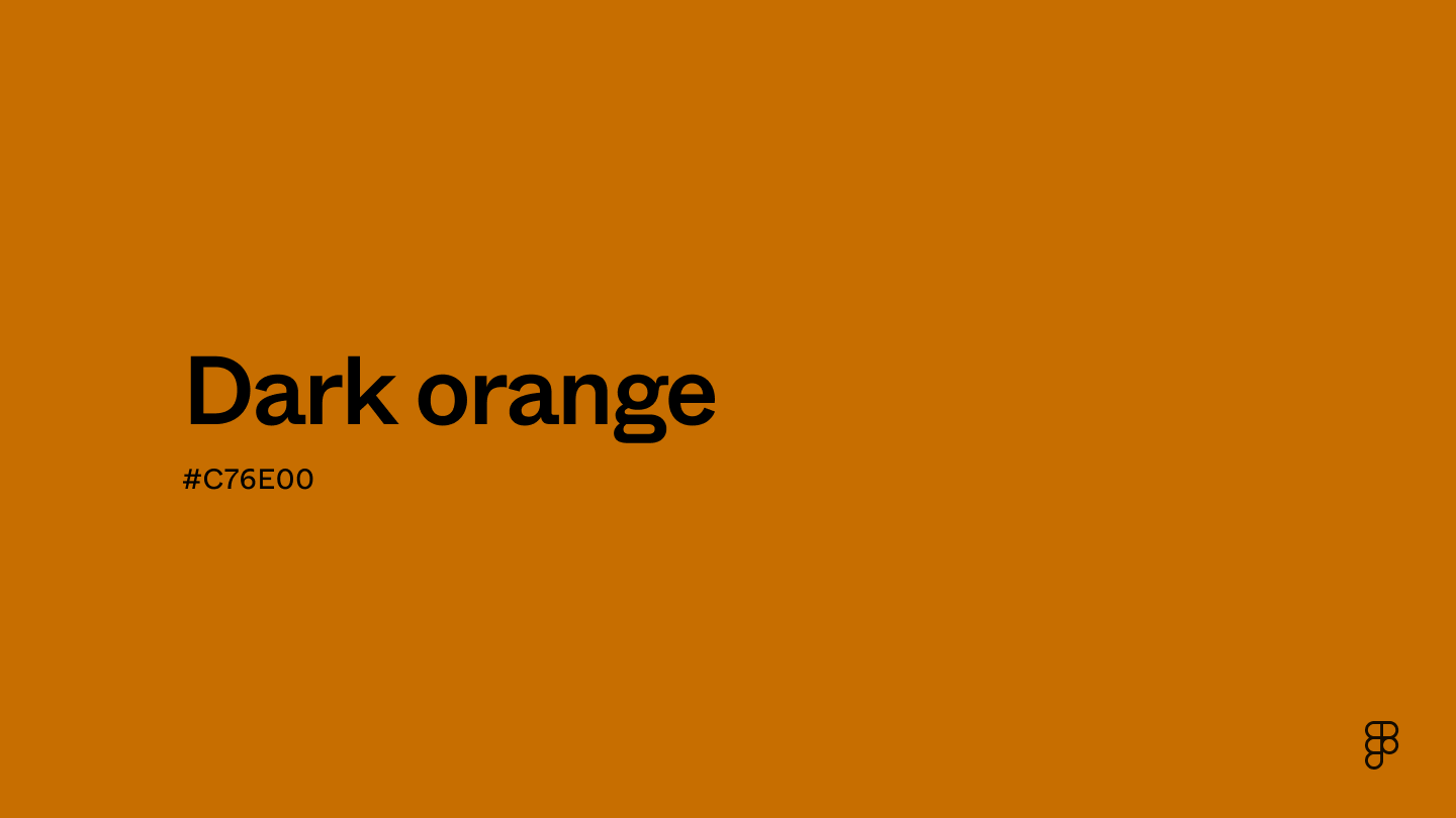
Dark orange is a deep, rich version of orange. While it’s not as bright as a standard orange on the color wheel, it retains vibrancy by leaning more red and occupying the deeper end of the RGB color space. Due to its warmth, dark orange conveys a sense of comfort and positivity.

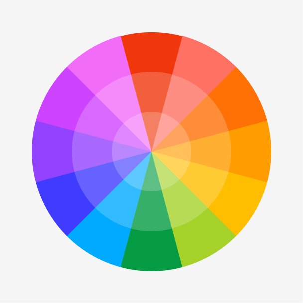
Color variations
Shades
Tints
Tones
Hues
Color harmonies
Complementary
Split
Monochromatic
Analogous
Triadic
Square
Custom palettes
Autumn Ember
Equinox
Spiced Cider
Dark orange is defined by the following color codes and values to ensure consistency across various digital platforms and devices.
- HEX code: #C76E00
- RGB value: 78% red, 43.1% green, and 0% blue
Accessibility considerations play a crucial role in UX and UI design color choices. Figma offers plugins in the Community to make sure your designs meet Web Content Accessibility Guidelines.
Here are some ways to use dark orange in your designs:
- Create contrasting headlines. Dark orange text makes headlines and titles pop on white, black, or beige backgrounds. Use backgrounds like teal, blue, or dark green for an even bolder statement.
- Add energy and warmth. Dark orange evokes feelings of energy, enthusiasm, and warmth. This is a good choice for websites or applications that want to feel exciting, like fitness apps, creative tools, or event websites.
- Convey sophistication and value. When paired with colors like cream or ivory, dark orange adds sophistication to designs. This is particularly useful for luxury brands or design portfolios.
Keep in mind that color and its meaning can change from culture to culture—and at any given time. If you are designing for a global audience, research color considerations for your specific regions.
For variations within the same warm and rich spectrum as dark orange, consider:
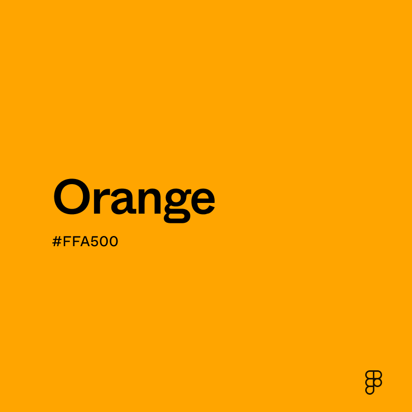
- Orange (#FFA500) is a vibrant color, similar to a tangerine peel.
- Burnt orange (#BE5103) leans more toward red and is a touch brighter.
- Yellow-orange (#FFB800) is a more cheerful orange with a hint of yellow.
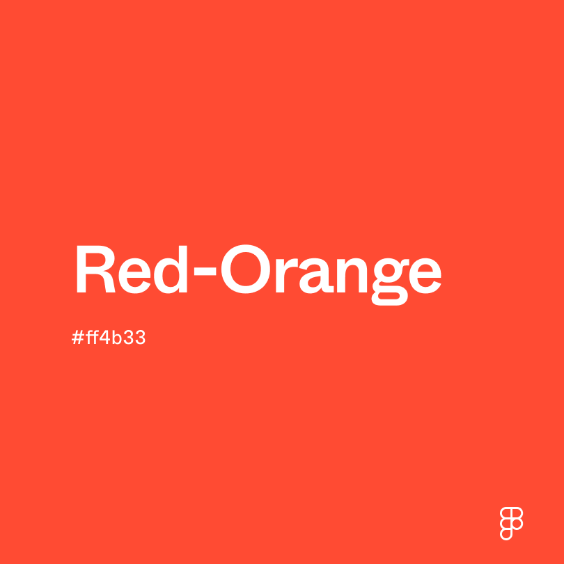
- Red-orange (#FF4B33) offers a vibrant red mixed with orange.
Due to its intense and warm hues, dark orange pairs well with other colors that enhance this boldness or create a striking contrast. To complement dark orange, consider pairing it with:
- Navy blue (#000080) and dark orange are a classic combination that exudes elegance and sophistication, often used in high-end designs or settings.
- Gold (#EFBF04) pairs well with dark orange to create an even more assertive, glamorous design.
- Cream (#FDFBD4) is a soft color that balances the intensity of dark orange, creating a warm and inviting space.
- Green sage (#98A869) combines with dark orange to evoke a sense of nature and tranquility.
Other complementary colors for dark orange include jewel tones, more earthy greens, and teal for vibrancy.
While dark orange is calm and warming, it may clash with:
- Fuchsia (#FE3894) is an intense color that looks jarring when paired with dark orange.
- Pink (#FF8DA1) is a more light and airy color that can clash with the boldness of dark orange.
- Rose (#FF1D8D) leans cool with its strong presence of blue, while dark orange is a warm color.
- Neon green (#2CFF05) is tricky to pair with dark orange because both are highly saturated and intense.
Dark orange conjures feelings of warmth, soft energy, and luxury. It sits between orange and red on the color spectrum, inheriting red's boldness and orange's energy.
While dark orange shares some orange’s vibrancy, it leans more toward passion and ambition. It represents enthusiasm but can also veer into negativity like selfishness or aggression.
For UI designs, dark orange can draw attention to important elements. Its bold nature accents calls to action without overwhelming the viewer. When paired with browns or beiges, dark orange is also a great choice for invoking a sense of history, tradition, or nature. This is especially valuable for brands that want to create a sense of comfort or stability in their designs.
In ancient Egypt and Rome, minerals like realgar and orpiment were used for paints. These pigments offered a range of orange hues, with some leaning darker. In the 20th century, a surge of design movements embraced bold colors. Art Deco, for example, used a range of oranges that could have contributed to a growing appreciation for the color. Today, dark orange is still used as an accent in home and UI designs.
Contrast checker
Contrast 3.71
- Large Text
#C76E00
- Normal Text
How you design, align, and build matters. Do it together with Figma.
| Category | ||
|---|---|---|
Fail | Fail | |
Pass | Fail | |
Pass | Fail |
Contrast 5.66
- Large Text
#C76E00
- Normal Text
How you design, align, and build matters. Do it together with Figma.
| Category | ||
|---|---|---|
Pass | Fail | |
Pass | Pass | |
Pass | Pass |
Color simulations
Protanopia
Deuteranopia
Tritanopia
Achromatopsia
The hexadecimal color #C76E00, known as dark orange, has RGB values of R:199 G:119, B:0 and CMYK values of C:0, M:45, Y:100, K:22.
| VALUE | CSS | |
|---|---|---|
| HEX | C76e00 | #C76e00 |
| RGB DECIMAL | 199, 110, 0 | RGB(199, 110, 0) |
| RGB PERCENTAGE | 78, 43.1, 0 | RGB(78%,43.1%,0%) |
| CMYK | 0, 45, 100, 22 | |
| HSL | 33.2°, 100, 39 | HSL(33.2, 100%, 39%) |
| HSV (OR HSB) | 33.2°, 100, 78 | |
| WEB SAFE | #CC6600 | #CC6600 |
| CIE-LAB | 55.376, 29.453, 62.908 | |
| XYZ | 29.13, 23.297, 2.963 | |
| xyY | 0.526, 0.421, 23.297 | |
| CIE-LCH | 55.376, 69.461, 64.912 | |
| CIE-LUV | 55.376, 74.066, 52.402 | |
| HUNTER-LAB | 48.266, 23.263, 30.147 | |
| BINARY | 11000111, 01101110, 00000000 | |
| iOS - SwiftUI | Color(red: 0.78, green: 0.431, blue: 0) | |
| iOS - UIKit | UIColor(red: 0.78, green: 0.43, blue: 0, alpha: 1.0) | |
| Android - Compose | Color(0xFFC76E00) |