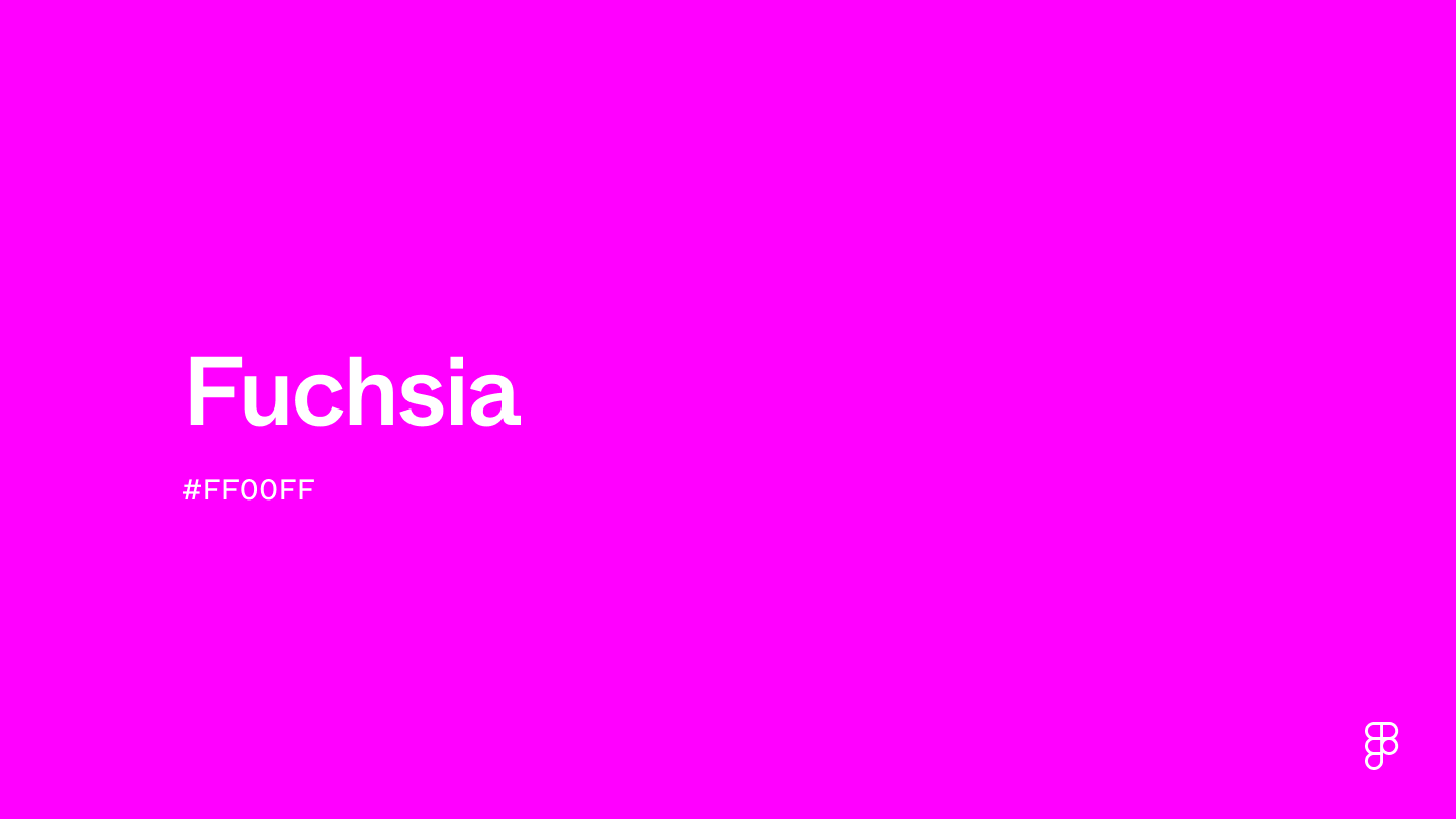
Fuchsia is a vivid and bold color that blends purple’s richness with pink’s bright energy. It’s a warm hue that sits between pink and purple on the color wheel, embodying a dynamic interplay of energy and playfulness. The shade represented by #FF00FF is particularly intense, resembling pure magenta and radiant hot pink, making it perfect for designs that attract attention and evoke excitement.

Color variations
Shades
Tints
Tones
Hues
Color harmonies
Complementary
Split
Monochromatic
Analogous
Triadic
Square
Custom palettes
Electric Nightshade
Mardi Gras
80s Arcade
Fuchsia is defined by the following color codes and values to ensure consistency across various digital platforms and devices.
- HEX code: #FF00FF
- RGB value: 100% red, 0% green and 100% blue
Accessibility considerations play a crucial role in UX and UI design color choices. Figma offers plugins in the Community to make sure your designs meet Web Content Accessibility Guidelines.
To effectively use fuchsia in UI design, consider these approaches:
Add pop. Use fuchsia for a pop of color, ideal for highlighting calls to action (CTAs), buttons, or key navigational elements. This will grab users’ attention and guide them through your interface.
Create dynamic visual interest. Its bold presence can break up monotonous color schemes, adding depth and dynamism to your UI, especially in creative or entertainment-focused apps.
Balance with neutral or dark shades. Pair fuchsia with shades of gray, black, or white to temper its intensity and maintain visual balance, ensuring your design remains sophisticated and not overwhelming.
Highlight innovation and creativity. Fuchsia’s bold and unconventional nature makes it perfect for brands aiming to convey innovation and a forward-thinking approach in their UI design. It highlights creativity and sets your interface apart.
Keep in mind that color and its meaning can change from culture to culture—and at any given time. If you are designing for a global audience, research color considerations for your specific regions.
For variations within the same vibrant and bold spectrum as fuchsia (#FF00FF), consider:
- Magenta (#FD3DB5) is essentially the same as fuchsia in many digital platforms, embodying the perfect blend of deep pink and light purple with a similarly vibrant intensity.
- Hot pink (#FF69B4), lighter and with a more pronounced pink hue, captures the spirited essence of fuchsia while offering a slightly softer impact.
- Deep pink (#FF1493), delivers a more concentrated pink tone, retaining the vibrancy of fuchsia with a slightly more intense focus on the pink aspect.
- Purple (#800080), while darker, shares fuchsia's depth and boldness but leans more towards the mystique and richness of traditional purple.
To complement fuchsia's dynamic tones, consider pairing it with:
- Lime green (#89F336) for a lively and energetic contrast that pops against fuchsia's vibrancy, creating a modern and spirited palette.
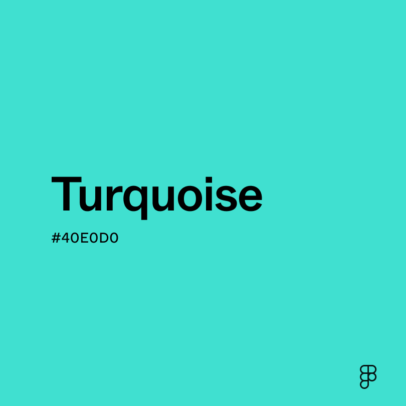
- Turquoise (#40E0D0) introduces a cool, refreshing counterbalance, offering a harmonious blend that's both bold and soothing.
- Navy blue (#000080) provides a deep, sophisticated backdrop that allows fuchsia to stand out, emphasizing its brightness and depth.
- Soft spray (#BEBEBE) offers a neutral, understated base that grounds fuchsia's intensity, perfect for designs seeking balance and subtlety.
- Gold (#EFBF04) adds a touch of luxury and warmth, enriching the palette with a festive, opulent vibe that complements fuchsia beautifully.
Other colors worth considering include black for a dramatic and elegant contrast, white for a crisp and clean backdrop that amplifies fuchsia's vibrancy, and silver for a modern, chic touch.
While fuchsia is versatile, it may clash with:
- Bright red (#FF0000) can compete for attention, potentially creating a visually overwhelming palette due to the similarity in vibrancy but difference in hue.
- Dark brown (#654321), being very muted and earthy, may dampen fuchsia's lively spirit and lead to a discordant aesthetic.
- Neon yellow (#FFFF00), while vibrant, may create a jarring contrast that's too intense and lacks visual harmony with fuchsia.
- Olive green (#808000), with muted, earthy tones, might not provide a pleasing contrast to fuchsia, resulting in an unbalanced palette.
- Burnt orange (#BE5103), though warm, can create a challenging combination with fuchsia, as their strong personalities may clash rather than complement each other.
Fuchsia is a color associated with boldness, confidence, and enthusiasm for life. Its bright and vivid shade is often linked to creativity, uniqueness, and nonconformity. In color psychology, fuchsia is considered to be a stimulant that encourages a sense of confidence and forward thinking.
In UI/UX design and branding, fuchsia is an excellent choice for making a statement. It’s a color that immediately grabs attention, creates excitement, and motivates people to take action. Fuchsia's stimulating nature is ideal for encouraging user confidence and driving action.
The name fuchsia, inspired by the bright purplish-red flowers of the fuchsia plant, comes from Leonhart Fuchs, a German botanist from the 16th century. In the 19th century, the color gained prominence when its dye was first made, marking a key moment in fashion history. This breakthrough allowed for the widespread use of fuchsia in textiles, turning it into a symbol of modernity and style. The color became popular again in the mid-20th century, especially during the 1960s and 1970s, reflecting the era's spirit with its bold and flamboyant shades.
Contrast checker
Contrast 3.14
- Large Text
#FF00FF
- Normal Text
How you design, align, and build matters. Do it together with Figma.
| Category | ||
|---|---|---|
Fail | Fail | |
Pass | Fail | |
Pass | Fail |
Contrast 6.7
- Large Text
#FF00FF
- Normal Text
How you design, align, and build matters. Do it together with Figma.
| Category | ||
|---|---|---|
Pass | Fail | |
Pass | Pass | |
Pass | Pass |
Color simulations
Protanopia
Deuteranopia
Tritanopia
Achromatopsia
The hexadecimal color #069494, known as teal, has RGB values of R:6, G:148, B:148 and CMYK values of C:0.96, M:0, Y:0, K:0.42.
| VALUE | CSS | |
|---|---|---|
| HEX | 069494 | #069494 |
| RGB DECIMAL | 6, 148, 148 | rgb(6,148,148) |
| RGB PERCENTAGE | 2.4, 58, 58 | rgb(2.4%,58%,58%) |
| CMYK | 96, 0, 0, 42 | |
| HSL | 180°, 92.2, 30.2 | hsl(180,92.2%,30.2%) |
| HSV (OR HSB) | 180°, 95.9, 58 | |
| WEB SAFE | 009999 | #009999 |
| CIE-LAB | 55.436, -31.788, -9.361 | |
| XYZ | 16.009, 23.355, 31.68 | |
| xyY | 0.225, 0.329, 23.355 | |
| CIE-LCH | 55.436, 33.137, 196.409 | |
| CIE-LUV | 55.436, -42.554, -9.188 | |
| HUNTER-LAB | 48.327, -25.443, -5.037 | |
| BINARY | 00000110, 10010100, 10010100 | |
| iOS - SwiftUI | Color(red: 6/255, green: 148/255, blue: 148/255) | |
| iOS - UIKit | UIColor(red: 6/255.0, green: 148/255.0, blue: 148/255.0, alpha: 1.0) | |
| Android - Compose | Color(0xFF069494) |