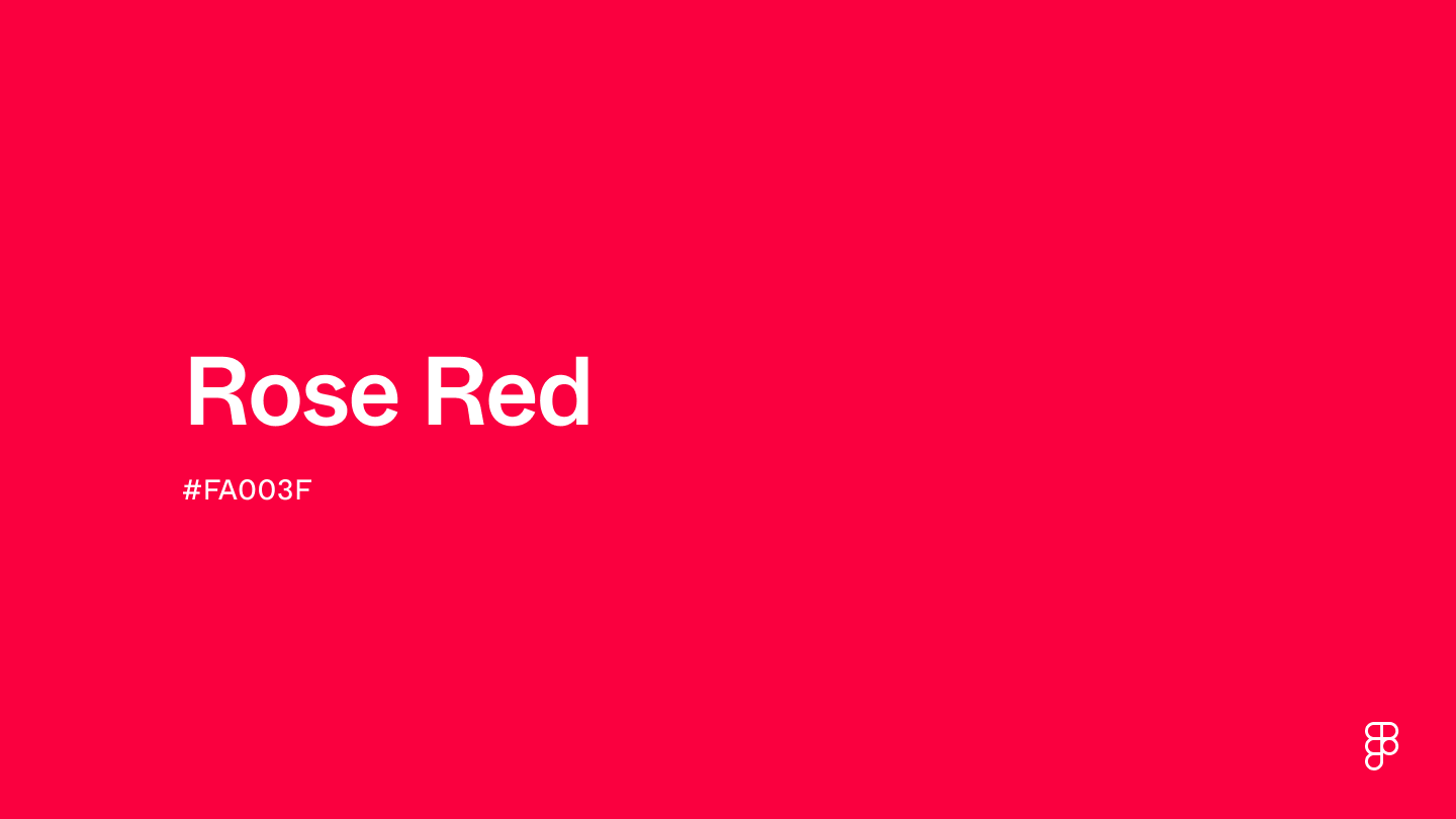
Rose red is a vivid and striking shade that captures the boldness of red with a touch of brightness. This hue falls on the vivid side of the red spectrum and closely resembles the commanding hues of crimson and scarlet.

Color variations
Shades
Tints
Tones
Hues
Color harmonies
Complementary
Split
Monochromatic
Analogous
Triadic
Square
Custom palettes
Rosey Red
Mystic berry
Passion Pop
Rose red is defined by the following color codes and values to ensure consistency across various digital platforms and devices.
- HEX code: #FA003F
- RGB value: 98% red, 0% green and 24.7% blue
Accessibility considerations play a crucial role in UX and UI design color choices. Figma offers plugins in the Community to make sure your designs meet Web Content Accessibility Guidelines.
Here's how to effectively use rose red in UI design:
Highlight important elements. Use rose red to draw attention to key elements like CTA buttons or promotional banners, leveraging its vividness to stimulate user action.
Create contrast. Pair rose red with muted tones like soft grays or deep blues to create a striking visual contrast that enhances the overall readability and aesthetic appeal of your design.
Use sparingly. Given its intensity, rose red should be used sparingly to ensure it doesn’t overpower your design. It's ideal for accents and highlights that must stand out without overwhelming the user.
Match the mood. Consider the emotional impact of rose red. Its brightness can energize and excite, making it suitable for playful and dynamic interfaces, while more subdued environments may require a less saturated shade.
Keep in mind that color and its meaning can change from culture to culture—and at any given time. If you are designing for a global audience, research color considerations for your specific regions.
For variations within the same warm and lively spectrum as rose red, consider:
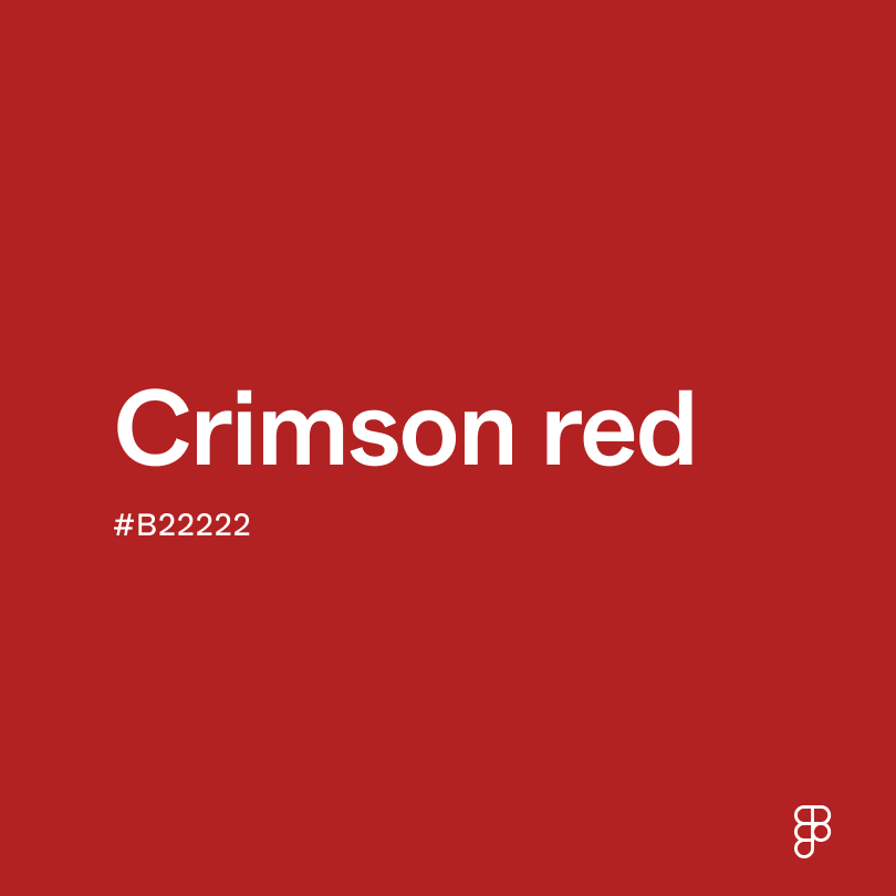
- Crimson (#BF2323) presents as a strong, bright red with a subtle blue undertone, offering a slightly cooler tone.
- Ruby (#E0115F) introduces a bit more purple, sharing rose red's depth and vibrancy with elegance.
- Scarlet (#FF2400) shines as a brighter and more orange-toned red, capturing attention just as rose red does.
- Carmine (#960018) appears darker and more subdued yet maintains rose red's intensity.
To complement rose red's warm tones, consider pairing it with:
- Midnight blue (#272757) offers a deep blue contrasting rose red's brightness.
- Pale rose (#FFE4E1) is a soft, delicate pink that subtly complements the intensity of rose red.
- Gold (#EFBF04) adds a shimmering touch, enriching the luxurious feel of rose red.
- Charcoal (#4A4A4A) is a dark, neutral gray that balances the vibrancy of rose red.
- Ivory (#FFFEF3) is a soft, warm white that pairs naturally with rose red for a timeless look.
Other colors worth considering include olive green for an earthy balance, teal for a modern twist, and lilac for a playful yet sophisticated palette.
While rose red is versatile, it may clash with:
- Kelly green (#4CBB17) can create a jarring visual when paired with the vivid rose red.
- Bright orange (#FFA500) and rose red compete for attention, potentially overwhelming and lacking harmony.
- Turquoise (#40E0D0) might clash with the warmth of rose red, causing a visual discord.
- Neon yellow (#FFFF00) has a luminous quality that could make rose red seem less vibrant in comparison.
- Light purple (#9370DB), when used extensively, may contrast too starkly with the warmth of rose red.
Rose red is a color deeply entwined with feelings of passion, vitality, and love. Traditionally associated with romantic themes, it conveys a sense of urgency and importance. This color often symbolizes deep affection and strong emotional bonds, making it a frequent choice in contexts that evoke warmth and intimate connections.
In color psychology, rose red stimulates energy. Its vibrant hue can ignite passion and desire, making it a powerful tool for grabbing attention and invoking strong emotional responses. The color's brightness and intensity can energize and motivate, so it is often used to signal action and highlight critical features.
While this shade of rose red can boost user engagement, use it judiciously in UI design to avoid overwhelming users. It works best when balanced with more neutral or subdued colors to ensure it stands out without dominating.
Ancient civilizations prized vibrant hues like rose red, often seen in clothing and frescoes as a symbol of prestige reserved for the elite. During the Middle Ages, rose red was prominently featured in religious iconography to represent both earthly and divine elements.
During the Renaissance, rose red was visible in Botticelli and Raphael's works, highlighting human emotion and divine presence, adding a vibrant warmth to art.
By the 20th century, rose red evolved to signify love and elegance, boldness and vibrancy, influencing modern design choices with its striking presence.
Contrast checker
Contrast 4.09
- Large Text
#FA003F
- Normal Text
How you design, align, and build matters. Do it together with Figma.
| Category | ||
|---|---|---|
Fail | Fail | |
Pass | Fail | |
Pass | Fail |
Contrast 5.14
- Large Text
#FA003F
- Normal Text
How you design, align, and build matters. Do it together with Figma.
| Category | ||
|---|---|---|
Pass | Fail | |
Pass | Pass | |
Pass | Pass |
Color simulations
Protanopia
Deuteranopia
Tritanopia
Achromatopsia
The hexadecimal color #FA003F, known as rose red, has RGB values of R: 250, G: 0, B: 63 and CMYK values of C:0, M:1, Y:0.75, K:0.02.
| VALUE | CSS | |
|---|---|---|
| HEX | #FA003F | #FA003F |
| RGB DECIMAL | 250, 0, 63 | rgb(250, 0, 63) |
| RGB PERCENTAGE | 98.0%, 0.0%, 24.7% | rgb(98.0%, 0.0%, 24.7%) |
| CMYK | 20, 0, 100, 0 | |
| HSL | 345°, 100%, 49% | hsl(345, 100%, 49%) |
| HSV (OR HSB) | 345°, 100%, 98% | |
| WEB SAFE | FF0033 | #FF0033 |
| CIE-LAB | 52.601, 80.003, 39.834 | |
| XYZ | 40.322, 20.683, 6.570 | |
| xyY | 0.597, 0.306, 20.683 | |
| CIE-LCH | 52.601, 88.941, 26.634 | |
| CIE-LUV | 52.601, 130.715, 19.613 | |
| HUNTER-LAB | 45.479, 78.672, 23.270 | |
| BINARY | 11111010, 00000000, 00111111 | |
| iOS - SwiftUI | Color(red: 250/255, green: 0/255, blue: 63/255) | |
| iOS - UIKit | UIColor(red: 250/255.0, green: 0/255.0, blue: 63/255.0, alpha: 1.0) | |
| Android - Compose | Color(0xFFFA003F) |