Copper is a warm orange-brown shade with strong and comforting qualities. It’s positioned in the red-orange section of the color wheel, exuding a sense of durability and energy while maintaining an earthy, grounded vibe.

Color variations
Shades
Tints
Tones
Hues
Color Harmonies
Complementary
Split
Monochromatic
Analogous
Triadic
Square
Custom Palettes
Copperwood
Mediterranean
Haven
Copper is defined by the following color codes and values to ensure consistency across various digital platforms and devices.
- HEX code: #C68346
- RGB value: 77.6% red, 51.4% green, and 27.5% blue
Accessibility considerations play a crucial role in UX and UI design color choices. Figma offers plugins in the Community to make sure your designs meet Web Content Accessibility Guidelines.
Here are some ways to use copper in your designs:
- Add warmth and depth. Copper’s inherent golden glow fosters a welcoming and inviting user experience. Use subtle copper gradients for backgrounds or textures to add depth without overwhelming the user.
- Tie in natural elements. The warm, earthy tones of copper perfectly complement nature-inspired designs. This natural color connection creates a calming and inviting atmosphere.
- Create a high-end or vintage feel. Copper’s association with precious metals adds a touch of elegance and timelessness. Buttons, icons, or borders with a subtle copper sheen can add a touch of sophistication. For a vintage feel, incorporate copper textures that resemble aged copper surfaces.
Keep in mind that color and its meaning can change from culture to culture—and at any given time. If you are designing for a global audience, research color considerations for your specific regions.
For variations within the same glowy spectrum as copper, consider:
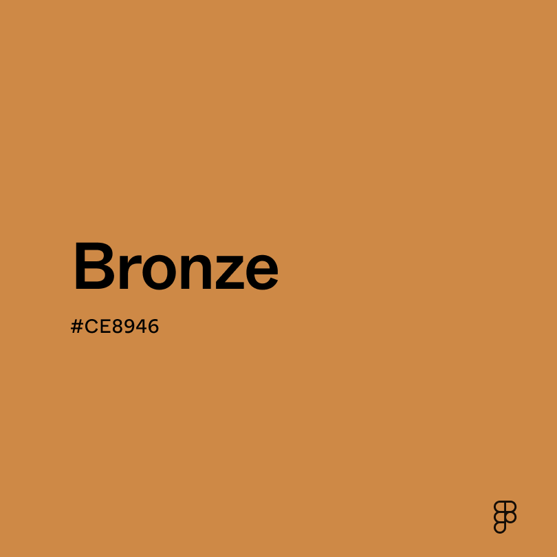
- Bronze (#CE8946) shares a similar warm reddish-brown base with copper, but bronze leans slightly grayer, creating a more muted and earthy tone.
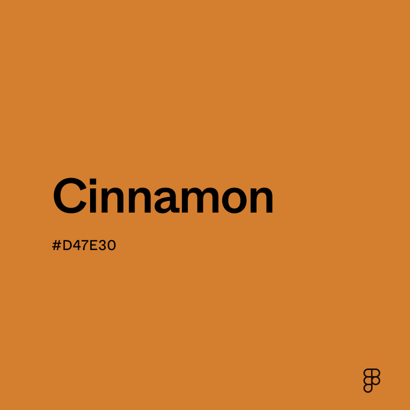
- Cinnamon (#D47E30) leans warmer than copper, incorporating its rich tones with a stronger red base for a more vibrant look.
- Rose gold (#DEA193) shares the warmth of copper but with a light, pinker base.
- Burnt sienna (#ED7B58) is a deep, rustic red-brown with earthy tones like copper but with a touch of orange.
To complement copper, consider pairing it with:
- Taupe (#54463A) acts as a calm, neutral background for copper accents.
- Navy blue (#000080) complements copper’s warmth to create a luxurious feel.
- Cream (#FDFBD4) creates a light, airy contrast to copper’s richness.
- Turquoise (#40E0D0) offers a striking and visually interesting contrast when paired with copper.
Other colors worth considering include green sage for a calming, natural appearance, marigold for a pop of color, or terracotta for an earthy pairing.
While copper is warm, it may clash with:
- Neon green (#2CFF05) can overpower copper’s warmth due to its extreme saturation.
- Light blue (#90D5FF) lacks contrast when paired with copper’s richness and can create a washed-out palette.
- Orange (#FFA500) can clash with the red-brown tones of copper.
- Black (#000000) creates a heavy, dark feel when paired with copper.
- Yellow (#FFDE21) is highly saturated, overpowering the warmth of copper.
Copper is associated with stability and security, enhanced by its connection to nature. In some cultures, it is even believed to possess healing properties.
In color psychology, copper’s warmth translates to feelings of comfort, assurance, and optimism. It can stimulate the mind and encourage creativity. The reddish tones offer a slight boost of energy and motivation, while the grounding natural tones evoke a sense of trust and stability.
Copper can be a versatile color in UI design. Its richness makes it ideal for accents and highlights, drawing attention to important elements. The warmth creates a welcoming atmosphere, perfect for interfaces promoting relaxation or creativity. But because of its visual strength, use copper strategically and avoid overuse to prevent an overwhelming effect.
Unlike some colors with rich symbolic histories, copper’s story is less about the color itself and more about its namesake metal. The metal copper dates back to 8000 B.C. when people used the naturally occurring metal for tools and other objects.
Artists have created copper-like colors throughout history, but the word "copper" as a color name only appeared in English in 1594.
As color theory developed in the 18th and 19th centuries, copper became a recognized color, linking the metal’s color and its name. Today, the color copper is used to add a touch of elegance to design, art, and jewelry.
Contrast 3.12
- Large Text
#C68346
- Normal Text
How you design, align, and build matters. Do it together with Figma.
| Category | ||
|---|---|---|
Fail | Fail | |
Pass | Fail | |
Pass | Fail |
Contrast 6.74
- Large Text
#C68346
- Normal Text
How you design, align, and build matters. Do it together with Figma.
| Category | ||
|---|---|---|
Pass | Fail | |
Pass | Pass | |
Pass | Pass |
Color simulations
Protanopia
Deuteranopia
Tritanopia
Achromatopsia
The hexadecimal color #C68346, known as copper, has RGB values of R:198 G:131, B:70 and CMYK values of C:0, M:0.34, Y:0.65, K:0.22.
| VALUE | CSS | |
|---|---|---|
| HEX | C68346 | #C68346 |
| RGB DECIMAL | 198, 131, 70 | RGB(198,131,70) |
| RGB PERCENTAGE | 77.6, 51.4, 27.5 | RGB(77.6,51.4%,27.5%) |
| CMYK | 0, 34, 65, 22 | |
| HSL | 28.6°, 52.9, 52.5 | HSL(28.6°,52.9%,52.5%) |
| HSV (OR HSB) | 28.6°, 64.6, 77.6 | |
| WEB SAFE | CC9933 | #CC9933 |
| CIE-LAB | 60.501, 19.934, 42.826 | |
| XYZ | 36.101, 20.113, 10.78532.511, 28.683, 9.618 | |
| xyY | 0.459, 0.405, 28.683 | |
| CIE-LCH | 60.501, 47.238, 65.04 | |
| CIE-LUV | 60.501, 52.453, 44.648 | |
| HUNTER-LAB | 53.556, 14.635, 26.842 | |
| BINARY | 11000110, 10000011, 01000110 | |
| iOS - SwiftUI | Color(red: 0.776, green: 0.514, blue: 0.275) | |
| iOS - UIKit | UIColor(red: 0.776, green: 0.514, blue: 0.275, alpha: 1) | |
| Android - Compose | Color(0xFFC68346) |