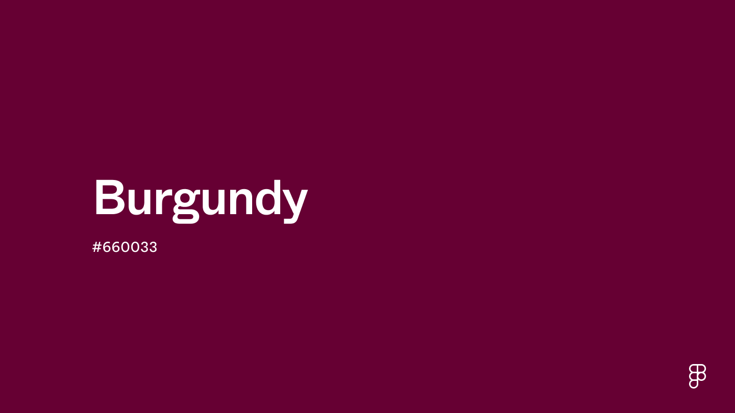
Burgundy is a rich and sophisticated color that blends dark red with hints of purple. This intense hue is positioned towards the darker end of the color spectrum, conveying depth and warmth and an atmosphere of sophistication and refinement.

Color variations
Shades
Tints
Tones
Hues
Color harmonies
Complementary
Split
Monochromatic
Analogous
Triadic
Square
Custom palettes
Summer Wine
Blooming Romance
Royal Gemstones
Burgundy is defined by the following color codes and values to ensure consistency across various digital platforms and devices.
- HEX code: #660033
- RGB value: 40% red, 0% green and 20% blue
Accessibility considerations play a crucial role in UX and UI design color choices. Figma offers plugins in the Community to make sure your designs meet Web Content Accessibility Guidelines.
To effectively use burgundy in UI design, consider these tips:
- Convey elegance and depth. Burgundy, with its deep red tones, adds depth and elegance to your design, making it ideal for brands aiming to portray sophistication and exclusivity.
- Use as an accent color. Burgundy is a practical accent color to highlight important elements like CTA buttons, enhancing the overall design without overwhelming it.
- Pair with muted tones. Combine burgundy with muted tones such as soft grays or creamy whites to create a balanced, visually appealing color scheme that enhances user experience.
- Emphasize luxury and seriousness. Burgundy's rich hue is perfect for UI elements in luxury brand applications, financial platforms, or any service that emphasizes trustworthiness and seriousness.
Keep in mind that color and its meaning can change from culture to culture—and at any given time. If you are designing for a global audience, research color considerations for your specific regions.
For variations within the same deep and rich spectrum as burgundy, consider:
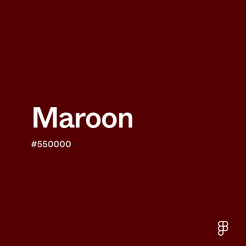
- Maroon (#550000) shares burgundy's dark, red vibe but with a slightly more brown undertone, providing a warm, earthy feel that's equally sophisticated.
- Wine (#722F37) closely resembles burgundy with its blend of red and purple tones, evoking the luxurious essence of a fine red wine.
- Oxblood (#4A0000) is darker and more intense, offering a deeper shade that retains the luxurious and bold characteristics of burgundy.
- Crimson (#BF2323), while brighter, shares burgundy's richness and depth, adding a more vibrant, energetic edge to the palette.
To complement burgundy's luxurious tones, consider pairing it with:
- Gold (#EFBF04) adds a shimmering touch of opulence, creating a rich contrast that highlights burgundy's depth and elegance.
- Cream (#FDFBD4) offers a soft, warm backdrop that allows the intensity of burgundy to stand out, providing a classic and refined palette.
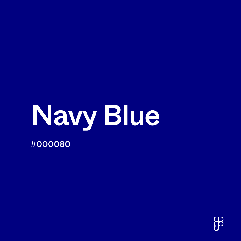
- Navy blue (#000080) introduces a deep, sophisticated contrast, amplifying burgundy's richness in a palette inspired by traditional elegance.
- Slate gray (#6D8196) provides a modern, neutral canvas that balances the vibrancy of burgundy with a touch of contemporary sophistication.
- Dusty pink (#DCAE96) softens the overall look, complementing burgundy's depth with a whisper of gentle color for a subtly romantic feel.
Other colors worth considering include forest green for a natural, grounded look, soft lavender for a gentle, contrasting pop, and pale blue for a cool, serene complement.
While burgundy is versatile, it may clash with:
- Bright lime green (#32CD32) can be too striking against burgundy, creating a visual contrast that may feel jarring or overly bold.
- Neon orange (#FFA500), with its intense vibrancy, might detract from burgundy's sophisticated richness, leading to a discordant palette.
- Electric blue (#0000FF) offers a cool, vivid contrast that can overshadow the warmth and depth of burgundy, resulting in a combination that lacks harmony.
- Hot pink (#FF69B4), while lively, may clash with burgundy by competing for visual attention, creating a palette that is too vibrant and potentially unsettling.
- Dark purple (#800080), though similar in depth, can compete too much with burgundy, overshadowing its unique characteristics and leading to a monotonous look.
Burgundy, especially the deep, rich shade represented by hex #660033, is synonymous with mature elegance and refined luxury. This color implies wealth and sophistication and conveys depth and richness.
In color psychology, burgundy is known to stimulate the appetite and promote warmth and comfort. Though more subdued than brighter reds, its intense hue can still evoke feelings of passion and energy.
In UI/UX design, burgundy creates a sophisticated and elegant atmosphere, making it especially effective for luxury branding and high-end websites. When used as an accent color, it helps highlight the most crucial elements of a design without overwhelming the user.
Burgundy’s name comes from the wine-producing region of Burgundy in France. The Burgundy region has been renowned for wine production since the Roman times, but the color gained prominence during the late Middle Ages and Renaissance. With improved dyeing techniques, deeper and richer reds became possible and highly sought after by the nobility and wealthy classes. Often worn by kings, nobles, and clergy, burgundy garments symbolized status, wealth, and power.
In the 19th century, burgundy became popular in Victorian fashion, symbolizing elegance and importance for both genders. In the 20th century, burgundy’s association with sophistication and luxury persisted, influencing interior design, automotive, and fashion.
Contrast checker
Contrast 13.02
- Large Text
#660033
- Normal Text
How you design, align, and build matters. Do it together with Figma.
| Category | ||
|---|---|---|
Pass | Pass | |
Pass | Pass | |
Pass | Pass |
Contrast 1.61
- Large Text
#660033
- Normal Text
How you design, align, and build matters. Do it together with Figma.
| Category | ||
|---|---|---|
Fail | Fail | |
Fail | Fail | |
Fail | Fail |
Color simulations
Protanopia
Deuteranopia
Tritanopia
Achromatopsia
The hexadecimal color #660033, known as burgundy, has RGB values of R:102, G:0, B:51 and CMYK values of C:0, M:1, Y:0.5, K:0.6.
| VALUE | CSS | |
|---|---|---|
| HEX | 660033 | #660033 |
| RGB DECIMAL | 102, 0, 51 | rgb(102,0,51) |
| RGB PERCENTAGE | 40, 0, 20 | rgb(40%,0%,20%) |
| CMYK | 0, 100, 50, 60 | |
| HSL | 330°, 100, 20 | hsl(330,100%,20%) |
| HSV (OR HSB) | 330°, 100, 40 | |
| WEB SAFE | 660033 | #660033 |
| CIE-LAB | 20.3, 43.47, -0.414 | |
| XYZ | 6.077, 3.064, 3.403 | |
| xyY | 0.484, 0.244, 3.064 | |
| CIE-LCH | 20.3, 43.472, 359.455 | |
| CIE-LUV | 20.3, 50.838, -6.679 | |
| HUNTER-LAB | 17.506, 31.333, 0.727 | |
| BINARY | 01100110, 00000000, 00110011 | |
| iOS - SwiftUI | Color(red: 102/255, green: 0/255, blue: 51/255) | |
| iOS - UIKit | UIColor(red: 102/255.0, green: 0/255.0, blue: 51/255.0, alpha: 1.0) | |
| Android - Compose | Color(0xFF660033) |