Light gray is a barely there shade of gray with almost no saturation, giving it a clean and airy quality. While light gray doesn’t hold a specific position on the color wheel, it leans more closely to blue, creating a solid and minimalist vibe.

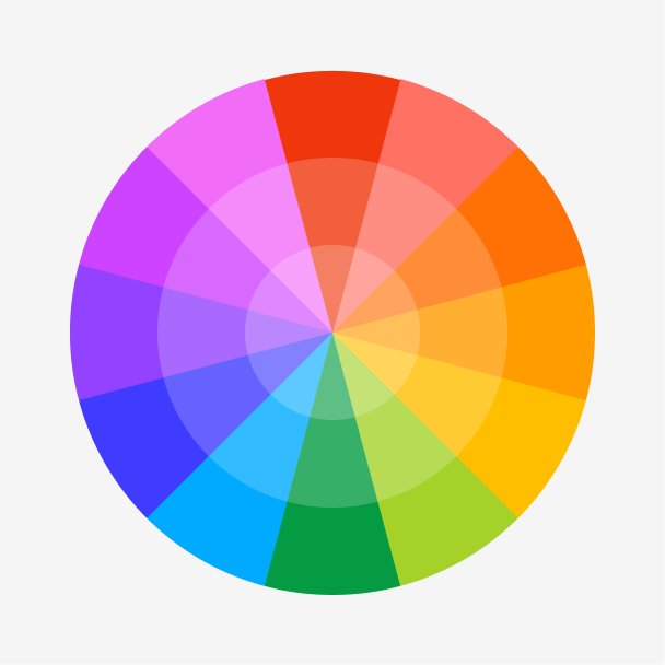
Color variations
Shades
Tints
Tones
Hues
Color Harmonies
Complementary
Split
Monochromatic
Analogous
Triadic
Square
Custom Palettes
Industrial
Silver Pine
Chalkboard
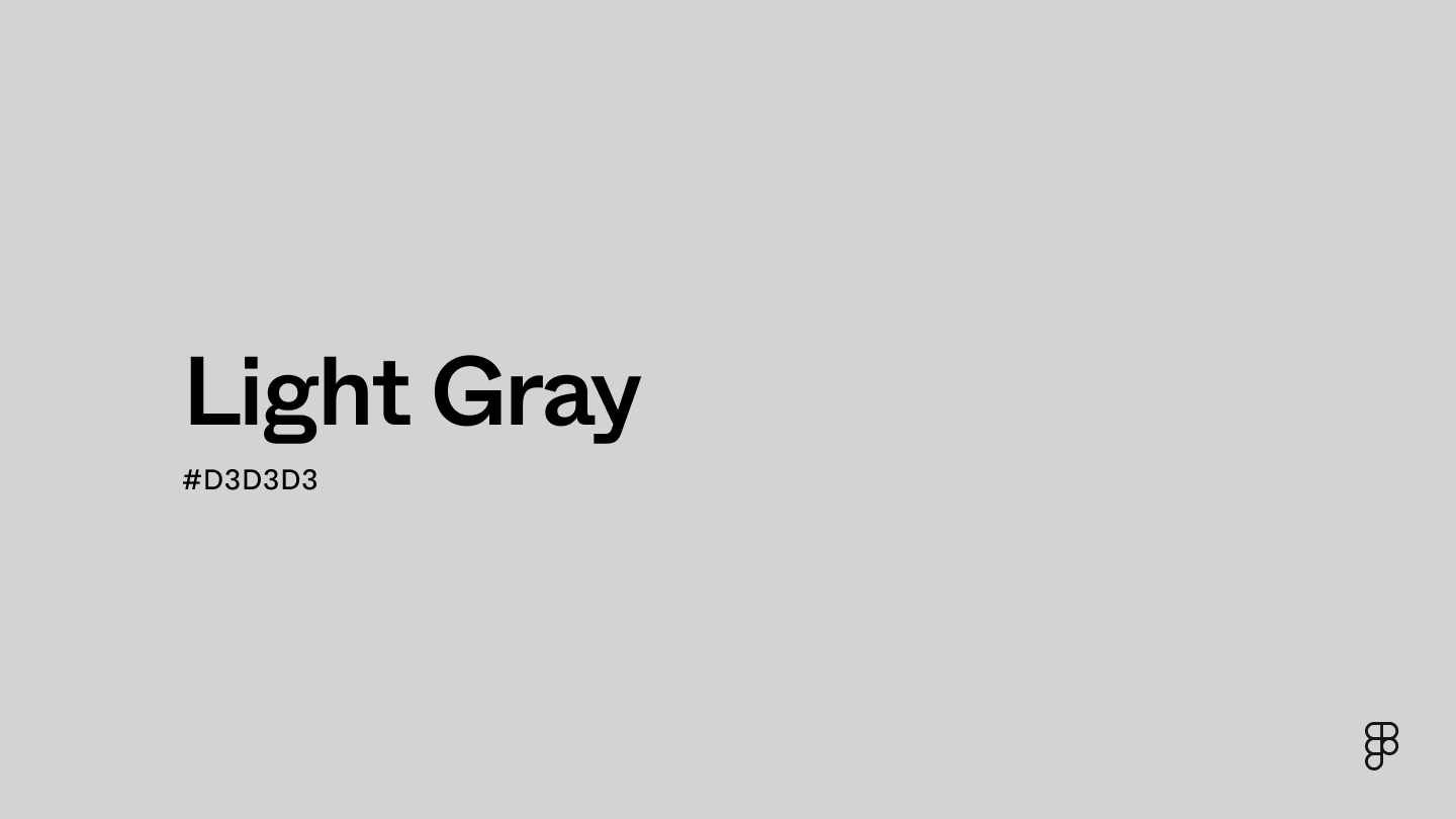
Light gray is defined by the following color codes and values to ensure consistency across various digital platforms and devices.
- HEX code: #D3D3D3
- RGB value: 82.7% red, 82.7% green, and 82.7% blue
Accessibility considerations play a crucial role in UX and UI design color choices. Figma offers plugins in the Community to make sure your designs meet Web Content Accessibility Guidelines.
Here are some ways to use light gray in your designs:
- Enhance readability. Light gray can provide an excellent contrast for dark-colored text and ensure optimal readability for users. This is crucial for accessibility best practices.
- Add interactive elements. Designers can use light gray to implement a subtle hover effect that changes the background of an element to a lighter or darker shade of light gray. This can create visual feedback to users about visual elements.
- Create a professional aesthetic. Light gray is a perfect background color for websites or apps in the financial or healthcare industry that need to convey stability and practicality.
Keep in mind that color and its meaning can change from culture to culture—and at any given time. If you are designing for a global audience, research color considerations for your specific regions.
For variations within the same minimalist spectrum as light gray, consider:
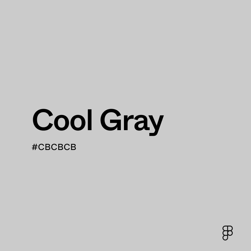
- Cool gray (#CBCBCB) is a darker shade that’s more akin to the color of concrete.
- Silver (#C4C4C4) is a metallic color that’s slightly darker than light gray.
- White (#FFFFFF) is similar to light gray in that both colors have little to no saturation.
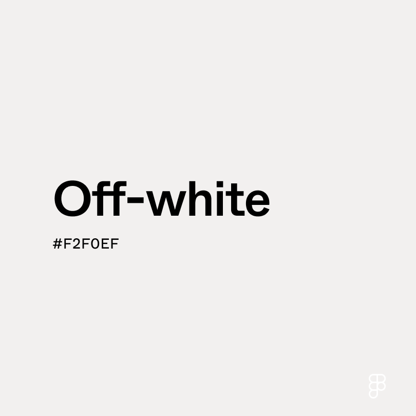
- Off-white (#F2F0EF) is another neutral color with a very small amount of warmth to it.
To complement light gray, consider pairing it with:
- Orange (#FFA500) creates a playful and creative color combination with light gray.
- Black (#000000) complements light gray by adding a touch of boldness and luxury.
- Light blue (#90D5FF) adds a soft contrast to light gray, creating a calm and inviting feel.
- Red (#FF2C2C) creates a striking contrast with light gray, grabbing attention and making a statement.
Other colors worth considering include ivory to create a more natural color scheme, celadon for a floral aesthetic, and brown for a grounded vibe.
While light gray is modest, it may clash with:
- Rose (#FF1D8D) is a bold, vibrant color that might drown out light gray.
- Aquamarine (#66F1C2) leans slightly cool and can create a cold, sterile palette when paired with light gray.
- Fuchsia (#FF00FF) is a highly saturated color that can overpower light gray.
- Yellow-green (#CCFF00) has a vibrance that can clash with light gray’s subtle qualities.
Light gray symbolizes intelligence, wisdom, and refinement. It can generate feelings of wistfulness for the past or hope for a clean slate and a yet-to-be-written future.
In color psychology, light gray’s calming neutral undertones evoke feelings of impartiality and emotional detachment. Offices and legislative buildings around the world incorporate this color to create a formal and unbiased atmosphere.
In UI design, light gray is ideal for avoiding inciting strong emotions among users. It’s an optimal color for traditional font styles like Arial or Times New Roman, which allows users to focus more on the information your text conveys rather than its appearance.
Light gray was extremely prominent in medieval communities since wool naturally resembled this color, and woolen clothes were accessible to the public. The sheer number of medieval castles and statues tinted light gray also speaks to this color’s importance.
Contemporary structures, such as the Flatiron Building in Manhattan, New York, prominently feature the color light gray in everything from brickwork to statues to decorative designs.
Contrast 1.5
- Large Text
#D3D3D3
- Normal Text
How you design, align, and build matters. Do it together with Figma.
| Category | ||
|---|---|---|
Fail | Fail | |
Fail | Fail | |
Fail | Fail |
Contrast 14.03
- Large Text
#D3D3D3
- Normal Text
How you design, align, and build matters. Do it together with Figma.
| Category | ||
|---|---|---|
Pass | Pass | |
Pass | Pass | |
Pass | Pass |
Color simulations
Protanopia
Deuteranopia
Tritanopia
Achromatopsia
The hexadecimal color #D3D3D3, known as light gray, has RGB values of R:211, G:211, B:211 and CMYK values of C:0, M:0, Y:0, K:0.17.
| VALUE | CSS | |
|---|---|---|
| HEX | D3D3D3 | #D3D3D3 |
| RGB DECIMAL | 211, 211, 211 | RGB(211,211,211) |
| RGB PERCENTAGE | 82.7, 82.7, 82.7 | RGB(82.7%,82.7%,82.7%) |
| CMYK | 0, 0, 0, 17 | |
| HSL | 0°, 0, 82.7 | HSL(0°,0%,82.7%) |
| HSV (OR HSB) | 0°, 0, 82.7 | |
| WEB SAFE | CCCCCC | #CCCCCC |
| CIE-LAB | 84.556, -0, -0.007 | |
| XYZ | 61.914, 65.141, 70.936 | |
| xyY | 0.313, 0.329, 65.141 | |
| CIE-LCH | 84.556, 0.007, 266.929 | |
| CIE-LUV | 84.556, -0.005, -0.011 | |
| HUNTER-LAB | 80.71, -4.311, 4.387 | |
| BINARY | 11010011, 11010011, 11010011 | |
| iOS - SwiftUI | Color(red: 0.8275, green: 0.8275, blue: 0.8275) | |
| iOS - UIKit | UIColor(red: 0.8275, green: 0.8275, blue: 0.8275, alpha: 1.0) | |
| Android - Compose | Color(0xFFD3D3D3) |