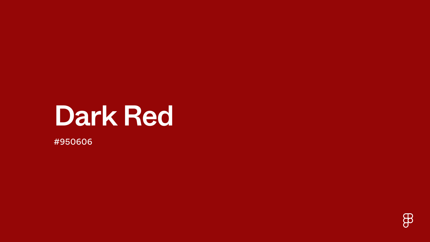
Dark red is a deep, rich shade that mixes red and black. Positioned on the warm spectrum of the color wheel, this shade embodies passion and sophistication while also suggesting a sense of mystery due to its depth.

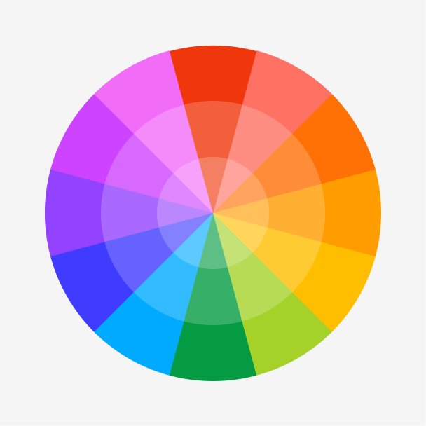
Color variations
Shades
Tints
Tones
Hues
Color Harmonies
Complementary
Split
Monochromatic
Analogous
Triadic
Square
Custom Palettes
Heartthrob
Scarlet Garden
Neo-Gothic
Dark red is defined by the following color codes and values to ensure consistency across various digital platforms and devices.
- HEX code: #950606
- RGB value: 58.4% red, 2.4% green, and 2.4% blue
Accessibility considerations play a crucial role in UX and UI design color choices. Figma offers plugins in the Community to make sure your designs meet Web Content Accessibility Guidelines.
Here are some ways to use dark red in your designs:
- Encourage user action. Dark red can attract attention without being visually overpowering, prompting users to click CTA buttons and other important elements.
- Convey urgency. Dark red is useful for error and warning messages or other alerts, communicating a sense of importance to users.
- Evoke sophistication. Whether used as a primary or accent color, dark red creates an elegant and luxurious atmosphere—a great choice for high-end products or exclusive experiences.
Keep in mind that color and its meaning can change from culture to culture—and at any given time. If you are designing for a global audience, research color considerations for your specific regions.
For variations within the same deep spectrum as dark red, consider:
- Maroon (#550000) takes a darker turn with a subtle hint of brown, giving it a hue similar to wine.
- Crimson red (#B22222) shares a similar richness but appears a bit more cool.
- Burgundy (#660033) has a purple hue but conveys the same sense of luxury and refinement.
- Chili red (#CD1C18) has a more vibrant appeal with a hint of orange, resembling the hue of a chili pepper.
To complement dark red, consider pairing it with:
- Ivory (#FFFFE3) brings a sense of balance and peace to tone down dark red’s intensity.
- Gold (#EFBF04) plays up dark red’s warmth for a rich, strong color scheme.
- Pink (#FF8DA1) adds a touch of playfulness for a romantic color combination.
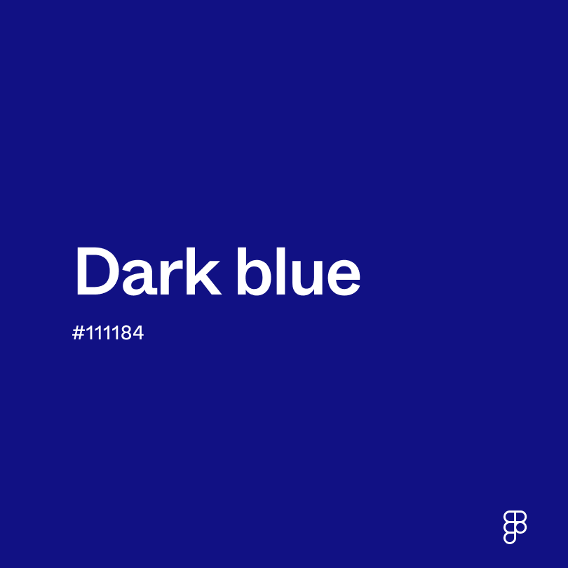
- Dark blue (#111184) creates a timeless pairing, exuding elegance and sophistication.
- Teal (#069494) complements dark red, offering a striking yet balanced contrast.
Other colors worth considering include beige for a warm and cozy atmosphere, orange to add a touch of energy, and silver for a cool, modern look.
While dark red is rich, it may clash with:
- Turquoise (#40E0D0) can clash with dark red’s warm undertones.
- Magenta (#00FFFF) is highly saturated, which can appear overwhelming next to dark red.
- Chartreuse (#CCFF00) can create a visually jarring effect next to dark red.
- Red-brown (#942222) shares a similar hue and doesn’t provide enough visual contrast.
- Royal purple (#6C3BAA) is a cool-toned shade that lacks harmony with dark red.
Dark red symbolizes passion and desire. Its deep hue also suggests mystery and suspense. Dark red carries connotations of luxury, wealth, and strength.
In color psychology, dark red can stir feelings of desire and intrigue. Its connection to mystery can also spark curiosity or caution. Due to its richness, dark red can make you feel grounded, strong, and in control.
In UI design, dark red brings a sense of sophistication and luxury to a user interface—ideal for high-end e-commerce sites, law firms, or educational institutions. It can be a great choice for CTA buttons or notifications, as it attracts attention and conveys urgency without overwhelming the user.
Red was one of the first colors used in cave paintings, dating back nearly 40,000 years. Over time, experimentation with black pigments led to the discovery of deeper hues, including dark red. Ancient artists used these deep red hues to depict powerful individuals and dramatic, passionate scenes in their paintings.
Today, dark red remains a popular choice in high-end fashion and contemporary art due to its bold and sophisticated look.
Contrast 9.1
- Large Text
#950606
- Normal Text
How you design, align, and build matters. Do it together with Figma.
| Category | ||
|---|---|---|
Pass | Pass | |
Pass | Pass | |
Pass | Pass |
Contrast 2.31
- Large Text
#950606
- Normal Text
How you design, align, and build matters. Do it together with Figma.
| Category | ||
|---|---|---|
Fail | Fail | |
Fail | Fail | |
Fail | Fail |
Color simulations
Protanopia
Deuteranopia
Tritanopia
Achromatopsia
The hexadecimal color #950606, known as dark red, has RGB values of R:149 G:6, B:6 and CMYK values of C:0, M:0.96, Y:0.96, K:0.42.
| VALUE | CSS | |
|---|---|---|
| HEX | 950606 | #950606 |
| RGB DECIMAL | 149, 6, 6 | RGB(149,6,6) |
| RGB PERCENTAGE | 58.4, 2.4, 2.4 | RGB(58.4%,2.4%,2.4%) |
| CMYK | 0, 96, 96, 42 | |
| HSL | 0°, 92.3, 30.4 | HSL(0°,92.3%,30.4%) |
| HSV (OR HSB) | 0°, 96, 58.4 | |
| WEB SAFE | 990000 | #990000 |
| CIE-LAB | 30.723, 52.83, 41.874 | |
| XYZ | 12.493, 6.535, 0.776 | |
| xyY | 0.631, 0.33, 6.535 | |
| CIE-LCH | 30.723, 67.412, 38.401 | |
| CIE-LUV | 30.723, 97.862, 21.112 | |
| HUNTER-LAB | 25.563, 42.502, 16.095 | |
| BINARY | 10010101, 00000110, 00000110 | |
| iOS - SwiftUI | Color(red: 0.584, green: 0.024, blue: 0.024) | |
| iOS - UIKit | UIColor(red: 0.584, green: 0.024, blue: 0.024, alpha: 1) | |
| Android - Compose | Color(0xFF950606) |