Soft pink is a cool-toned shade located in the red-violet section of the color wheel. Like other pink shades, it has calming, romantic, and whimsical qualities, while the subtle hint of red adds a touch of sophistication.


Color variations
Shades
Tints
Tones
Hues
Color Harmonies
Complementary
Split
Monochromatic
Analogous
Triadic
Square
Custom Palettes
Ballerina
Garden Gala
Spring Fling
Soft pink is defined by the following color codes and values to ensure consistency across various digital platforms and devices.
- HEX code: #E89EB8
- RGB value: 91% red, 62% green, and 72.2% blue
Accessibility considerations play a crucial role in UX and UI design color choices. Figma offers plugins in the Community to make sure your designs meet Web Content Accessibility Guidelines.
Here are some ways to use soft pink in your designs:
- Balance bolder colors. Use soft pink to offset vibrant or contrasting colors. It helps create visual harmony and prevents the overall design from feeling overwhelming.
- Soften the user experience. Soft pink’s gentle nature can help create a calming user experience. Use it as a background color or accent to reduce visual fatigue and promote a sense of tranquility.
- Create a feminine and calming atmosphere. Soft pink is often associated with care and comfort, making it ideal for wellness, beauty, and maternal care interfaces.
Keep in mind that color and its meaning can change from culture to culture—and at any given time. If you are designing for a global audience, research color considerations for your specific regions.
For variations within the same feminine spectrum as soft pink, consider:
- Light pink (#FFB5C0) offers a softer, more muted version of soft pink, evoking a sense of innocence.
- Pink (#FF8DA1) is slightly brighter and more vibrant than soft pink, creating a playful and energetic feel.
- Puce (#E491A6) leans more brown, creating a mature and vintage look.
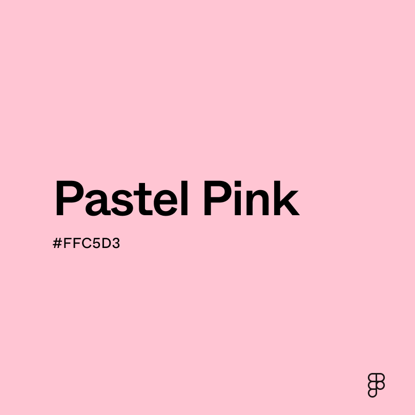
- Pastel pink (#FFC5D3) shares the softness of soft pink but with a slightly muted hue.
To complement soft pink, consider pairing it with:
- Beige (#EDE8D0) creates a soft, understated look when paired with soft pink.
- Light blue (#90D5FF) is a refreshing contrast that creates a calming and airy atmosphere.
- Nude (#F7D9BC) creates a monochromatic look with subtle variations.
- Celadon (#A8DCAB) is a gentle green that complements the softness of pink, creating a harmonious and natural feel.
Other colors worth considering include gray, silver, and gold for a modern and sophisticated look, and darker shades of pink for a monochromatic approach.
While soft pink is gentle, it may clash with:
- Neon orange (#FF5C00) has a high intensity that can overwhelm the delicacy of pink.
- Chartreuse (#CCFF00) is a highly saturated color that can clash with the muted tones of soft pink.
- Red (#FF2C2C) is a bright color that can create visual tension when paired with soft pink.
- Salmon (#FF7E70) has orange undertones that can create a flat appearance when combined with soft pink.
Soft pink symbolizes femininity, tenderness, and sweetness. It evokes feelings of love, compassion, and care. Often associated with romance, childhood, and innocence, soft pink carries a sense of purity and optimism.
In color psychology, soft pink is linked to nurturing, empathy, and emotional support. It is believed to have a calming effect, reducing stress and anxiety. This color can also evoke feelings of unconditional love and a sense of belonging.
In UI design, soft pink can create a welcoming and approachable atmosphere. It’s often used in designs targeting a female audience or products related to beauty, fashion, and childcare.
Like many pastel hues, soft pink gained prominence during the Victorian era. This period, known for its emphasis on femininity and delicacy, saw a rise in the use of soft pink in fashion, decor, and art. The color became associated with the ideal Victorian woman.
Today, soft pink is a versatile and popular color in modern design. It appears in brands that appeal to all genders. Its association with gentleness remains, but now it also carries broader meanings.
Contrast 2.1
- Large Text
#E89EB8
- Normal Text
How you design, align, and build matters. Do it together with Figma.
| Category | ||
|---|---|---|
Fail | Fail | |
Fail | Fail | |
Fail | Fail |
Contrast 10.01
- Large Text
#E89EB8
- Normal Text
How you design, align, and build matters. Do it together with Figma.
| Category | ||
|---|---|---|
Pass | Pass | |
Pass | Pass | |
Pass | Pass |
Color simulations
Protanopia
Deuteranopia
Tritanopia
Achromatopsia
The hexadecimal color #E89EB8, known as soft pink, has RGB values of R:232, G:158, B:184 and CMYK values of C:0, M:0.32, Y:0.21, K:0.09.
| VALUE | CSS | |
|---|---|---|
| HEX | E89EB8 | #E89EB8 |
| RGB DECIMAL | 232, 158, 184 | RGB(232,158,184) |
| RGB PERCENTAGE | 91, 62, 72.2 | RGB(91%,62%,72.2%) |
| CMYK | 0, 32, 21, 9 | |
| HSL | 338.9°, 61.7, 76.5 | HSL(338.9°,61.7%,76.5%) |
| HSV (OR HSB) | 338.9°, 31.9, 91 | |
| WEB SAFE | FF99CC | #FF99CC |
| CIE-LAB | 72.94, 31.156, -2.173 | |
| XYZ | 54.157, 45.073, 51.192 | |
| xyY | 0.36, 0.3, 45.073 | |
| CIE-LCH | 72.94, 31.231, 356.011 | |
| CIE-LUV | 72.94, 44.815, -8.875 | |
| HUNTER-LAB | 67.136, 26.503, 1.786 | |
| BINARY | 11101000, 10011110, 10111000 | |
| iOS - SwiftUI | Color(red: 0.91, green: 0.62, blue: 0.722) | |
| iOS - UIKit | UIColor(red: 0.91, green: 0.62, blue: 0.722, alpha: 1) | |
| Android - Compose | Color(0xFFE89EB8) |