In good company: How agencies are transforming client collaboration


To take creativity to new heights, agencies and freelancers are breaking down traditional boundaries and using tools like Figma to partner with their clients every step of the way.
Share In good company: How agencies are transforming client collaboration
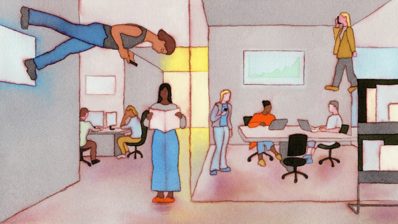
Hero illustration by André Derainne
The landscape of design agencies and freelance work has seen dramatic shifts in the past two decades. Not only has remote work created more dispersed teams, but boutique agencies have risen to challenge the behemoths that once dominated the space. Gone is the attitude that design is an opaque process; instead, agencies and clients stay in close collaboration, co-creating a bespoke workflow for each project. Within agencies, roles are blurring as well. “Now, more than ever, you need to be well-versed in everything,” says Judson Collier, Co-founder of Design Business Company. “Generalism is back.”
Navigating the creative process across time zones and teams means keeping open communication, making space for diverse viewpoints, and leveraging tools that speed up the work. We spoke with a range of agencies and freelancers to learn how they spark, synthesize, and ship ideas with Figma—and how they work effectively with clients every step of the way.
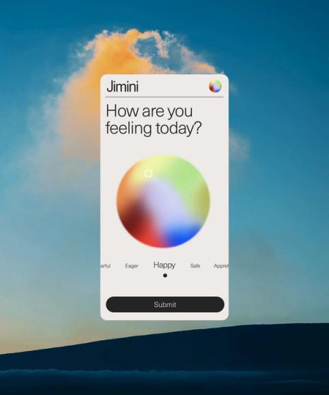
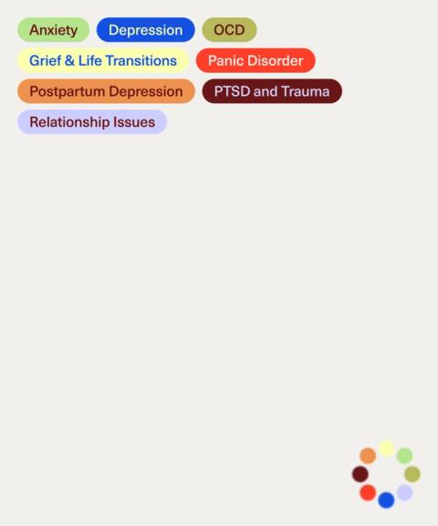
How Human and Jimini Health aligned on a bold brand direction
When Rachael Yaeger and Michael Ray founded the digital studio Human in 2013, it was an industry outlier for a team to grow or shrink depending on client needs; now, it’s becoming the norm. Human, which fluctuates between 6 and 10 employees, prefers this structure because it allows the team to work intimately with clients, emphasizes the craft of both designers and developers, and reduces the friction that can come when in-house and agency teams are balkanized. “We sit in this beautiful sweet spot with the agility and expertise of a freelancer, but the cohesion, experience, and security of a large agency,” Rachael says.


Clients want to work more intimately with the agencies they hire, too. “Traditional management layers are becoming less and less frequent,” says Rachael, who notes that clients are more comfortable embedding outside partners within their teams. Compared to a decade ago, clients also have a higher design aptitude and fluency in design tools. “Figma speaks to the fluidity of the industry right now,” she says. “We’re not suits in a boardroom with printed PDFs anymore.” Plus, the shift to remote work has led to less formal, more frequent interactions. “We send a client a Figma link, and they drop some comments at the end of day, and we keep riffing,” Rachael says. “The dynamic is friendlier now. It’s less ‘agency is God and knows everything.’”
We send a client a Figma link, and they drop some comments at the end of the day, and we keep riffing. The dynamic is friendlier now.
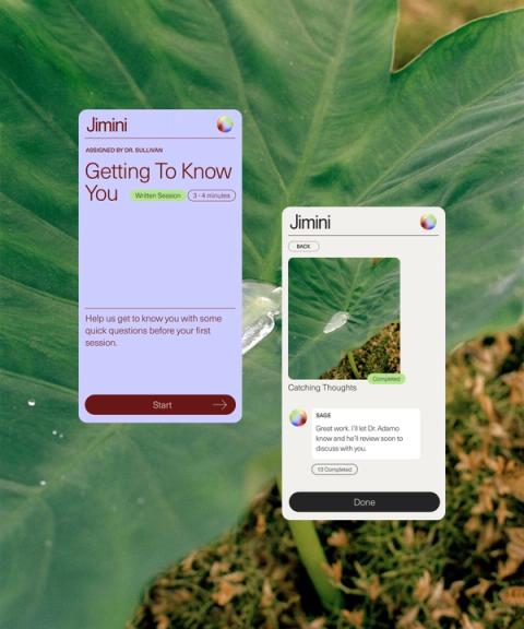
This fluid way of working was critical when Human created a new visual identity and website for Jimini Health, an AI company for mental health. While in sprint mode, both teams had foundational conversations about what the brand should embody. Human used Figma Slides Today, we’re announcing new features in Figma Slides that unlock high-fidelity design and cross-functional collaboration.
How teams tap into the power of design with Figma Slides
Figma also helps Human smoothly transfer ownership of a project. As Jimini began to apply the brand book to its app, for example, the team could quickly get feedback on whether UI elements followed brand guidelines through comments. “Figma gives everyone access to each other in a really easy way,” Rachael says.
How PORTO ROCHA created a scalable identity for VEEPS
Felipe Rocha, Founder and Creative Director of PORTO ROCHA, took the stage at Config 2025 with Carlo Michelangeo, Head of Creative at Robinhood, to talk about their creative partnership on Robinhood’s recent rebrand.
For PORTO ROCHA, a 32-person agency whose strategy, design, motion, and interactive teams span the globe, being adaptable is key to standing out in a design-focused market. Their clients in tech, fashion, finance, and culture range from art galleries like Kunsthalle Basel to household names like Google. Working across a breadth of sectors, scales, and mediums fuels the agency creatively. “It allows us to remain curious, shift our approach across these industries, and make decisions rooted in context,” says Gabriela Carnabuci, Associate Design Director at PORTO ROCHA.
Over the past five years, PORTO ROCHA has incorporated Figma into every step of its workflow, from ideating and initial concepting, to design, to final handoff. “It’s a tool that feels alive,” Gabriela says, and has become essential for virtually every team, not just design. The strategy team, for example, uses FigJam to host remote client workshops and corral research and data into one place, which helps clarify the narrative. Internal files allow PORTO ROCHA to riff freely, and external files keep the agency in conversation with the client while containing some of the inherent messiness of the design process.
Close-knit collaboration sets clients up for success even after the project is complete. This was the case when PORTO ROCHA redesigned the brand and product for VEEPS. As the official livestreaming platform for Live Nation and Ticketmaster events, VEEPS has reached millions of viewers with shows from some of the biggest names in music. The challenge lay in creating a strong visual identity for the platform while allowing moments for artists to shine.
“Striking this balance meant building a cohesive, yet flexible, experience across desktop, mobile, TV, and social media,” says Marcos Rodrigues, Interactive Design Director at PORTO ROCHA. “It was about stress testing every possibility and format.” Working with Figma played a significant role in making sure designs translated across each surface—especially when it came to incorporating video, motion graphics, and live content. To help the VEEPS team adapt the identity post handoff, the designers built an extensive component library and used plugins like Stark to make sure all designs were respecting accessibility parameters.
“Our process explored creating an iconic, yet utilitarian system that balanced brand personality and functional needs,” says Gabriela. “Because the client needed a flexible system, our approach was to imbue each brand element—from the logo to the typography and color—with personality, allowing artists and their own brand expressions to take center stage.” Since the rollout of the new identity, engagement with VEEPS has more than tripled, and their social following has grown by 50%, contributing to VEEPS’ place as an industry leader.
Our process explored creating an iconic, yet utilitarian system that balanced brand personality and functional needs.
How Design Business Company plugged into GitHub’s Shop
Stewart Scott-Curran, Judson Collier, and Jordan Egstad founded Design Business Company (DBCo) with the intention of leaving behind the one-size-fits-all approach of bygone agency work. Stewart, who once worked in-house at Nike, Coca-Cola, and CNN, remembers that he “always yearned for a relationship that felt like the agency understood us more, or had more curiosity about who we were.”
DBCo understands that the more invested and hands-on clients are, the stronger and more exciting the outcome. Instead of onboarding a client, then returning months later with a big reveal, DBCo keeps work transparent and collaborative. “We try to avoid the ‘magician pulling the rabbit out the hat’ effect,” Stewart says. From day one, DBCo shares its Figma files with clients and encourages them to leave comments or drop sticky notes, which helps the team course correct earlier and cuts down on the need for formal presentations. “We can share ideas more quickly and collaborate more freely, which in turn makes the whole creative process feel less precious,” Jordan says.
We try to avoid the ‘magician pulling the rabbit out of the hat’ effect.
This is a big attitude shift from a few years ago. “I remember peers saying, ‘I never want somebody looking over my shoulder while I’m designing. That freaks me out,’” Judson says. “Now, we’re on the other side of that.”
The Konami Code (↑↑↓↓←→←→BA) is a cheat code that’s appeared in many video games. It’s also known as the Contra Code, since it gave players 30 extra lives in the NES version of the game “Contra” by Konami.
Having GitHub inside the file, for example, pushed DBCo. to go big when reimagining the developer platform’s online shop, which involved a new website, merchandise and packaging, and product photography—all designed in Figma. “What’s really nice about the tool is you can see in one location how the brand can stretch and apply to all these different surfaces at the same time,” Jordan says. To win over developers’ hearts, DBCo. designed creative site interactions like text animations that mimic lines of code, and promotional codes that seem to unscramble themselves. Prototyping in Figma helped to realistically depict these elements—and bring to life other experiments that would usually require significant developer resources, such as an Easter egg that uses the Konami code to transform photographs into ASCII images.
While the workflow varies by client and project, there is one constant to all of DBCo’s projects: The team begins with Construct, an internal design system created using Figma variables. The foundational system has four different collections that can auto-populate files with the right values, which trims a day-and-a-half’s worth of work to just 30 minutes. “We can expedite all of the grunt work,” Jordan says. “It has taken time to find the sweet spot between having enough system in place to be helpful and having too many constraints, but we’ve found a good balance.”
How ChaChaanTeng! built flexible modules for Eastern Margins
As with other agencies, the London-based studio ChaChaanTeng! has seen many changes since its start four years ago. Not only has moving to Figma allowed the team to guide clients through designs in the file instead of through formal presentations, but it’s also helped “gamify the working process,” says Founder Wei Prior, through actual games, fun backdrops on the canvas, and drawings. Since every member of the small studio can see what others are working on, they can generate narratives for projects more quickly. “We work so collaboratively,” Wei says. “As a platform, Figma enables us to work across a large cohort of projects with ease and is foundational to our growth.”
Figma enables us to work across a large cohort of projects with ease and is foundational to our growth.
The platform has helped ChaChaanTeng! take on more clients—including international ones like Eastern Margins, a UK record label promoting alternative artists in Asia. They began collaborating two years ago on a new brand identity: a riotous mix of neon colors, symbols, illustrations, and video that total over 100 layers in all. Wei calls the work “a modular approach to madness,” which references and dials up the density and cacophony found in megacities like Hong Kong, Tokyo, and Manila, where Eastern Margins artists are based.


When Wei presented these concepts to Eastern Margins Founder David Zhou, he demonstrated how he built the visuals one layer at a time. David enjoyed seeing this so much that the teams decided to integrate motion into the identity to play up the system’s dynamic nature. “We like things that are unexpected, when things get distorted, and when we produce mutations,” David says. “Because we work in Figma, those happy accidents or unexpected things pop up much more naturally.”
Because of the nature of the music industry, ChaChaanTeng! often delivers files that are 95% done, allowing designers at Eastern Margins to, say, fine-tune the order and size of artist names on a poster. “That’s the kind of thing that managers and agents will get fired for if they get wrong,” David says. These variables can change just hours before an event is scheduled, so Eastern Margins needs to be able to adjust designs at the last minute without relying on an agency in a different time zone. “Figma makes it easy for someone who’s not a graphic designer, but has a rudimentary understanding of design, to change the font size or order, and that’s saved us significant headaches,” David says.
How designer Kevin Twohy iterated on Good Inside’s parenting app
Kevin Twohy gave a talk on the magic of small group creativity at Config 2025.
Kevin Twohy, Founder and Principal at Twohy Design Works, structures his work so he can stay as nimble as possible. Depending on the client and project, he’ll sometimes embed within a team, operating more like an employee, or function like a small studio, hiring specialists as needed. “We’re in this era of the super individual,” Kevin says. “With new technology, there’s an ability for one person to creative direct a larger scope of work.” It also suits how Kevin likes to work—that is, build one-on-one relationships with his clients, stay close to the work itself, and follow what’s creatively interesting.
We’re in this era of the super individual.
For the past two years, Kevin has been collaborating with Good Inside, an online parenting resource founded by the clinical psychologist Dr. Becky Kennedy. From early discussions and research, it was clear that parents needed immediate assistance during stressful moments, which led Kevin and the team to focus on a personalized coaching app to help parents guide their kids through tantrums, bedtime resistance, and more.

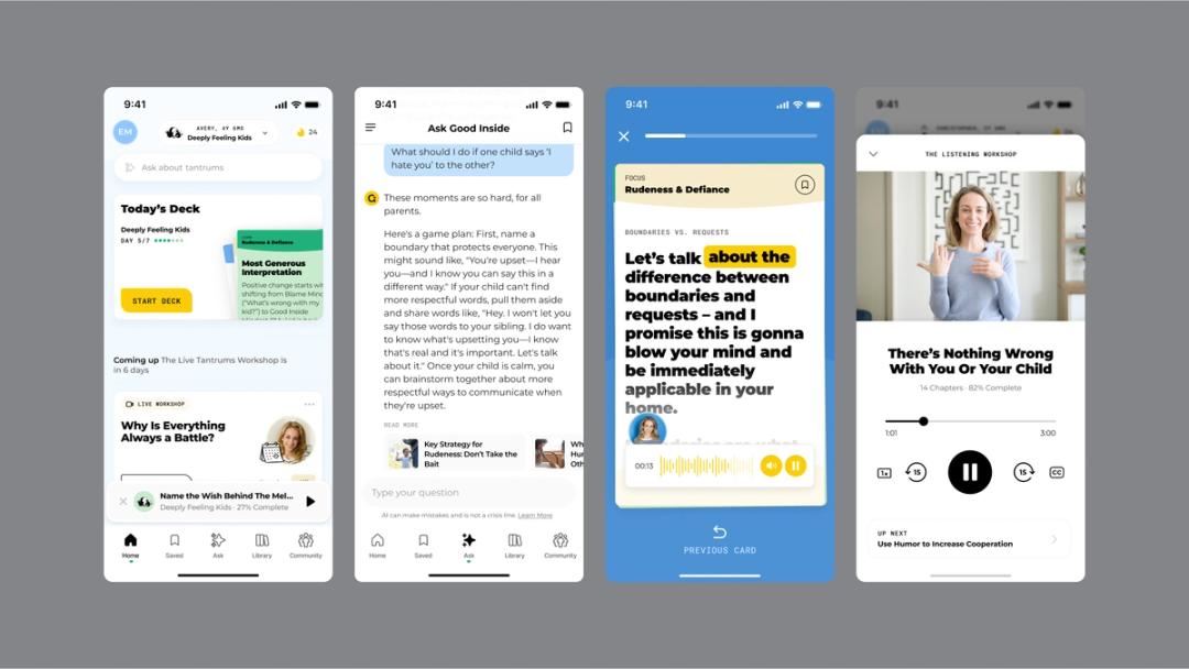
The design challenge was “not just designing the interface or content,” Kevin explains, “but the map that shows the arc of what a parent goes through, and the content plans associated with it.” Finding the right sequence and density for scripts and parent instructions—which involve text, audio, video, and images—was crucial. Kevin and the Good Inside team used FigJam to hash out what a parent would need to know, and Figma to organize that content into low-fidelity wireframes, and later to create high-fidelity prototypes for user testing. This created tight iteration cycles that allowed them to swiftly refine the content, containers, and interface.
Perfecting the information architecture was essential for Good Inside to build a long-term relationship with its app subscribers. “You can’t just make something that works for a week or 30 days in a user test,” Kevin says. “It’s not enough to hear a user say, ‘Oh, it’s great. It makes me feel X.’ You have to test it for real.” Beta testing lasted a month or longer, informing multiple iterations based on what the team learned—for instance, the app has a light onboarding experience to avoid burdening parents with irrelevant information in a heated moment. This helped Good Inside’s app earn a 4.9–star rating.
“The parents—the customers—they’re real people in the real world, and they need help with an issue,” Kevin says. “They didn’t wake up saying, ‘I want an app.’ It’s about having the right things there that truly help, and delivering them in the right way.”
Agencies and freelancers require agile tools that bring the right players onto a project—sometimes at a moment’s notice—and work more intimately with clients. Smaller agencies are taking bigger swings, designing across multiple surfaces—from websites to apps, to printed materials and physical products—all within the scope of a single project. Within this landscape, Figma helps teams build trust, hone ideas, and communicate closely, which ultimately leads to exceptional outcomes. Learn more about how teams are using Figma, and get in touch for a demo.