How we shaped the visual identity for Config 2025


From giant inflatable glyphs to welcoming soundscapes, Figma’s Brand Studio designed an immersive conference that celebrated the spirit of makership at every turn.
Share How we shaped the visual identity for Config 2025
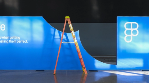
Photography by Desmond Studio, VTProDesign, STMNT Studios, and Maria Chimishkyan
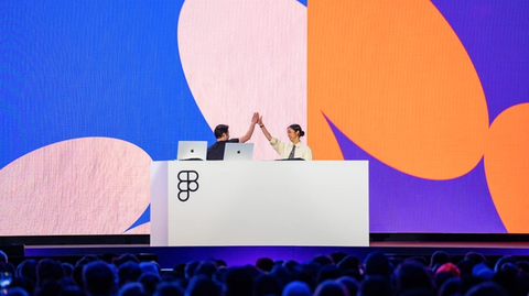
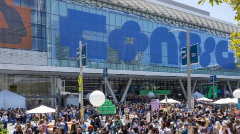
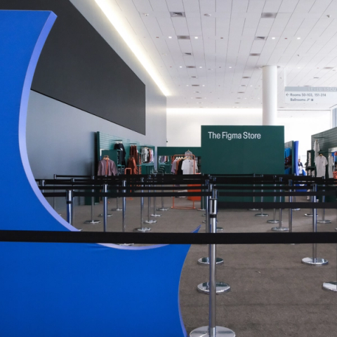
For our Brand Studio team, Config is a year-round affair. In fact, 10 months before our 2025 user conference was due to land in San Francisco and London, the team kicked off a sprint to start crafting its visual identity. Each year, it’s an epic undertaking that encompasses everything from main-stage screens and spatial experiences, to attendee badges and sought-after swag. With over 10,000 designers, developers, and product builders in attendance in San Francisco and London—and tens of thousands more tuning in virtually—Config is a high-stakes event that requires creativity, collaboration, and no small amount of stamina to pull off. Here, we speak to the people who made the branding and experience of Config 2025 feel expressive, tactile, and distinctly Figma.
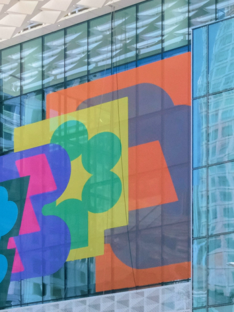
Finding a visual concept with stretch and wiggle
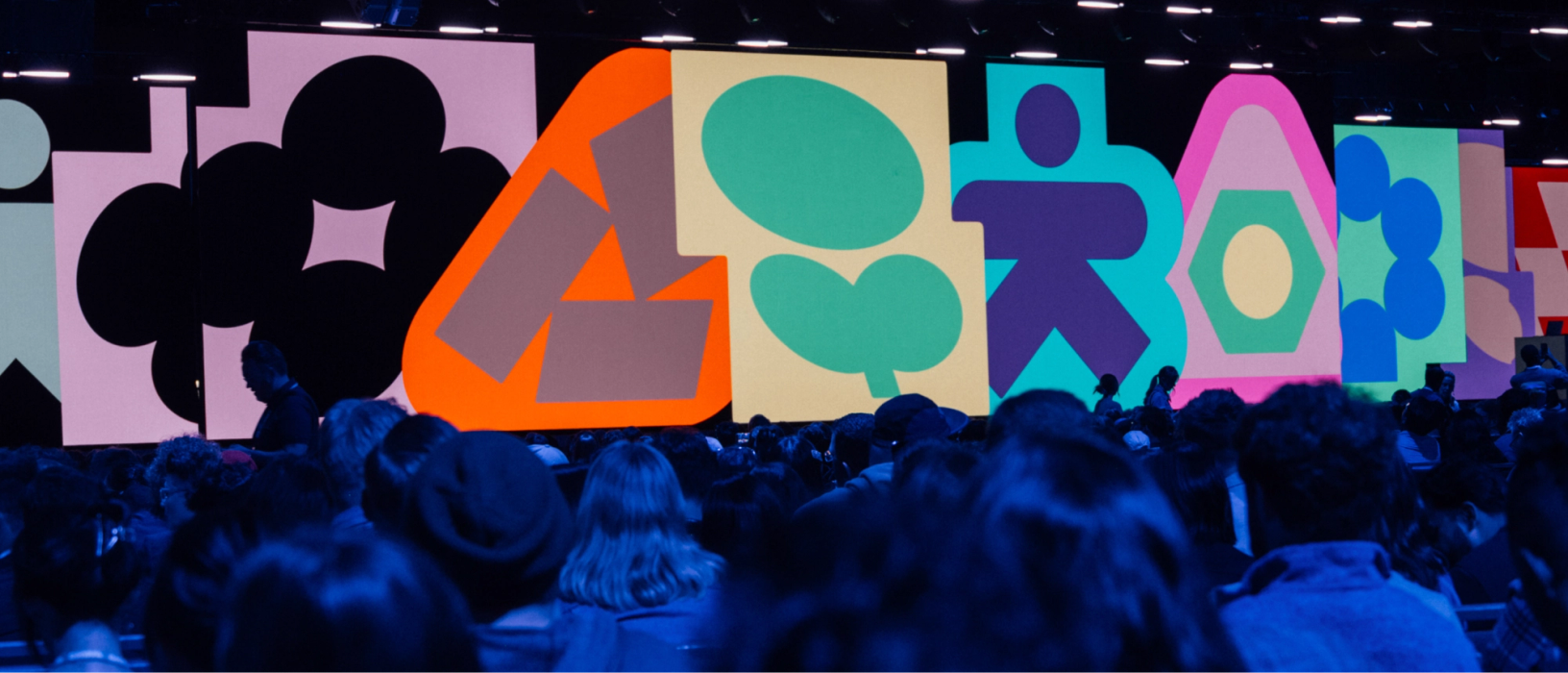
Developing the Config visual identity starts with an open exploration phase. “The brief remains both consistent and a little intentionally fuzzy year over year,” says Damien Correll, Figma’s Creative Director. The team knew that the identity would revolve around a series of expressive animated glyphs built out of basic shapes, or primitives. “Form—shapes, glyphs, and primitives—sits at the core of the Figma brand, and Config, as an extension, pushes the edges of that form-making,” says Leandro Castelao, a Design Manager on the Brand Studio team and the creative lead on Config 2025. He and the team started from concepts rather than moodboards. If you focus too narrowly on style or visual execution at the start, you end up with a brand that feels obvious and flat, explains Damien: “Constraining the concept, but not constraining the execution, is a really important part of creating a system that is adaptable and flexible.”
In terms of application, the concept needed to stretch across everything from social media posts, to huge digital screens, to physical activations. It also needed to accommodate changes and constraints that would inevitably emerge during the event planning process. “We needed to create something with possibilities,” says Leandro. “The event unfolds and evolves, so we needed to ensure the identity had some wiggle room.”
Product launches for Config Dylan Field runs down everything we launched at Config 2025 and explains why pushing design further matters more now than ever. Figma Draw pairs faster, simpler vector editing with powerful tools for visual expression—so designers of all stripes can bring their vision to life without breaking focus. Today, we’re launching Figma Sites, an all-in-one tool for you to design and build custom, responsive websites. Here, we share how you can go from design to production in the most efficient—and expressive—ways.Config 2025: Pushing design further

Express yourself with Figma Draw

Publish your designs on the web with Figma Sites
The glyphs he and the team designed in Figma followed this ethos. Each glyph, for instance, includes both an inner and an outer element, and they respond to one another. “The glyphs and compositions represent dynamism, change, and adaptability,” says Leandro, and this variation reflects the ever-surprising path of the making process. This is especially apparent when the glyphs jump into motion. “A single glyph can shift and trigger a ripple that transforms an entire composition,” he says. A glyph library, built in Figma, provided partners and vendors with a flexible toolkit. “Because the glyphs were built as components, it was easy to swap and customize them across different surfaces,” says Leandro.
Fortuitously, the team had recently launched a brand refresh Figma’s visual identity has gotten a bold refresh. From playful primitives to a vibrant new palette, we’re unveiling our latest brand evolution—one that speaks to all product builders. As Figma expands to include tools for all product builders, our community has evolved—and so has our brand. We’ve overhauled our entire visual identity from color palette to illustration style, and even commissioned a new typeface.Figma on Figma: Evolving our visual language
Just our type: The story of creating Figma Sans


Translating the identity for the web
As a landing page for products launched at Config 2025, the Brand Studio team also designed and built Config.new in Figma Sites, taking advantage of built-in interactive features.
In creating the Config web experience, Brand Designers Catherine Bui and Andy Luce forged a strong connection to the visual identity while reducing complexity and serving functionality. The site needed to support both the San Francisco and London events, so they built light and dark themes, respectively, that dictated background colors, text colors, and UI elements for each page. They also created color palettes for different talk themes on the agenda—like Keynote, Design Craft, Product Management, and Dev & Code—all set up as variables in Figma with matching speaker photo backgrounds. “We designed the theme colors to be consistent across the two events for wayfinding, while still showcasing a diverse set of colors for each event, given that San Francisco and London had different programming,” says Catherine.
Balancing visual interest with utility was also crucial in determining the type hierarchy, which made use of condensed and regular Figma Sans. “The web surface is dense and text-heavy, so we needed to make sure the information was digestible,” says Catherine. “The condensed version could really sing as display and header type.” Similarly, they were sparing with the use of glyphs to avoid clashing with background colors or dense copy, using them instead as moments to celebrate keynote speakers or to bookend a successful registration flow. “Without intention, the glyphs can start to feel decorative and lose their purpose,” she says. They pulled details from the glyphs—their alternating round and sharp corners—and applied the motif to elements like speaker photos, carousel items, and navigation buttons.
Putting ideas into motion
At other companies, motion and sound typically join the branding workflow only after the logo and other static elements are locked. Not so at Figma, says Motion Design Manager Chad Colby: “Here it’s in the front, with everybody on the same level.” This is partly down to short timelines and the need to run workstreams in parallel, but it also goes deeper. “At Figma, the animation is so linked with everything that we like to develop it at the same time,” says Brand Motion Designer Ben Hill. This can pose its own challenges (“The designers will be on iteration 50, and we’re just setting up the animation file,” laughs Chad), but also opportunities. For Brand Motion Designer Gilles Desmadrille, it was exciting to “steer the direction as it was being developed.”
Working in Figma allowed Gilles, Ben, and Chad to stay in lockstep with the rest of the team. “It helped us gather designs, prep assets for animation, lay out motion ideas, and figure out the flow and storyboards for the conference’s opening film,” says Gilles. They developed a motion language to guide the way glyphs, typography, photography, and other elements would come alive.
These guidelines became part of a motion library and toolkit in Figma that functioned less like rules, and more like examples to show external vendors and partners how each element should be treated. “We wanted to leave room for it to grow,” says Gilles. For example, the team demonstrated how Primary type (used for talk titles and speaker names) could get either expressive or functional motion treatments. “The expressive type takes a bit more time to animate on and has more personality, while the functional type is quicker and more straightforward,” says Gilles.
One of the team’s trusted partners was the Copenhagen-based design and animation practice, Relay, who helped create the animated film that played before Figma CEO and Co-founder Dylan Field’s opening keynote. The film had the dual purpose of building excitement for the talks to follow and teasing some of the launches to be announced. To that end, flashes of grids, gradients, textures, and code hint at the new products being added to the Figma platform. “Taking that visual identity and using it to tell a dynamic story was both a design and a motion challenge, but it ensured the film was grounded in substance, and not just eye candy,” says Chad.
The team reduced the frame rate from 60 to 15 frames per second to make the opening film feel “a little more tactile and handmade, and not so smooth and slick,” Chad explains. This motion principle of highlighting handicraft—also established as part of the brand refresh—was reflected in everything from promotional assets to displays in the lobby of San Francisco’s Moscone Center. It perplexed the external A/V vendors (who, understandably, expected “slick and smooth” to be the goal), but it made sense for Figma. “We create software for creatives, and the creative process is messy,” says Ben. “We try to think about motion and design in a way that supports that concept of the maker process.”
Turning up the volume
To put the “A” in “A/V,” the team worked with London-based sound design studio, Sounds Like These, who created a series of sonic palettes for everything from walk-on music for Config speakers, to scores for each product launch video. “Because sound design is such an important part of the day-of experience, it was important not just to think about the opening film,” says Damien. “We started by thinking about these sonic motifs that you hear throughout the course of the day, and then asked how we could incorporate those into the videos, so it all feels connected.”
It wasn’t as simple as asking for a “poppy EDM track,” says Damien. “Figma is a digital design tool, but there are humans behind it, crafting with it. So, how do we represent that in an audio format?” To strike a balance, the instrumentation of the sonic palettes skew digital, while still staying warm and organic.
Surprisingly, it was a quieter moment that best demonstrated the impact of this thoughtful sound design. Before the opening film began, there was a minute-long, ambient animation that told the audience to grab a seat and get ready. Sounds Like These worked on a way to signal this through audio. “We started kicking around the idea of an orchestra warming up,” says Damien. “Maybe you hear some of the motifs of the actual score, but you’re hearing someone find the groove.” Having this track meant that there didn’t need to be an announcement on the PA system, interrupting the vibe. “The music was a nice, subtle cue to everyone that Config was about to start,” says Damien.
Opening up new dimensions
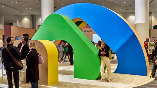
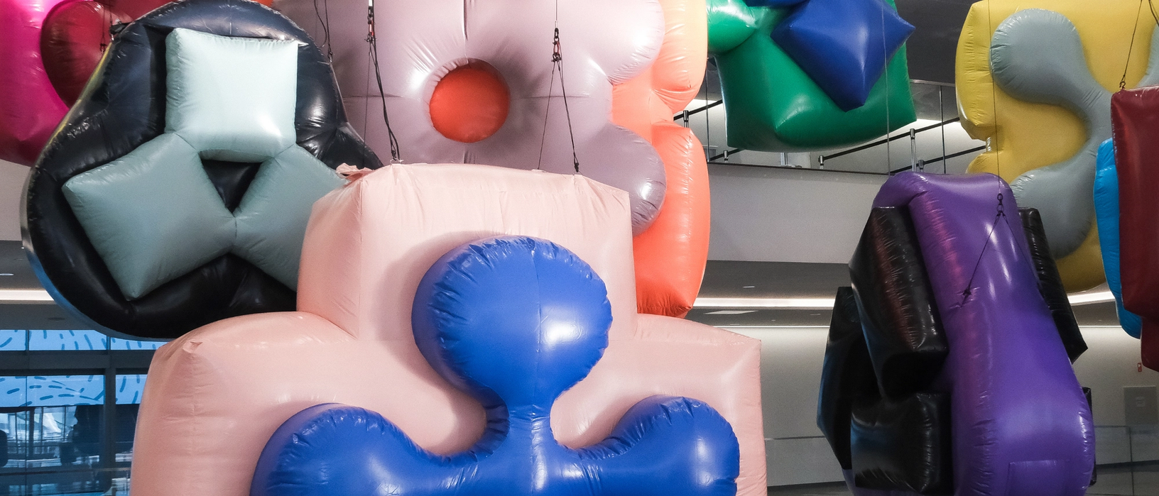
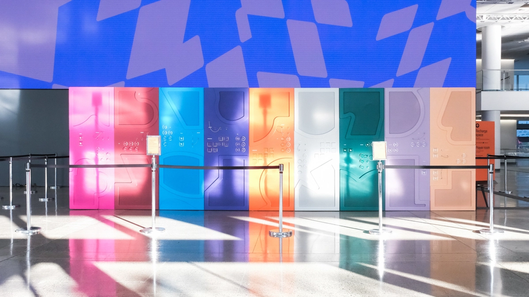
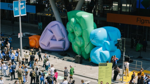
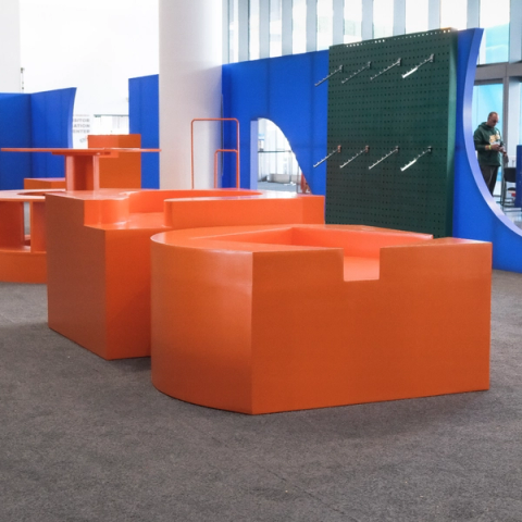
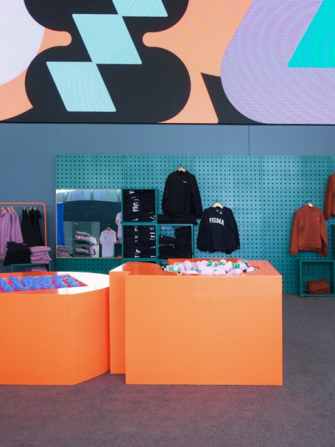
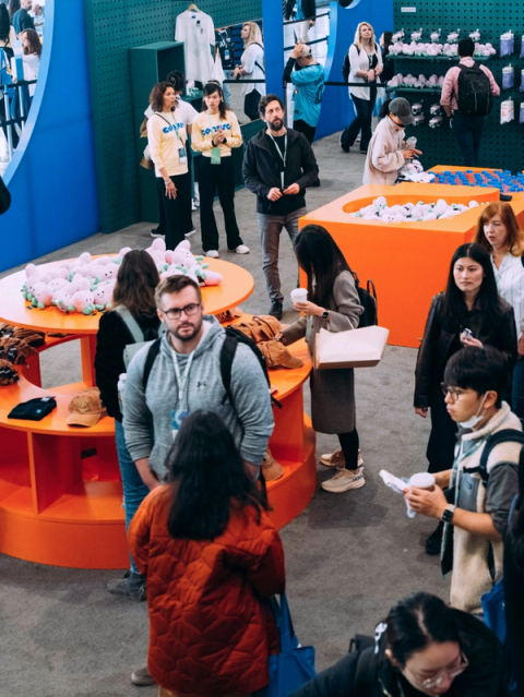
The immersive experience of Config wasn’t created by sound and motion alone, of course. Brand Designer Maria Chimishkyan took the creative lead on spatial design, which included wayfinding, interior structures, wall graphics, and activations spread throughout the Moscone Center. And who could miss the supersize inflatables arranged throughout the conference—or resist taking a photo with them?

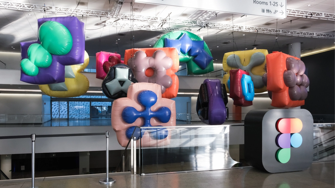

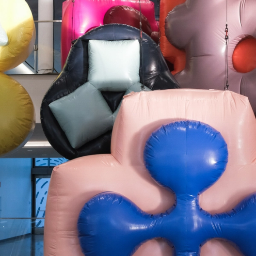

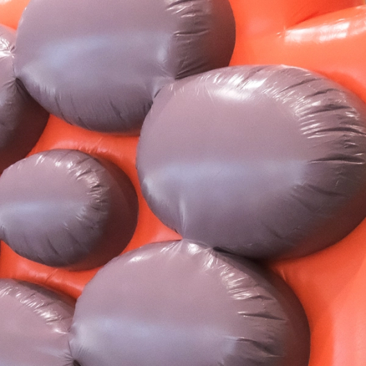

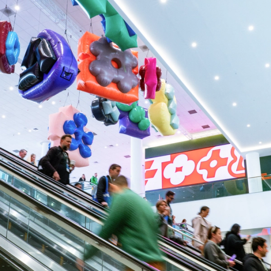
“The glyphs we were using in the brand identity had this larger-than-life, expansive feeling,” says Maria, “so we thought: Why not literally expand them?” To create the inflatables, the team worked with the Los Angeles–based experiential studio VTProDesign, which presented two options for materials: glossy and matte. “The matte option felt almost like a fabric and was surprisingly nice,” says Maria, “but we wanted a glossy sheen so the light could hit all the curves and accentuate the forms.” The sheer scale of the inflatables meant that they had a bit of “droopiness,” she says, which the team chose to embrace in the spirit of messy making. “We could have put framing inside them, but you don’t really want to fight that medium and totally obliterate what is lovely about it.”

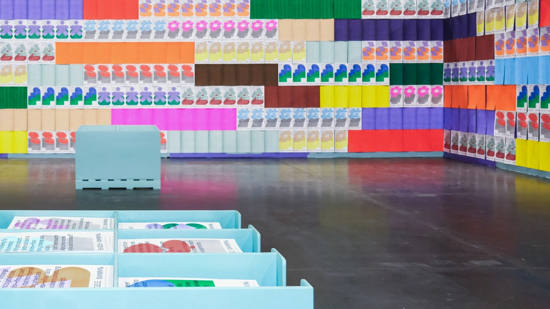

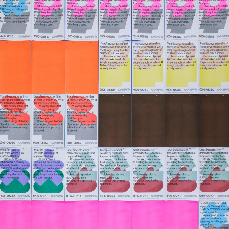

Many of the risograph posters were printed with quotes from Practice, a book about design and craft edited by Figma’s Story Studio and designed by graphic design studio Other Means. Every Config attendee got a copy in their swag bag.
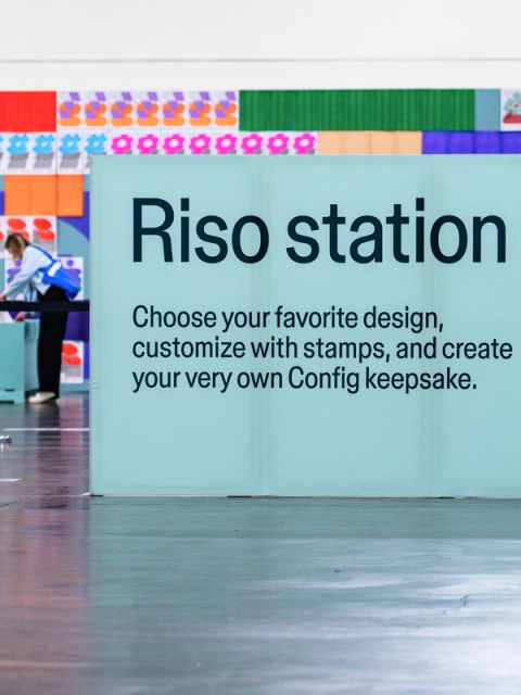
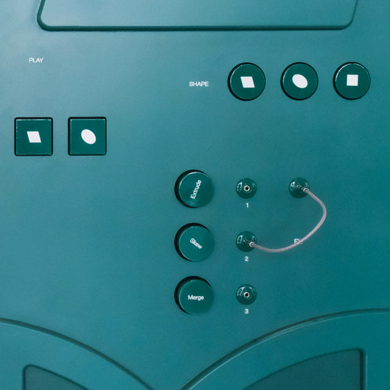
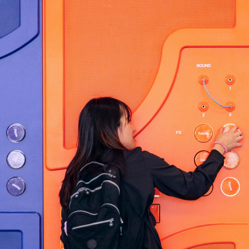
While the inflatables were playful, two interactive stations invited attendees to get hands on. A “glyph synthesizer,” created in partnership with Sounds Like These and VTProDesign, let people control the synth and manipulate the sonic palettes designed for Config. Meanwhile, a risograph station allowed attendees to print their own posters and customize them with a set of stamps. “There’s an imperfection and a texture to riso that is really lovely,” says Maria. “It felt so connected to the themes of craft and practice that were being explored at the event and that were at the heart of some of the launches being announced.”


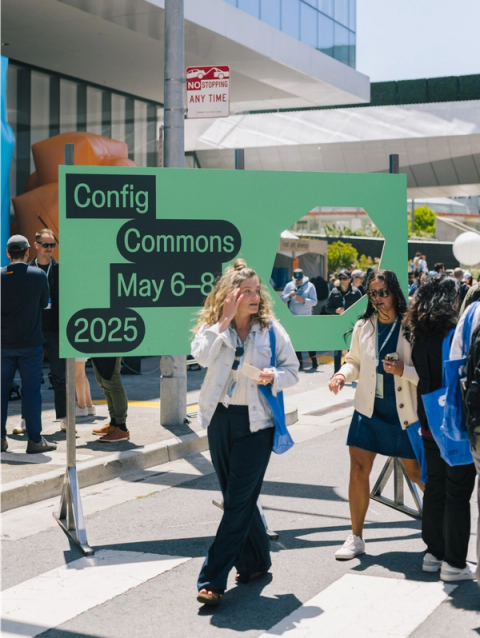
Making space for common ground
For the second year in a row, Config Commons offered people an informal space to hang out, listen to music, and get to know each other over drinks and food. Unlike last year, however, Config Commons took over Howard Street directly outside the Moscone Center, and lasted the entire event. “That meant we had to create something that felt unique on the first day, but stayed alive for the next two days,” says Leandro. The proximity to the main event was something to navigate, says Brand Designer Chelsea White, who led this part of the project. “Config Commons needed to feel less buttoned up, but since it was right in front of the Moscone Center, it interacted with the core brand a lot,” she says. “So the relationship also needed to be close enough that it didn’t feel wrong.”


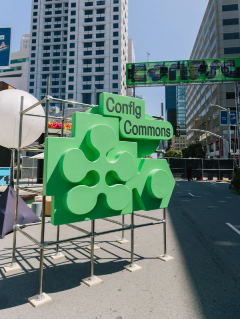


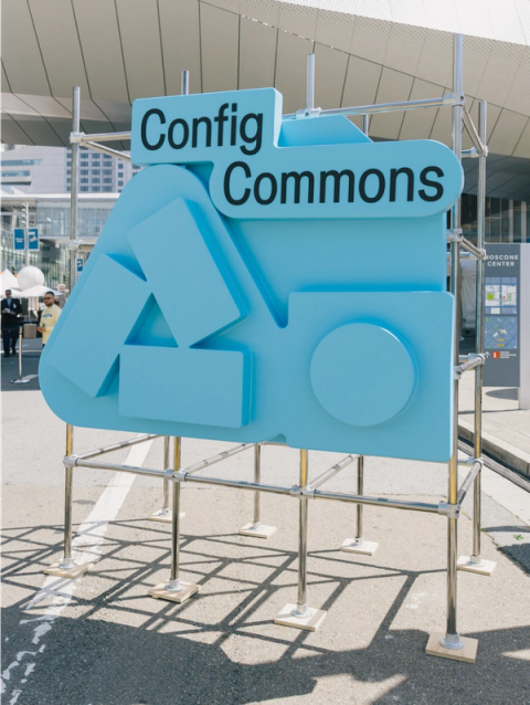


To create this relationship, Chelsea stripped back elements of the core Config brand. For instance, she took the glyphs that were the backbone of the identity, reduced the number of colors being used, and removed some of their interior shapes. “We broke them down, deconstructed them, melted them together, and layered them tightly,” says Chelsea. “The result feels a little less polished.” Collaborating with the brand experience and events agency Set Creative, she also chose materials and structures that felt “simple, humble and clever”: metal bleachers, exposed scaffolding, raw wood facades. As Damien puts it, the team was trying to strike a balance, making the space feel both “designed and under-designed.”
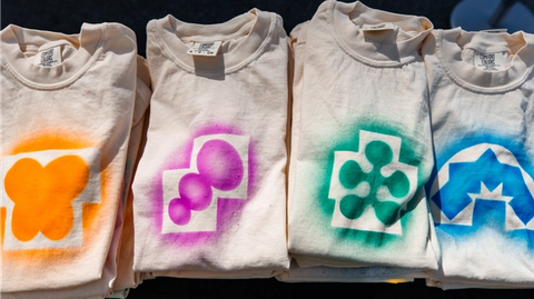
The outdoor venue meant that Chelsea could take advantage of natural light as another material. “I was fortunate to have the benefit of light and shadow, so I leaned into a lot of embossed forms and cutouts for the main signage and inflatables,” she says. “It created this lovely shadow and light play.” The team amped up the block party vibe with an airbrush studio, where attendees could pick their favorite glyph and color to be airbrushed onto a T-shirt or bandana. There was also a music stage and stalls selling intentionally commissioned, beautifully off-brand merch. For Chelsea, the work all came together when she looked down Howard Street on the first day. “The brand moments were just these pops of color that you encountered down the street,” she says. “It felt so cohesive.”


Greater than the sum of its parts
In the end, it takes all these elements coming together to bring Config to life—and it takes attendees to give it meaning. “The best part is when people are in the space, learning new things, playing around with the activations, and connecting with others,” says Damien. For the Brand Studio team, crafting an unforgettable experience means capturing the creativity and innovation of the product building community—and embracing the ideation, iteration, and refinement it takes to get there.

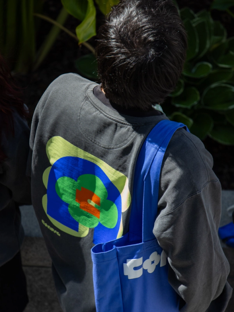
Many hands brought the visual identity of Config 2025 to life. The Brand Studio members involved in this effort include Kaley Aposporos, Cat Bui, Leandro Castelao, Maria Chimishkyan, Chad Colby, Damien Correll, Gilles Desmadrille, Sydney Halle, Ben Hill, Mika Kunisaki, Andy Luce, Jessica Svendsen, and Chelsea White.
Matt is a freelance writer and editor based in London, who was previously the editor-in-chief of creative media company It's Nice That. Before that, he worked at Monocle magazine, where he covered a range of topics, from business and entrepreneurship to design and retail.