Figma on Figma: Evolving our visual language


Figma’s visual identity has gotten a bold refresh. From playful primitives to a vibrant new palette, we’re unveiling our latest brand evolution—one that speaks to all product builders.
Share Figma on Figma: Evolving our visual language
Over the past decade, Figma has grown from a tool primarily for designers to an ecosystem supporting developers, product managers, and entire product teams. As we’ve expanded beyond our singular design focus, we recognized the need to move past a visual language rooted in vector vernacular—the static cursors and heavy black outlines that defined our brand for the past five years. We wanted our new identity to reflect the many hands involved in crafting the journey from imagination to reality.

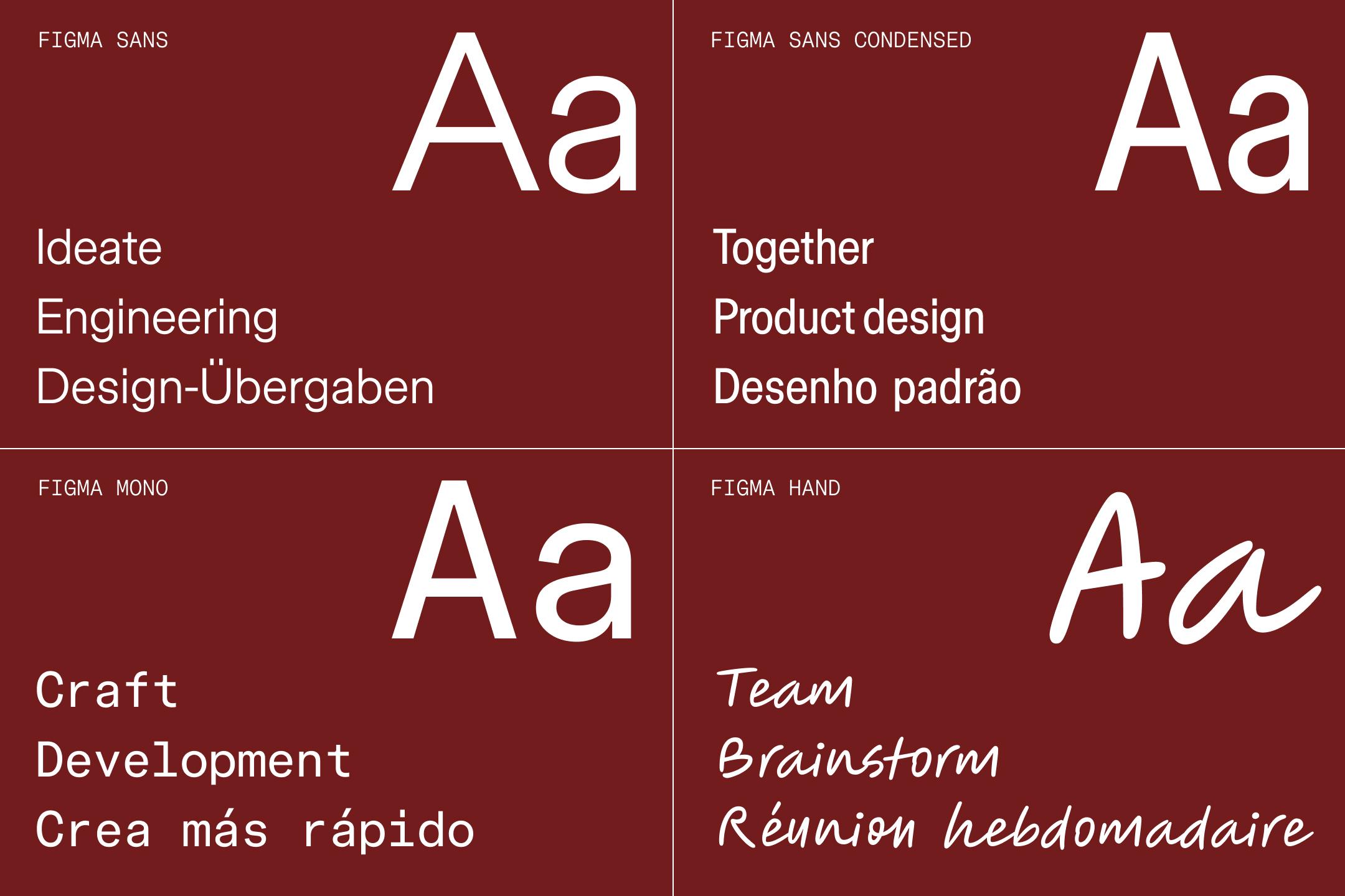
We partnered with Grilli Type to create Figma Sans, an opinionated grotesque. In addition to Figma Sans, our brand includes three other fonts: Figma Condensed, Figma Mono, and Figma Hand by OH no Type.
We focused our refreshed brand around four key foundations:
- Versatile primitives representing the various individuals involved in co-creation
- Dynamic compositions reflecting varied modes of making and building
- An expanded color palette, leveraging variables for easy adaption across contexts
- Integrated motion principles animating actions and flows in the creative process
Through these elements, we’ve created a visual language that reflects where Figma is today and points to where we’re headed—a place where anyone can bring their ideas to life, regardless of their role or background.
Starting in the sandbox
To kick off the exploratory phase, Figma’s Brand Studio began by examining all the ways people use Figma—from brainstorming and initial ideation, to inspecting elements and adding final polish.
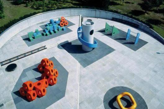
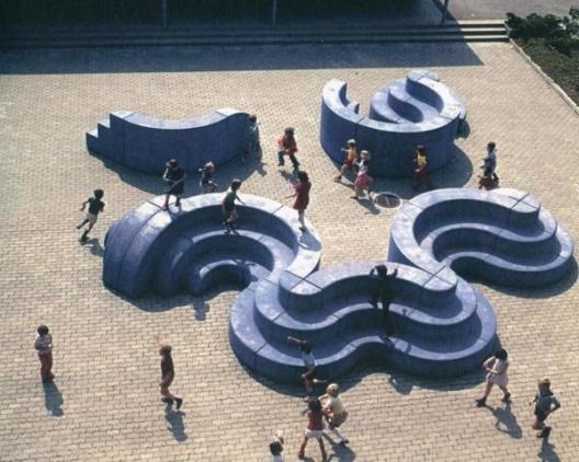
The team was drawn to the concept of activities playing out in a shared space, akin to parallel play. Brand Designer Jefferson Cheng recalls drawing early inspiration from the playgrounds of Isamu Noguchi and Mitsuru Senda: “They were a metaphor for the Figma canvas—a place where people come together to create and experiment.”


While the team ultimately moved beyond the literal metaphor of the playground, they continued to build on the concept of simultaneous activities happening in one shared space. Figma’s infinite canvas, too, served as a sandbox for the team, as they explored directions, as well as tested color schemes and patterns using variables. Brand Studio Director Damien Correll explains, “The canvas allows people to interact with objects in different ways. A developer might look at something as simple as a rectangle one way, through inspection mode, while a designer may see it from an alternate perspective.”
These ways of seeing and interacting became the core of the new visual language. The team mapped out as many activities as they could think of, assigning rules and behaviors to each. These guidelines provided scaffolding for early explorations, and formed the foundation of a visual lexicon where a single element can be manipulated in infinite ways to tell countless stories.
Reimagining iconography and illustration
Our previous illustration system relied heavily on geometric shapes with main character energy—shapes that push on each other and act as protagonists in nearly every vignette. For this refresh, the team sought to create a more flexible language that could grow with Figma in the years to come.
Damien emphasizes, “Enduring visual identities should be thought of as languages, not systems. Systems imply rigid rules and predictability.”
Enduring visual identities should be thought of as languages, not systems.
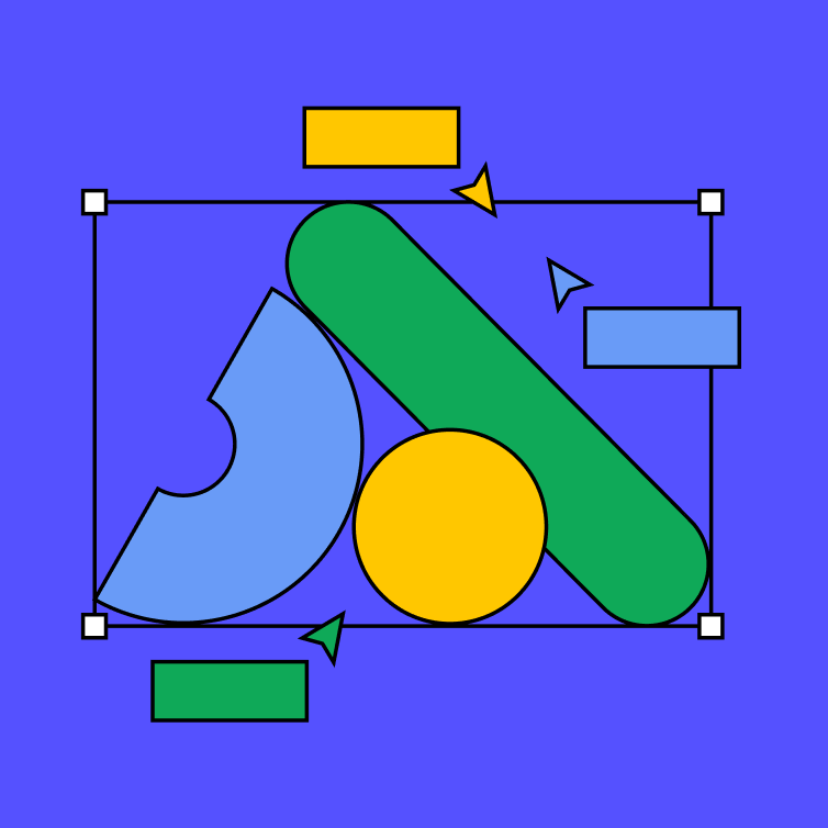
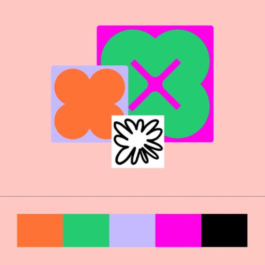
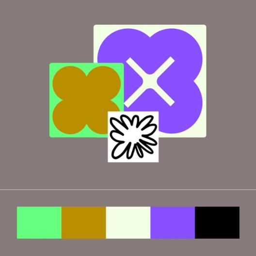
To achieve this, Figma’s Brand Studio developed a collection of primitives—basic shapes forming the building blocks of our illustrations. These range from ambiguous blobs to representational forms, illustrating various takes on form and function.

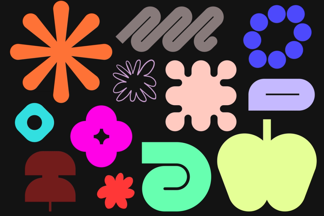


The primitives were inspired by everyday examples of craft, both digital and physical.
Brand Designer Leandro Castelao elaborates, “The primitives are intentionally varied, like the hands that made them.” Their slight incongruities and open-ended nature also mean that more can always be added to the mix.
The primitives are intentionally varied, like the hands that made them.

While each primitive is distinct, they share key characteristics. They’re unapologetically graphic and more “jumbo” than their predecessors. Think: Big shapes, oversized nodes, and bold use of color. But jumbo isn’t just about size—it’s about putting a focus on the details, the care and precision that goes into making something.
“It’s almost as if we zoomed in on each element, stripping away the non-essential and honing in on composition,” Jefferson adds. Importantly, the primitives are vector-based, ensuring they can be created entirely in Figma.


As the Eamesism goes: “The details are not the details. They make the design.”
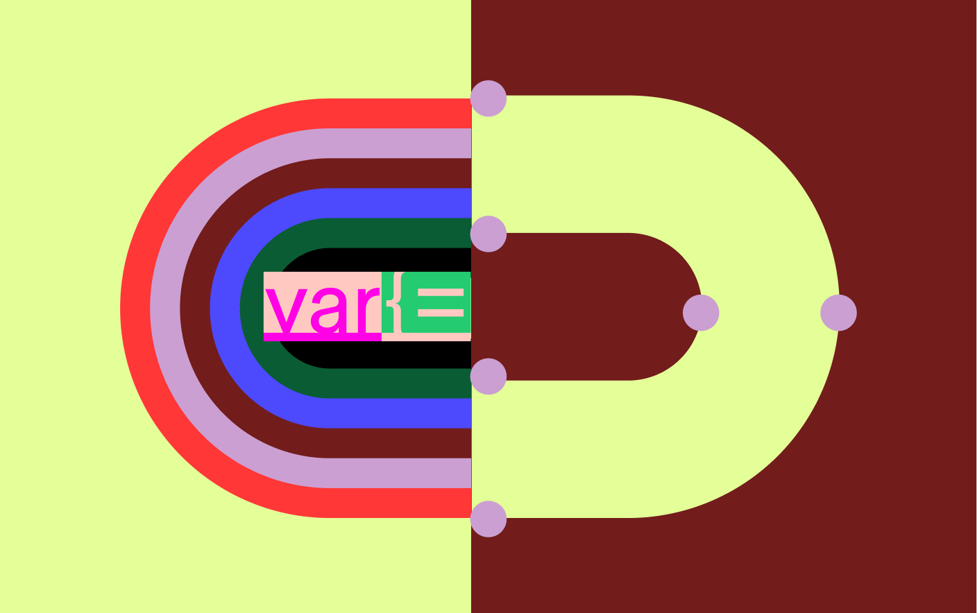
Jumbo nodes—large squares fixed to the corner of bounding boxes—amplify Figma UI, implying the act of “selection” on the canvas. For Brand Designer Maria Chimishkyan, seeing jumbo nodes on the butterfly was an early highlight: “Things started to click together. It felt like this poignant, abbreviated take on nodes, meaningfully selective.”
Nodes also unlocked new ways to suggest movement and interactivity. Square nodes become circles when an object is being “edited.” Selected objects can be moved around the canvas or shift their z-axis order—just like in Figma. Primitives can be “passive” (solid-color shapes), “activated” (with pattern), or “hyper-activated” (with wider color spectrums). Borders can also be activated with color, pattern, and scale—in accordance with the jumbo principle.


Motion designers worked closely with brand designers on animation studies, inspiring even more ideas for how all these elements work together, such as a dashed, marquee border representing hyperactivity and collaboration.
Aligning on composition
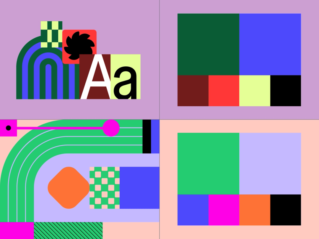
Just like in Figma, objects can interact with other objects on the canvas, creating endless compositions. To standardize these arrangements, the team revisited their list of modalities and actions pulled from their audit of the product development process. “Ideation” is represented by freeform collage, like stickies on a FigJam canvas, “designing” relies heavily on manipulation and transformation, and “building” is represented by visual abstractions of coding, inspecting, and annotating.
Taken together, these compositional arrangements comprise four main moves:
- Overlap: Shapes layer upon each other, embracing the (occasional) messiness of the Figma canvas.
- Reveal: A selected shape can “inspect” or expose the underlying structure of another element.
- Clustering: Shapes and patterns cluster together into freeform compositions.
- Multi-move: Different compositional elements come together.

Our previous black outline style
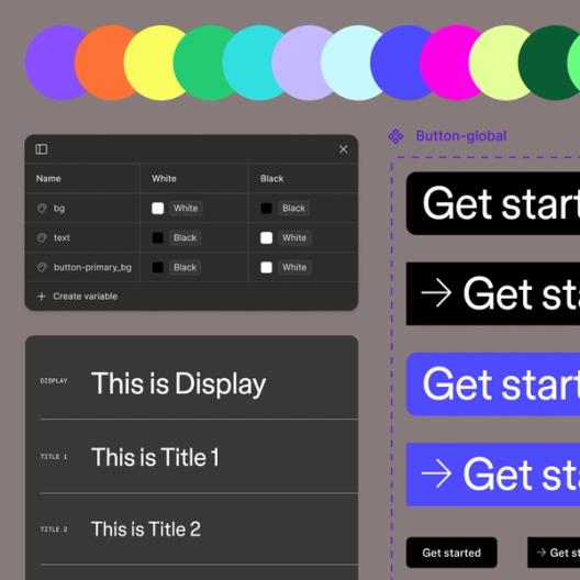
An expanded color palette
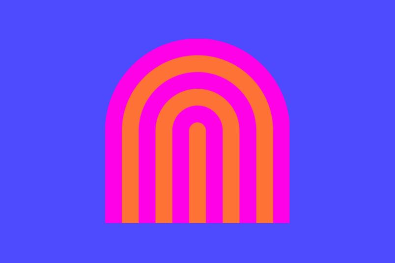
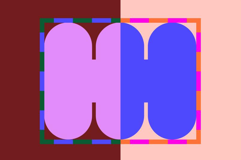
As shapes and composition convey the multivalent nature of work, our expanded color palette punches up the message. While we’ve retained our signature purple, we’ve introduced a broader range of colors that include bold primaries, bright neons, and muted earthy tones that reflects the diversity of our community and the breadth of what you can do across our products.
In an industry where owning a color or pairing is perceived as the pinnacle of successful branding (think Coca-Cola red or John Deere green), Damien believes that such an approach is unrealistic for many contemporary brands: “[Heritage brands] have put in the time to build that equity and, frankly, were there first. We have an incredible in-house team and they pushed for a more sophisticated palette—recognizing that we need a spectrum with a principled way of using—rather than a limited, color-by-numbers approach.”

The Brand Studio developed a complex yet harmonious system of color schemes, using variables to create a range of expressions. They began by pairing two seemingly tonal colors on the same hue level, creating a vibrating effect when viewed side-by-side. Without black outlines, these colors jut up against each other, creating crisp contrasts and a sense of movement, like the energy and flow of teamwork.
The team built out three hero color schemes, each consisting of a vibrant primary color pair and four secondary colors. These schemes have light and dark modes, swapping out secondary colors depending on context.

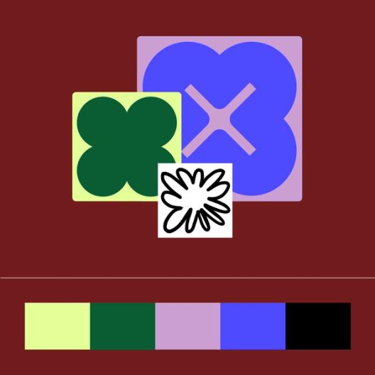


Two color principles guide both illustration and product images:
- Tonal vibrancy: Colors create electric and unexpected pairings that convey activation while balancing contrast and distinction.
- Adaptive schemes: Color schemes offer flexible use, allowing variations from dark to light, simple to complex, to suit different needs.


Maximalist color schemes are used for emphasis, similar to scale in our jumbo principle.
For emphasis, maximalist color schemes come into play, with colors accentuating pattern, line, or hyper-activated shapes.
Putting it into motion
Motion isn’t just an add-on—it’s an integral part of how we express our principles. From the start, we considered how visual elements would move and interact. “We focused on core moves like selection, activation, and transformation,” explains Gilles Desmadrille, Brand Motion Designer. “It’s about bringing the canvas to life without relying on cursors.”
The collaborative chaos of building for everyone
The process of refreshing our brand was far from linear and involved months of collaborative exploration. The team worked fluidly, grabbing and riffing off of each other’s work. Oftentimes, the team would lose track of the original authorship of one idea or iteration, an ideal outcome for a team looking to create a scalable system. “Figma lends itself to being egoless,” says Jefferson. “It doesn’t matter where something originates; we’re coming together to make something great.”
It doesn’t matter where something originates; we’re coming together to make something great.
This all-hands-on-deck approach also helped the team iterate quickly. Maria adds, “It’s not like you’re waiting on the one designer that specializes in primitives. We’re all doing them and reusing them.” The team leveraged Figma’s design system features to create brand libraries and toolkits, making assets easily available to everyone at Figma.
Room to grow
“This isn’t the final destination. It’s a new starting point,” says Taryn Cowart, Design Manager of the Brand Studio. “We’ve created a system that’s flexible enough to adapt as we continue to grow and change.”
This is the second part of our series exploring Figma’s latest brand evolution, following our deep dive into our new custom typeface, Figma Sans As Figma expands to include tools for all product builders, our community has evolved—and so has our brand. We’ve overhauled our entire visual identity from color palette to illustration style, and even commissioned a new typeface.Just our type: The story of creating Figma Sans
Figma’s Brand Studio: Andrea Helmbolt, Brand Strategist; Andy Luce, Brand Designer; Becca Ramos, Brand Designer; Catherine Bui, Brand Designer; Damien Correll, Creative Director; Gilles Desmadrille, Brand Motion Designer; Jefferson Cheng, Brand Designer; Kaley Aposporos, Brand Copywriter; Leandro Castelao, Brand Designer; Maria Chimishkyan, Brand Designer; Sydney Halle, Brand Producer; Taryn Cowart, Design Manager
Agency Collaborators: Buck, for out of home campaign; Nimble, for narrative work.