How to streamline your design system workflow in Figma


If you’ve ever stared down a blank Figma file while building a new design system, never fear: These new features and plugins will turn that mountain of work into an afternoon task.
Share How to streamline your design system workflow in Figma
Hero animation by Kelli Anderson
Here’s a quick reference list of plugins we’re covering:
- CSS color-mix(): Create color palettes and gradients
- Colorbox: Generate full color ramps
- The Genome Color Tool: Build WCAG-compliant color scales
- Peppercorn: Set up your entire type system
- Print Variables: Create sticker sheets for variable collections
- Auto Documentation: Make sticker sheets for all variables
- Variables and Styles List: Get variable sheets in a canvas widget
- Propstar: Map out component prop variations
- Specs: Generate component specs
- Similayer: Filter for specific layers and properties
- Style Finder: Find styles across pages
- CTRL Var: Rename variables
- Export Import Variables: Manage variables in or out of Figma
- Handoff: Copy CSS variables instantly
- Variables Converter: Translate variables into code
- Shaper: Manage token architecture and generate CSS code
We’ve all been there: starting a new design system project, staring out the window, feeling the weight of the mammoth task ahead. Color ramps, typography scales, spacing systems—as a Designer Advocate, I know they can be immensely enjoyable to finesse, but let’s be honest: They can take forever to get right.
After countless rounds of this cycle, I’ve discovered a combination of tools and plugins that save me hours and take away my blue-500s. Think of them as your design system co-pilots, each specializing in a different aspect of the journey from concept to code. And the best part? Today, we’re launching 9 new design systems features that address some common frustrations—let’s get to know what’s changed in Figma, and how these updates make my favorite plugins even more powerful.
Reorder modes and collections with ease
If you’ve ever tried reorganizing your modes or collections, you know the pain of deleting and recreating them, only to have designs get out of sync. No more: Now, you’re able to easily drag and drop them to make sure everything is exactly how you want it. Modes and IDs stay intact as you rearrange, preventing resets or broken dependencies, and you can adjust your default mode without complication.
This may sound like a small change, but it makes a huge impact for teams that want to:
- Keep their most-used collections at the top
- Group related modes together
- Rebrand or update product lines
9 new quality-of-life improvements
Today, we’re shipping updates that sand down friction and speed up your workflow:
- New shortcut for go-to-main component, so you can jump straight to the source
- Duplicate and copy styles for faster iteration
- Variable paints can be hidden and unhidden to keep your workspace uncluttered
- Improved component description UI that makes things easier to read at a glance
- Drag the variable modal from the entire header for better control and access
- Variable changes auto-save, so you don’t have to click to keep your updates
- Tooltips on component names give you quick context when you hover
- Edit button now properly aligned for a cleaner, more polished experience
- Style window text overflow improvement to make sure long names don’t get cut off
Laying foundations: Getting the basics right
Now, let’s talk about the plugins that make these features even better. Community plugins have the potential to supercharge specific parts of your workflow. Here are the tools aimed at the foundational stage of building a design system, when you’re starting with color and typography.
Creating color palettes
Our own Developer Advocate Jake Albaugh created CSS color-mix(), a plugin that works like a digital color lab. Generate full palettes—with variables included—using modern formats like HSL, HWB, LCH, or OKLCH. It also creates smooth, natural gradients that transition beautifully between colors. When paired with Peppercorn (mentioned below), you can create a system within Figma at a remarkable speed.

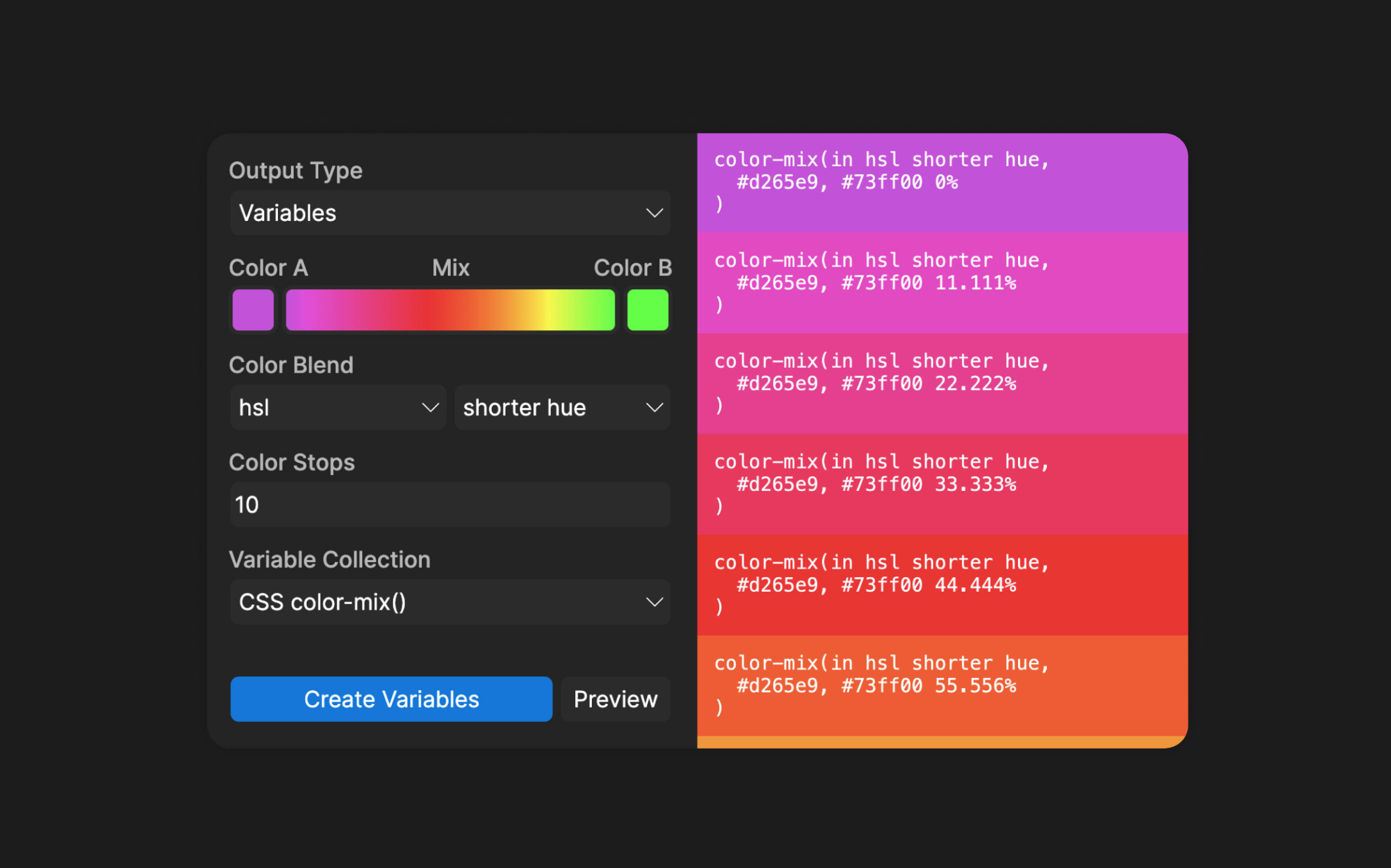
Use CSS color-mix() to support modern color spaces and generate swatches, variable ramps, and solid or gradient fills.
Pro tip: It’s tempting to create 10 shades of every color in your system, but start with just three to five. You usually need one for backgrounds, foregrounds, and borders. You can always add more when you need them.
For quick color ramp generation, Colorbox by Kevyn Arnott is my go-to tool. Build color scales using intuitive filters for saturation, brightness, and hue, then export to JSON or directly to Figma. Once you’ve created your palette, our new variable organization features make it easy to arrange them exactly how you want.

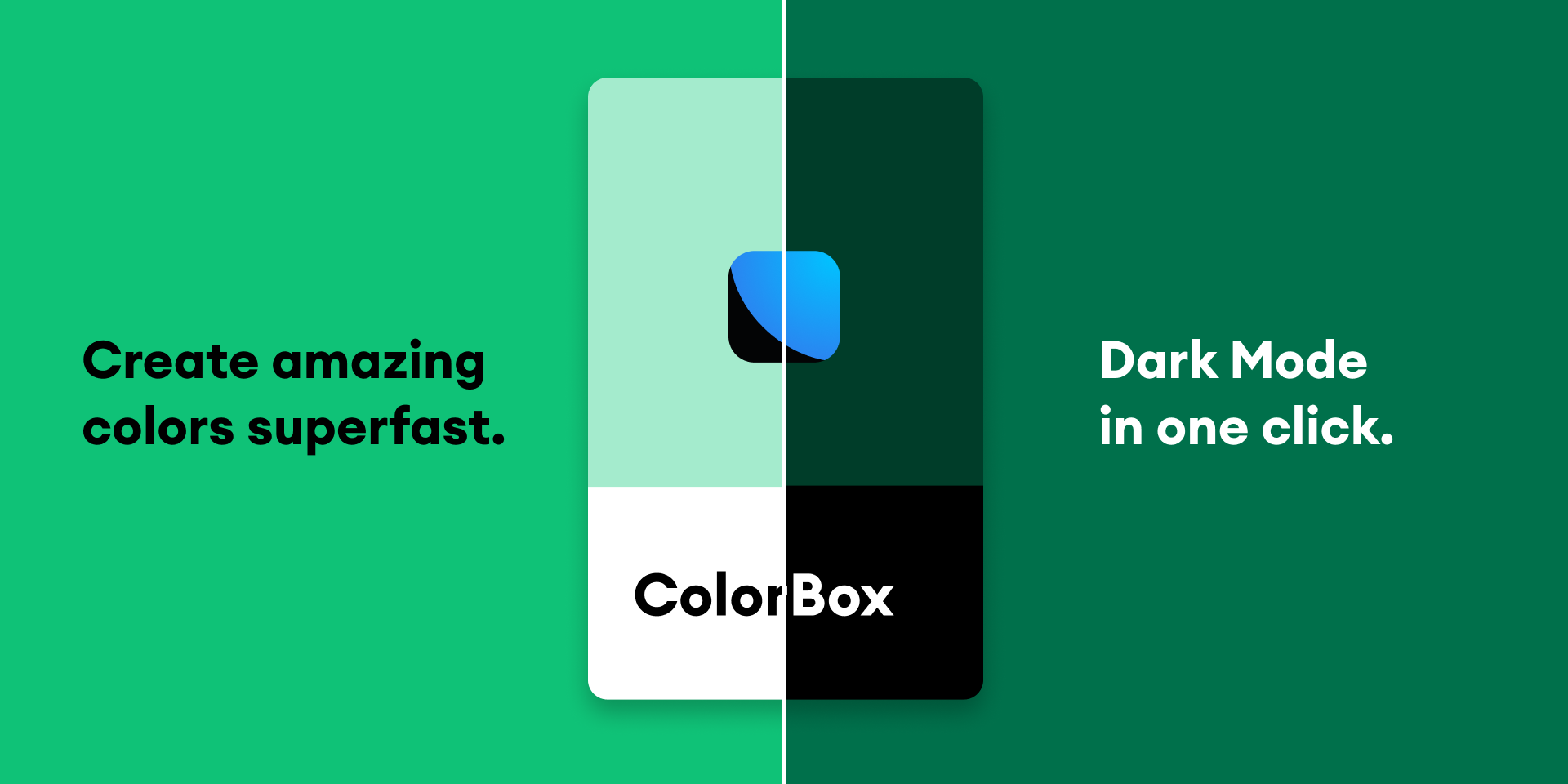
Use Colorbox to generate and tweak color ramps in seconds, and export directly to Figma or JSON.
Lastly, if you’re on the hunt for a WCAG-compliant, full color palette generator, Kevin Muldoon’s The Genome Color Tool is preloaded with color ramps for primary, secondary, tertiary, positive, negative, highlight, attention, info, system, and neutral within your system. As if that wasn’t enough, it also has a lot of familiar design system color palettes pre-loaded—Univers, IBM Carbon, Salesforce Lightning, Adobe Spectrum, Ant, and Material—which you can export in JSON format, too.

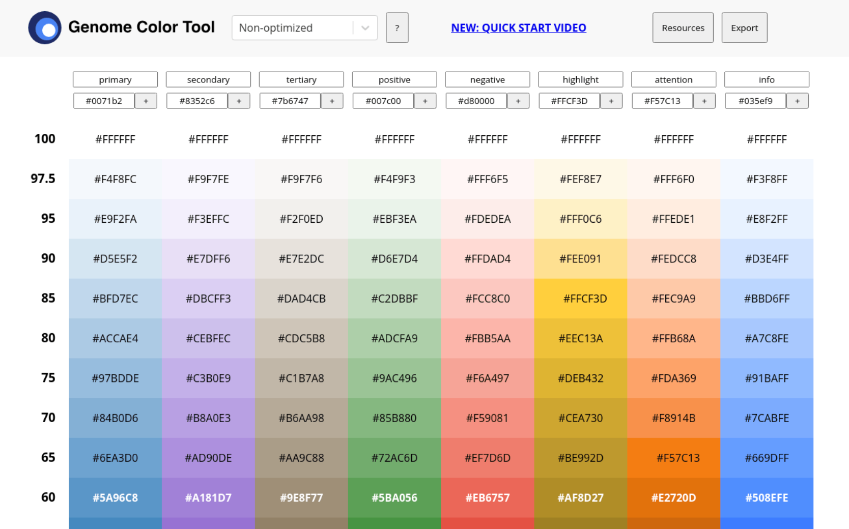
Use The Genome Color Tool as your accessibility-minded color builder.
Streamlining typography systems
Creating a type scale has always been a challenging process. Peppercorn changes that entirely. Set up your entire type system—from headings to body text—with your preferred font family, base size, and scale ratio. The live preview shows you exactly what you’re getting, and you can export JSON or CSS. With Figma’s improved variable management, your typography system becomes considerably easier to maintain.

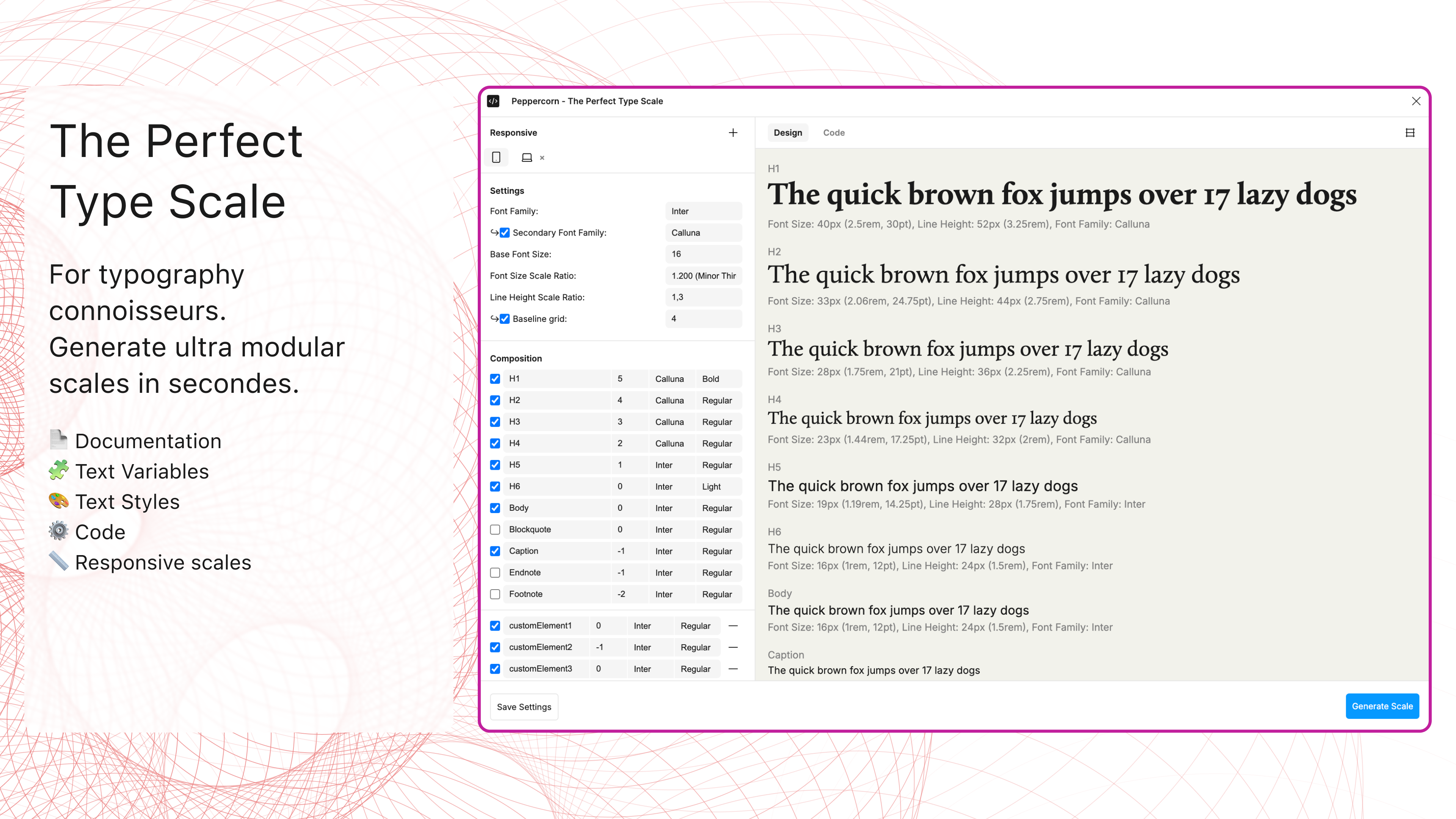
Use Peppercorn to build complete type systems, and export everything developers need.
Documentation: Making your system clear and accessible
Once you’ve built your system, you need to document it so that our designer and developer partners can view, adopt, and implement it in all its glory. These plugins handle the time-consuming work.
Creating variable sticker sheets
When you need to document specific variable collections, Print Variables by MINKMINKs creates beautiful, focused sticker sheets. It includes variable descriptions, adding context that helps team members understand each value’s purpose. Use this with our new variable organization features to create contextual and dynamic documentation.

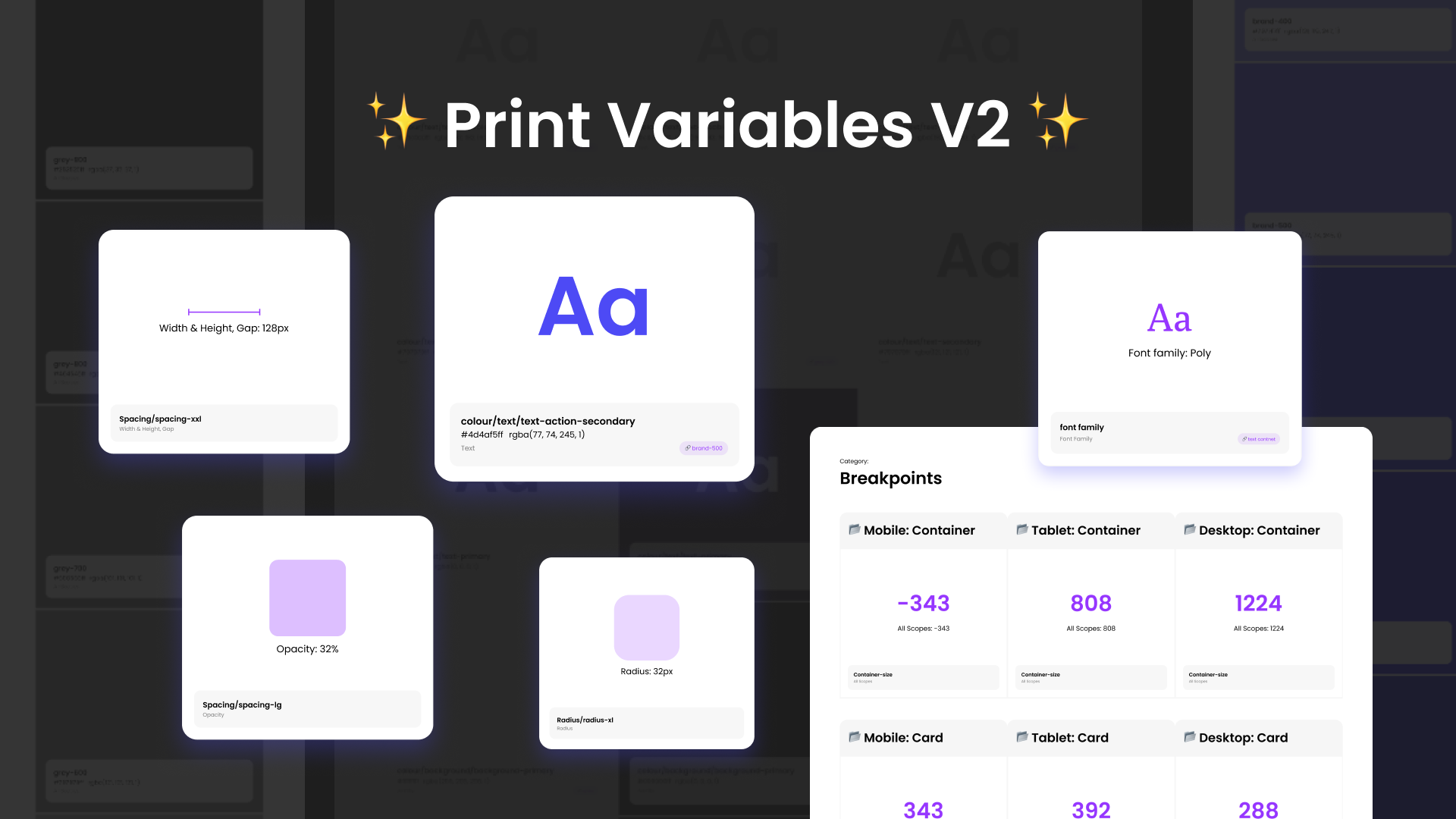
Use Print Variables to create delightful sticker sheets of your variables, complete with descriptions.
For comprehensive documentation, Auto Documentation by Eddy Salzmann generates entire pages with all your variables, organized by collection and mode. With our upcoming ability to reorder collections and modes, your documentation will match your actual organization perfectly.

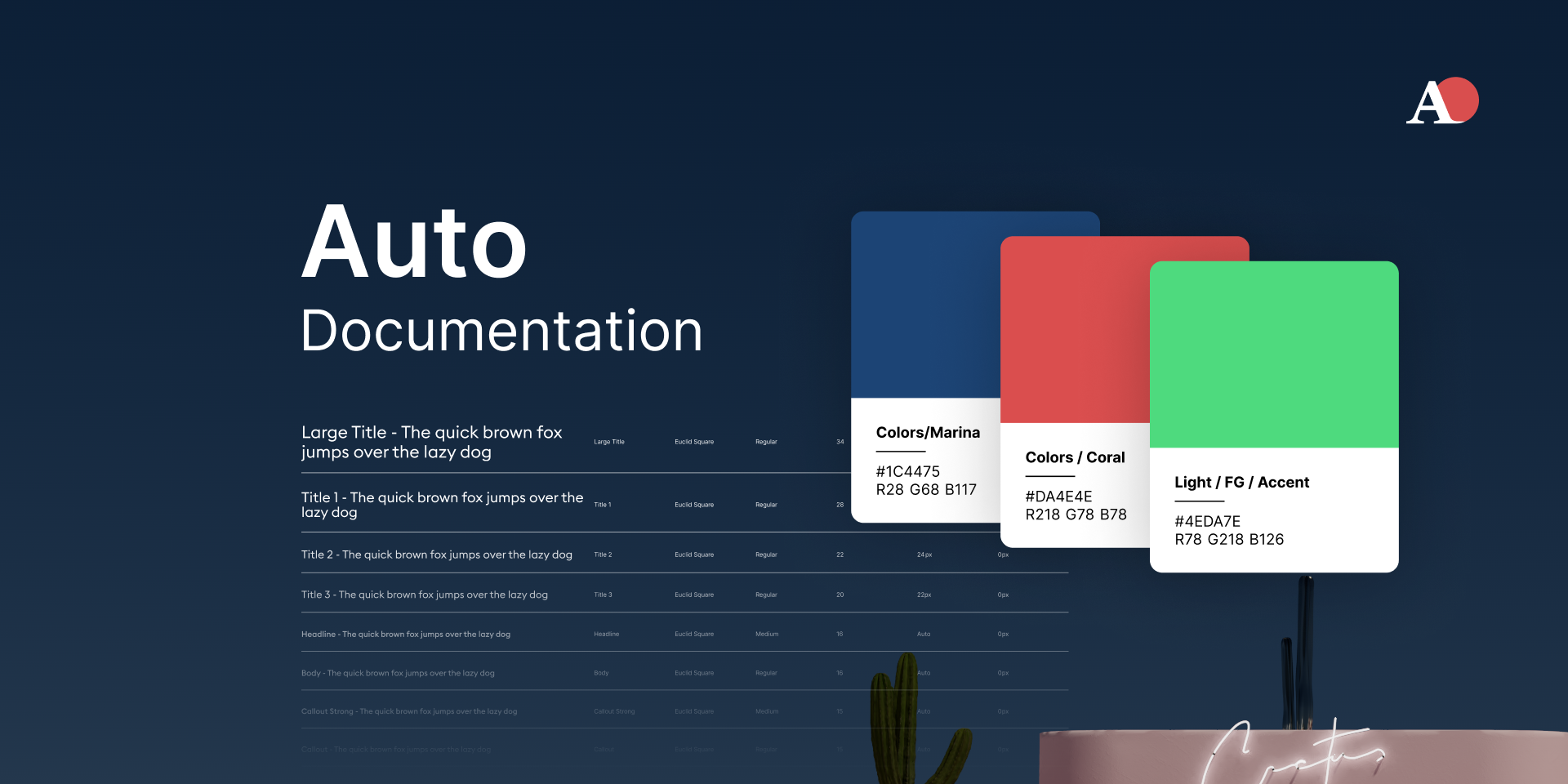
Use Auto Documentation to create documentation frames cataloging all your variables by collection and mode.
If you’re looking for something a little bit more dynamic, Variables and Styles List can print out all of your variables within the context of an updatable canvas object. It’s unique in that it uses a widget and can be updated with the press of a button, versus other options which require the entire frame to be regenerated whenever you make a change.

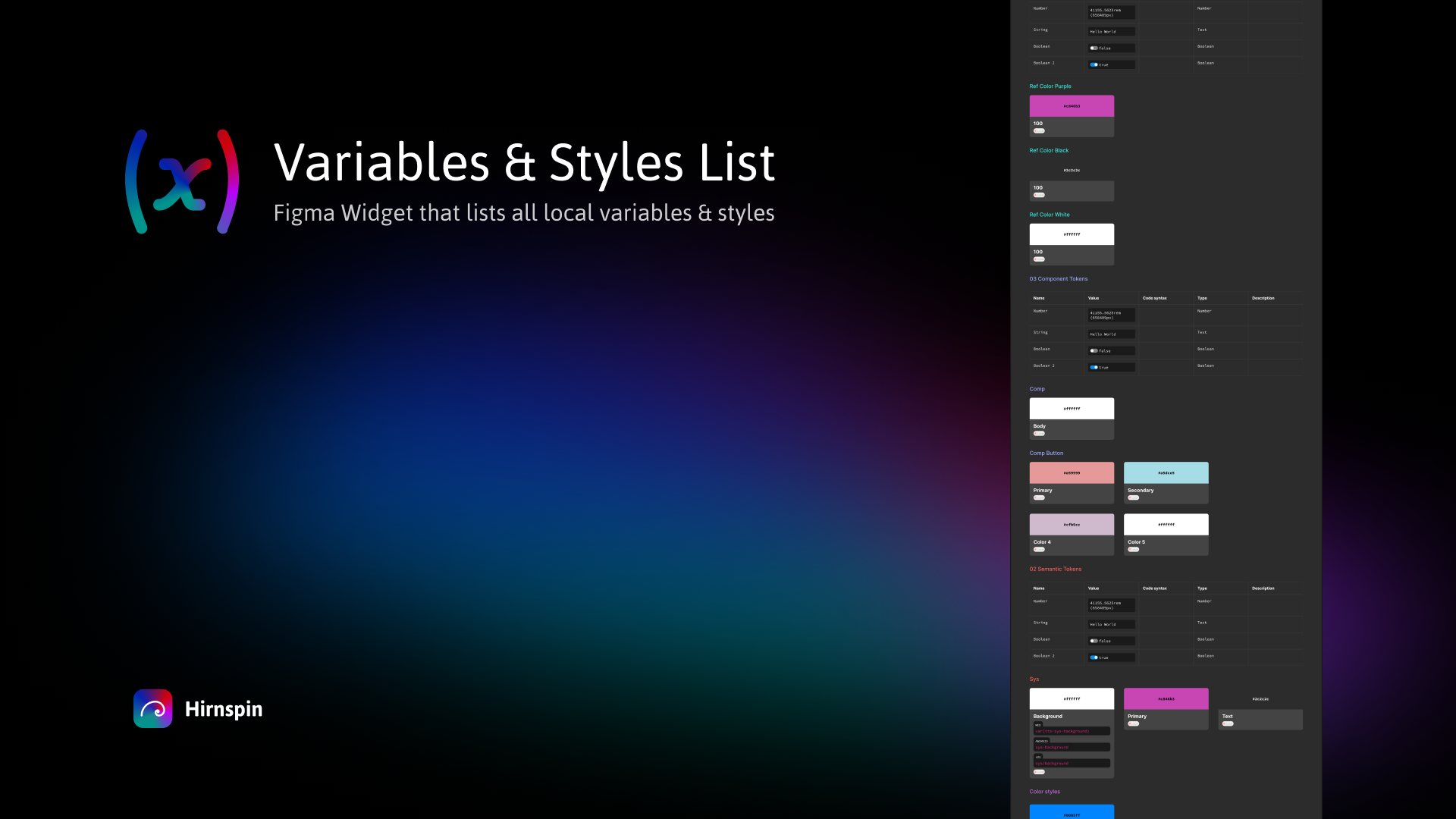
Use Variables and Styles List to keeps tabs on all your variables in real-time, updating with a simple button press.
Visualizing component variations
Propstar by Gusso displays every permutation of your variants and properties in a comprehensive table. No more clicking through endless combinations to see if everything works. This places a full table of all the combinations on the canvas, making it a lot easier to see the edges of your carefully crafted components. Combined with Figma’s property panel consolidation, this plugin helps you keep things specced out like a Propstar.

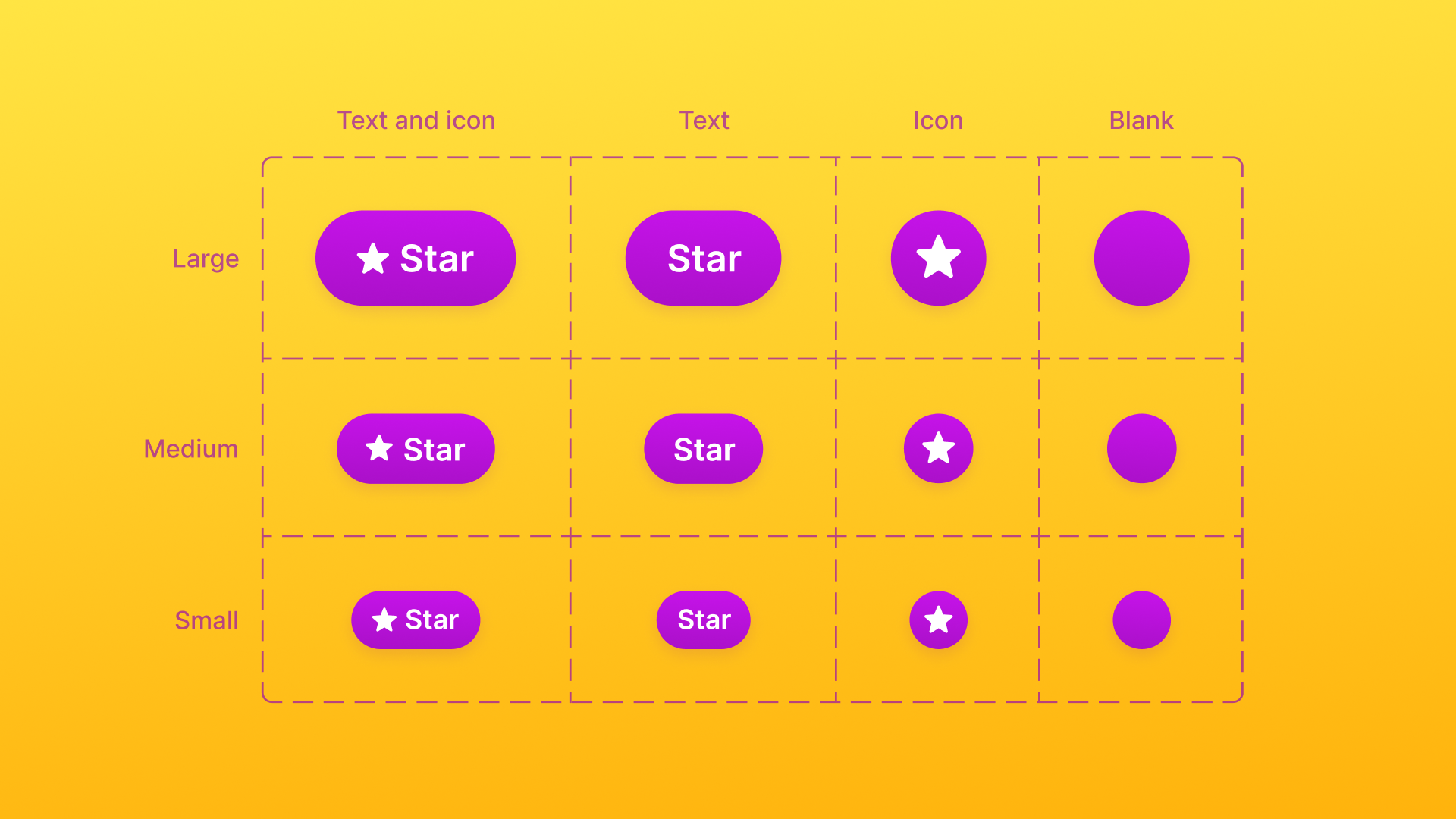
Use Propstar to map out every possible permutation of your component variants in a tidy table.
Need to document everything about your components? Specs by Directed Edges Plugins creates thorough breakdowns—variables, styles, nested components, prop values, and more. It’s a one stop shop for a full spec sheet.

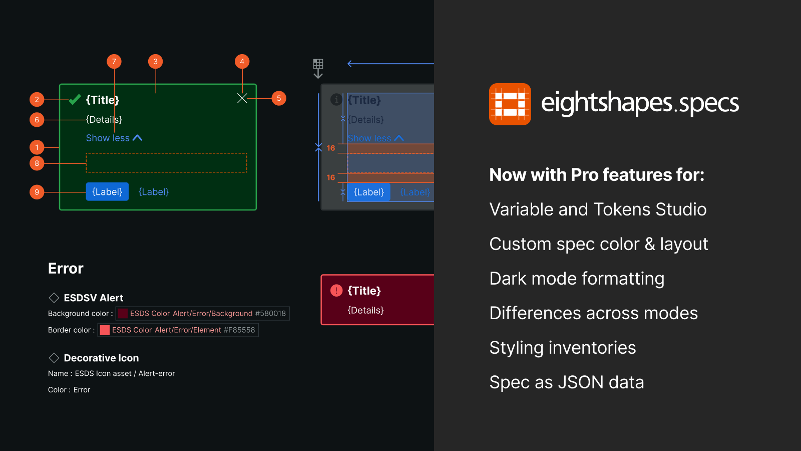
Use Specs to gather every detail about your components—from variables to nested elements—into crystal-clear documentation.
Auditing your design system
For scanning documents layer by layer, or property by property, I highly recommend Similayer. It has honestly saved me hundreds of hours when auditing and migrating between design systems. It was even used on the Figma UI3 community file when we migrated it from staging to production.

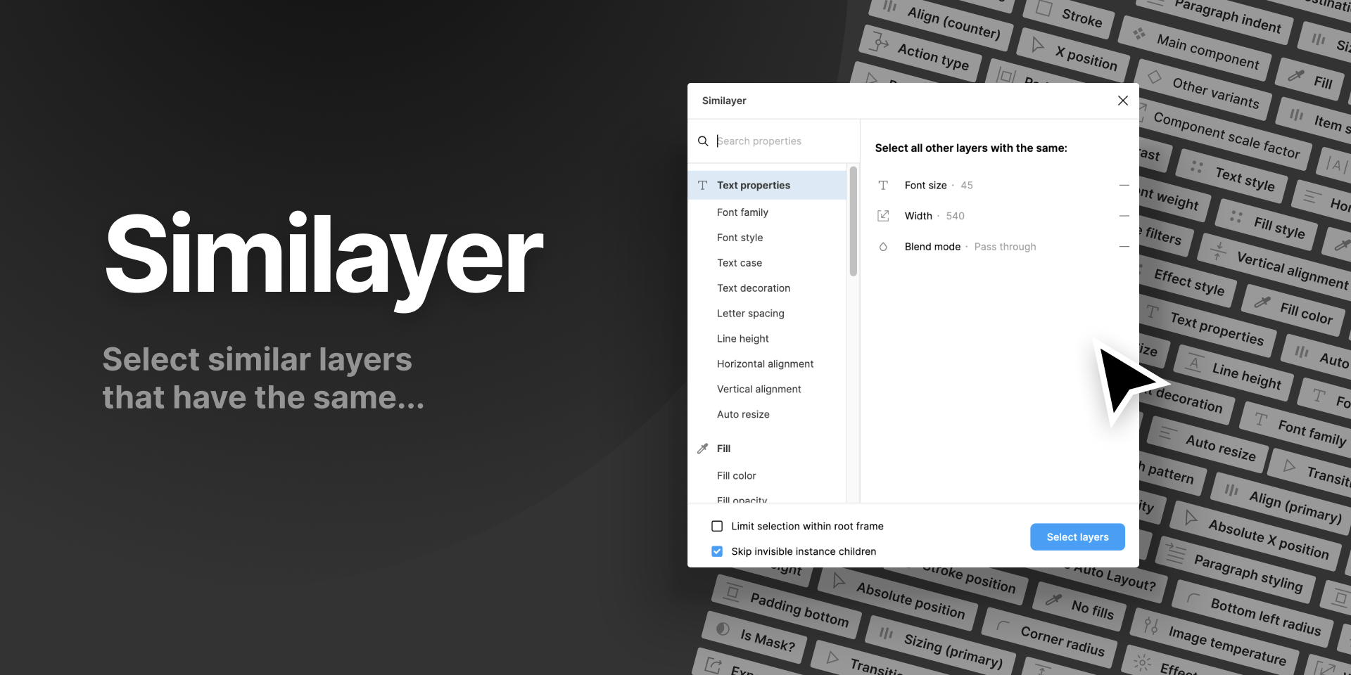
Use Similayer to find specific layers within your designs, whether they are based on line height, color, layer name, or all of the above.
When maintaining or updating design systems, Style Finder by Tafumi is our godsend. This plugin scans your entire document and lists every instance of a style or variable. It has saved me countless hours of tedious searching and made system maintenance much more manageable.

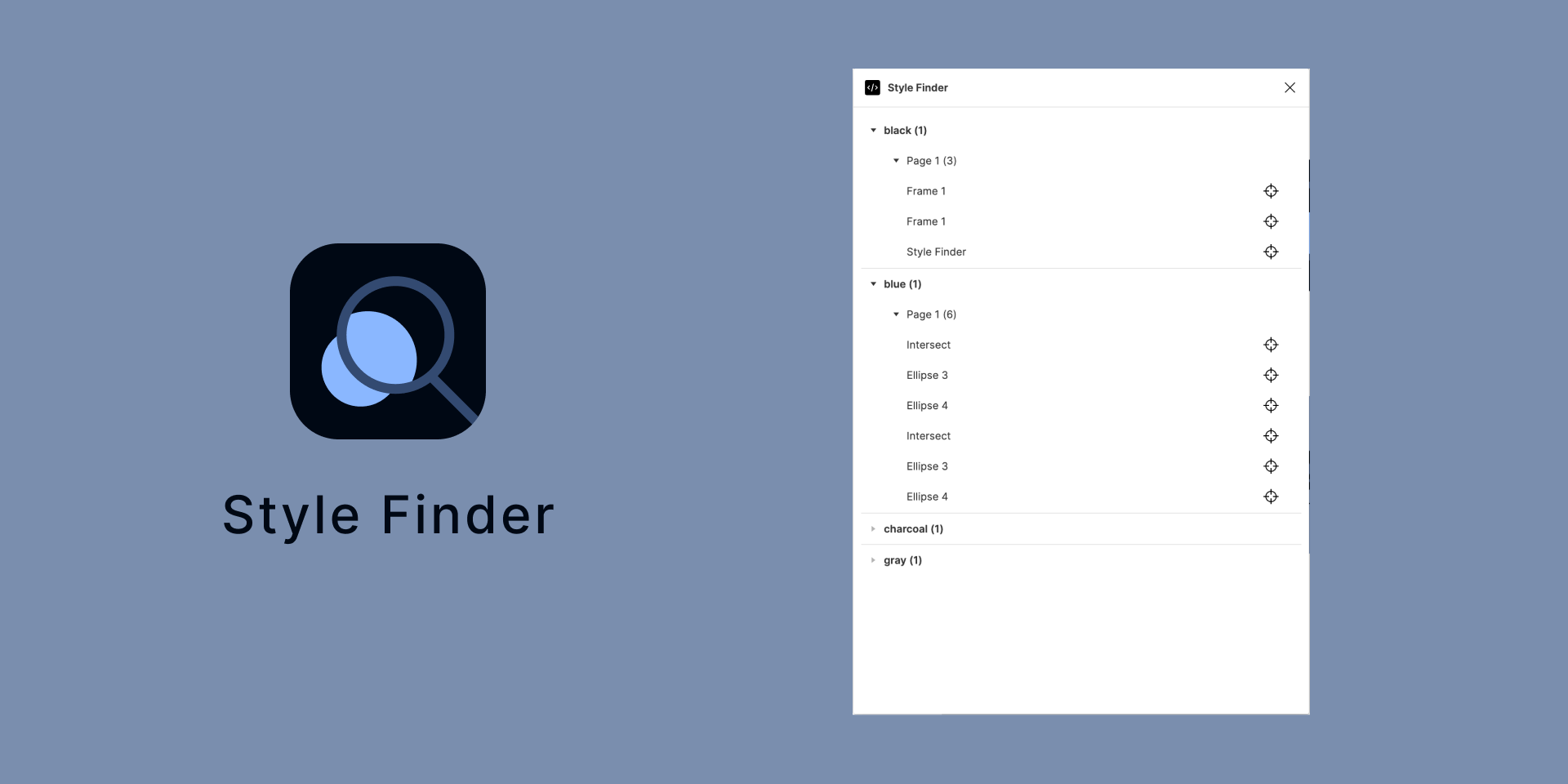
Use Style Finder to track down every instance of every style across your files.
As your system grows, so will your number of variables. Often, we need to change our mind about a naming convention, which means hours of manual effort to update our existing sets. CTRL Var: Rename Variables by Murph is our savior here, with the plugin offering us a chance to batch rename using group or variable pattern matching.

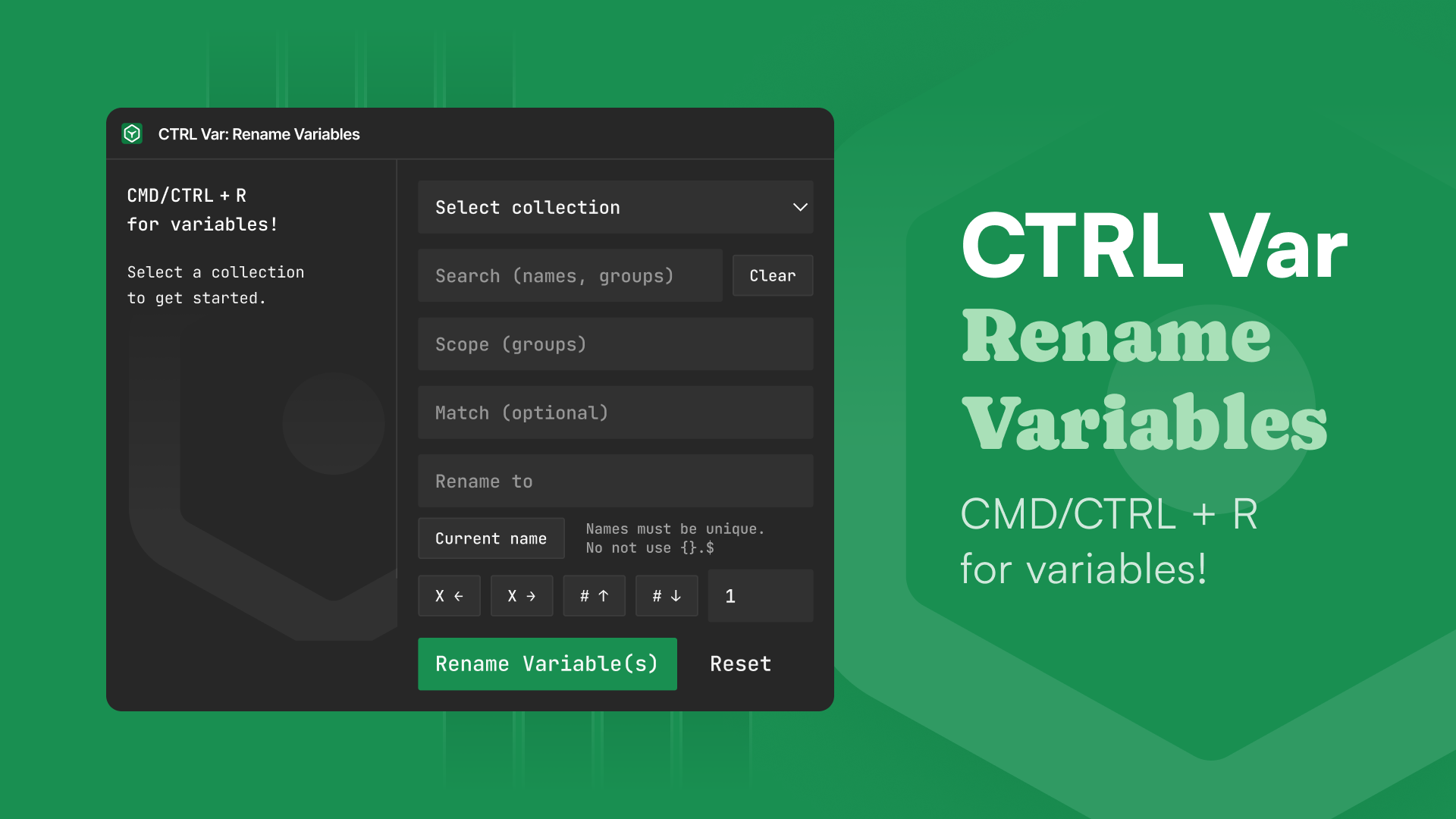
Use CTRL Var: Rename variables to modify the names of your local variables across all collections.
Implementation: Bridging design and development
The final challenge is getting your design system into code efficiently. We can get very far with the previous steps, but we can also optimize the process by translating our designs to code, ensuring parity with development.
Export Import Variables by Jan Toman serves as the bridge between Figma and development. Import existing tokens from your engineering team or export your Figma variables to JSON. If you don’t have a JSON file up and running, this plugin also allows you to export from Figma—a double whammy bonus. With our new variable organization features, your exported tokens will maintain the structure your developers expect.

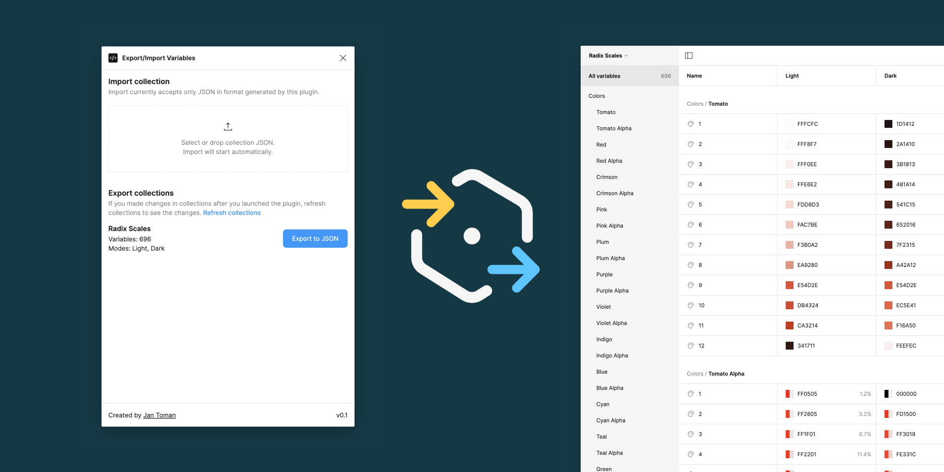
Use Export Import Variables to bridge the gap for design tokens between Figma and development.
Speaking of exporting, if your engineering team is working specifically with CSS and you’d like a quick way to copy and paste the token values as variables, check out Handoff by Convertiv. This one gets a bonus point for the really clean design of the plugin—they manage to pack so much information in while keeping it easy to use.

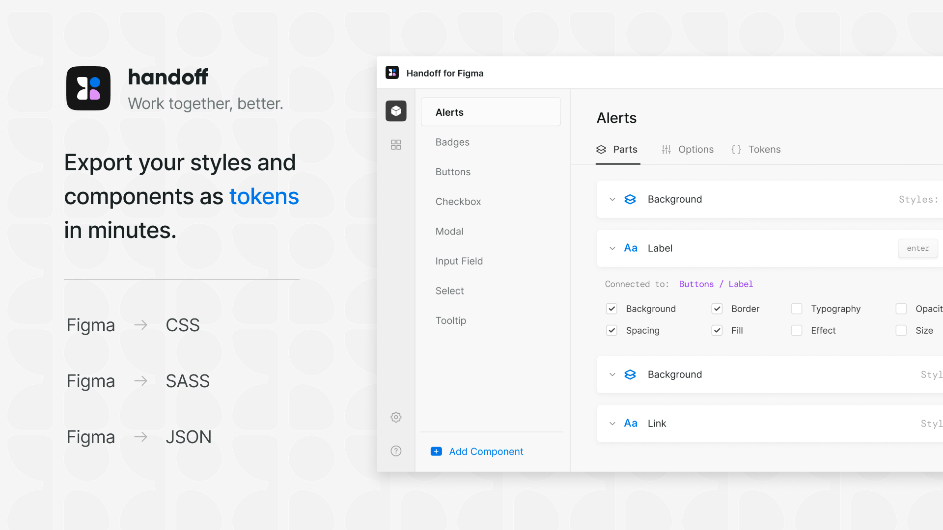
Use Handoff to create a living preview of your design system so developers can see exactly how components should look and behave.
For more insights from Laurent on effective engineering practices and leadership, check out his post, “10 Lessons from an Engineering Manager.”
For quick code exports, Variables Converter by Laurent Thiebault transforms your Figma variables into multiple formats: CSS, JavaScript, Compose, and SwiftUI. Select your collection and mode, and it generates clean, ready-to-use code. This process becomes even more seamless with our improved variable organization.


Use Variables Converter to translate Figma variables into various code dialects—from CSS to SwiftUI.
If you’re looking to create a spec sheet or full CSS variable code snippet outside of Figma while also seeing a preview on a common set of elements, check out Shaper. This web tool is a full scale customizer, where you can set your font family, padding value, spacing scales, and primary color in a preview window and then grab the CSS when you’re done—it even provides dark mode values.

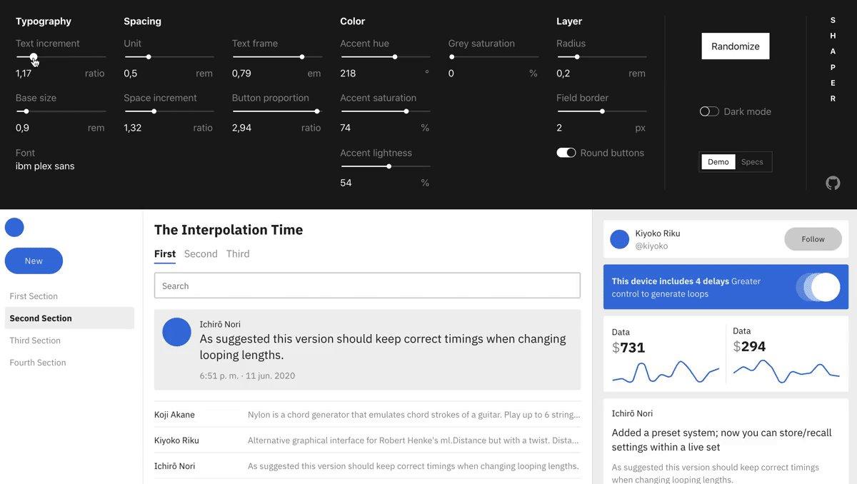
Use Shaper to fine-tune interface styles in real-time while generating clean CSS code that works in light and dark modes.
What’s in your toolkit?
Putting it all together, here’s how I approach a new design system project using these tools and features:
- Build foundations with CSS color-mix() and Peppercorn
- Organize everything with Figma’s new reordering capabilities
- Document thoroughly using Auto Documentation and Specs
- Audit for consistency with Style Finder
- Hand off to development using Export Import Variables
I don’t know about you, but I’m feeling efficient. With these design systems updates, plugins, and widgets, we’re guaranteed to save hours on design systems work. That means more time can be spent grinding those craft coffee beans you bought at the farmer’s market last weekend. (Flat white with oat milk over here, thanks!)
What plugins do you rely on for your design system work? Reach out on X to continue the conversation. And don’t forget to check out our latest features—your design system will thank you.