8 tips for designers building branded templates in Figma Buzz


To create self-serve templates that bend—but don’t break—brand designers need to consider work through a marketing lens. Here’s how to set up editing guardrails and design layouts that flex and scale.
Share 8 tips for designers building branded templates in Figma Buzz
For both brand designers and marketers, the goal with any asset is for it to be appealing, accurate, and on brand. Being consistent when you’re managing hundreds of assets across dozens of touchpoints, however, can be tough—especially when deadlines are tight. From a misused font to an awkwardly resized logo, things can slip through the cracks. As a brand designer, you don’t always have the time to review individual assets before they go live. Sensitive to this backlog, marketers create what they can with the skills and templates they have, but still have to make some snap decisions.
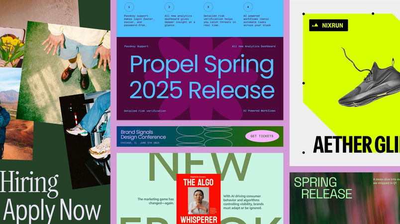
Figma Buzz With Figma Buzz, brand designers and marketers have a shared space to build beautiful, on-brand assets at scale.
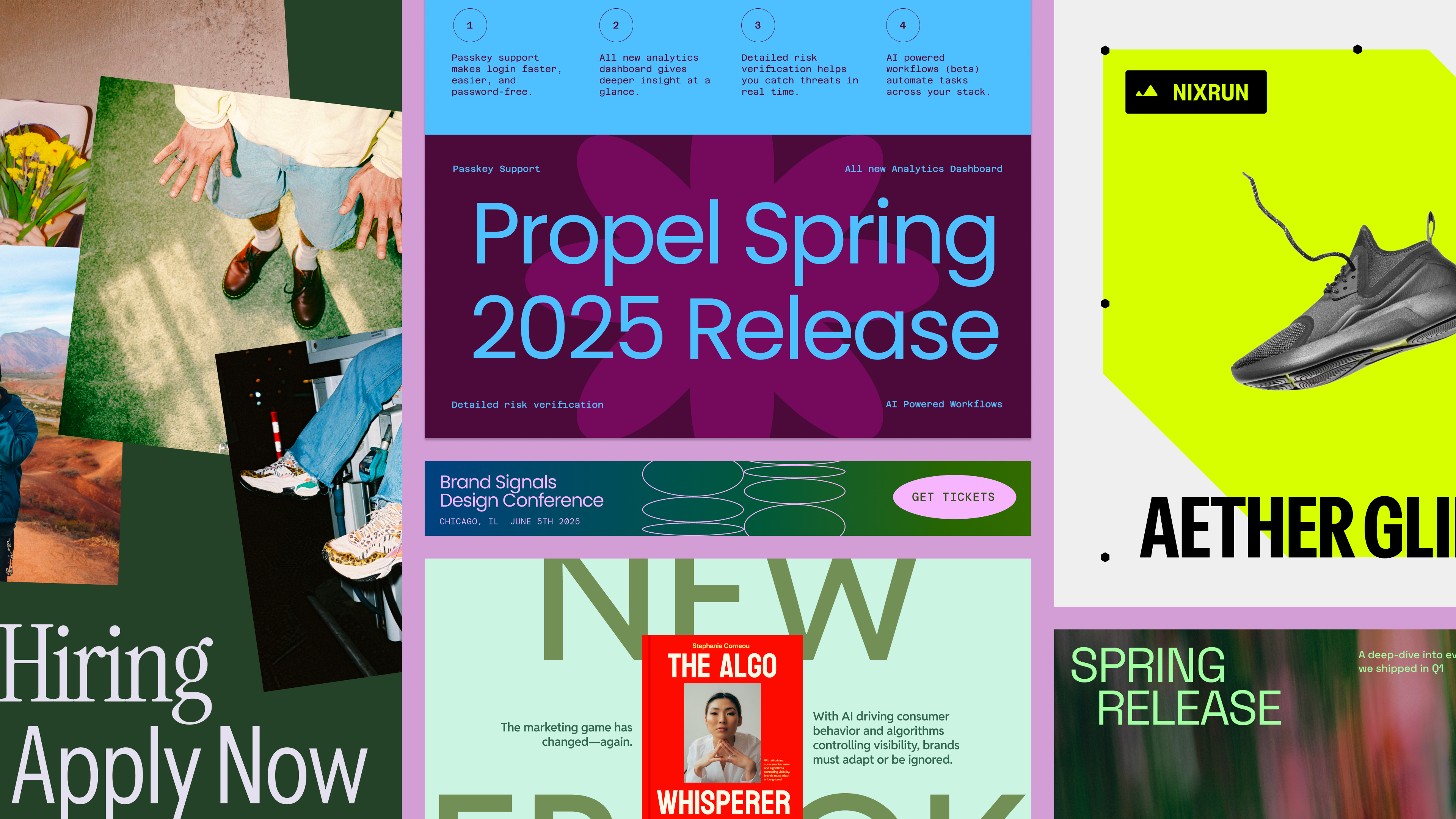
Figma Buzz is where design and marketing teams co-create
1. Start in a Figma Design frame
If you’re new to Figma Design, check out our beginner course.
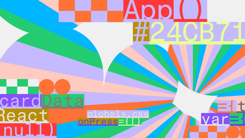
You can easily move your design work across products in Figma, so start where you’re most comfortable and create a frame in Figma Design. You’ll be able to set up components and take advantage of the expressive tools of Figma Draw Figma Draw pairs faster, simpler vector editing with powerful tools for visual expression—so designers of all stripes can bring their vision to life without breaking focus.

Express yourself with Figma Draw
2. Create flexibility with auto layout
Auto layout is the backbone of responsive template design. Adding auto layout ensures that elements like buttons, text boxes, and image containers maintain consistent spacing, adjusting when the content changes. If someone enters a long headline in a text field, for example, it won’t nudge elements out of alignment in the template.
3. Separate your text layers
How you structure your design really matters. Make sure to separate text layers for each unique input, especially if you’re using different font styles or sizes. This is crucial for Bulk create, which allows you to generate many assets at once by importing content from a CSV or XLSX file, where each data field maps a layer in the design. Combining multiple styles or input fields in one layer can break formatting and make updates harder, so keep things modular to ensure that your template formatting stays intact across different assets and campaigns.
4. Lock aspect ratio for images and vectors
To lock aspect ratio, select the image or vector, then click the square icon next to the layout width and height fields in Figma Design or design mode in Figma Buzz.
While your layout may be set up for a specific format, like a 1080 x 1080 social post, marketers may need to adapt the template for other uses—like a vertical Instagram story or a web banner. One of the easiest ways to make your templates foolproof is to lock the aspect ratio on images and vector graphics so elements like logos, headshots, and illustrations don’t get distorted as they scale. Otherwise, images can get stretched or squashed in the process.
5. Give each layer a clear name
By default, a text layer will be named according to the exact string on the canvas. To change this, use the keyboard shortcut Command + R to replace the text, or double-click the layer directly.
If you have a lot of layers to clean up, try using Figma AI to quickly rename layers.
After you publish a template in Figma Buzz, your teammates will be able to edit any unlocked text or image layer through changing the input fields in the Edit Content panel, much like filling out a form. To make sure it’s an intuitive, user-friendly experience, make sure each layer is clearly labeled. If your teammate sees a box like “Text 45” or “Rectangle 12,” they won’t know what they’re updating, and you’ll likely end up with misplaced content and further template revisions.
Instead, rename your layers with labels like “Event Title,” “CTA Button Text,” or “Speaker Photo.” You can also consider including example text if there’s a specific way it should be formatted, like “Date of Event (e.g. July 10, 2025).” This not only ensures consistency across outputs, but also helps users understand what formatting will work best within the design layout.
6. Use component variants for multiple options
To create a component set, select all the frames you want to include in Figma Design. In the right design panel, click the three dots and select “Create component set.” If they were already set as separate components, select “Combine as variants.”
Click here for more information on how to create and use variants.
Using component variants is especially helpful in templates where a small detail—like the layout of a logo, background pattern, or icon—might change depending on the application. By using a component set already defined in Figma Design, you give marketing counterparts the ability to customize without exposing too much surface area for manual edits.
Think of a logo lockup with both horizontal and vertical orientations, or a brand illustration in three color styles. Instead of creating separate templates for each option, you can combine these options into one component variant set, showcasing one of the variants in the design. Then, anyone editing the asset can select the component and click Swap Content in the inline toolbar to choose the appropriate variant for their use case.
7. Check your template from a user perspective
While it can look like a template is “done” once it looks right in Figma Design, your goal isn’t just to design something beautiful—it’s to create a frictionless, self-serve experience that empowers your team and clears the path for high-value creative work. Before you share your template far and wide, take the time to test it in Figma Buzz—exactly as your teammates will experience it.
Start by opening your template in a new Figma Buzz file to experience the assets in focused editing view. Are the right fields visible in the Edit Content panel? Are all the right layers editable, and are they named clearly? Do any unexpected elements show up, like duplicate layers or empty frames? Next, check how your layout behaves when actual content is added. Paste in long text strings, swap images, and try resizing the asset—especially if your template is designed to stretch across formats. This kind of usability QA helps you catch issues early, like text overlap, misaligned content, or confusing layer behavior.
Your teammates will be able to browse other templates, so don’t forget about how things are organized overall. Is the title of the file clear and searchable? Do you have naming conventions to standardize file structure across templates? Take this moment to check how each individual template asset is named and organized within the file. If you are using rows, make sure the order and groupings make sense, and rows have descriptive names.
8. Share your templates with the right context
Once your templates are tested and published, it’s time to share them with your team. Copy the template link to share it with your collaborators. This link opens a new Figma Buzz file and drops them directly into the template they need, so they don’t need to hunt for the right asset. For campaigns that require assets in multiple dimensions for different platforms, there’s also the option to add the full template set to the canvas.
This handoff moment is also an opportunity to provide helpful guidance. What kinds of assets are included in the template set? Are there any locked fields, swappable components, or formatting do’s and don’ts to keep in mind? Spending just a few minutes upfront to explain context and intent can prevent unnecessary rework, and drastically cut down on off-brand mishaps.
Whether you’re creating assets for a social campaign, badges for an in-person event, or digital ads for a range of platforms, templates help ensure that every touchpoint is on point. Figma Buzz is in open beta With Figma Buzz, brand designers and marketers have a shared space to build beautiful, on-brand assets at scale.Figma Buzz is where design and marketing teams co-create