Version control: How Figma Make helped us figure out video playback


To get videos working just right in Figma Buzz, Product Designer Natasha Tenggoro used Figma Make to prototype complex ideas when words alone fell short. We show three of them here, prompts and all.
Share Version control: How Figma Make helped us figure out video playback
Illustration by Antonio Carrau
We know that motion plays a critical role in brand expression. That’s why we added the ability to use videos in Figma Buzz, our tool for creating on-brand assets at scale. With the ability to create and customize video templates, teams can bring their assets to life, whether it’s a 3D render spinning in the background of an Instagram Story or a film collage in a Facebook ad.
Adding this feature, however, wasn’t as straightforward as it might seem. From scope to ship, the team only had two months to figure out a host of complex interactions before their first live demo. “The hardest thing to design was the playback experience,” says Figma Product Designer Natasha Tenggoro. “Compared to Figma Slides or FigJam, you’re doing a lot more manipulation of the asset in Figma Buzz.” The team knew users would be layering text, images, and other objects, which meant they couldn’t just slap a play button anywhere on the video. They needed a more nuanced, flexible approach.
To help things along, Natasha turned to our prompt-to-app tool, Figma Make Today we’re introducing Figma Make, a new prompt-to-app capability to help you quickly explore, iterate, and refine—whether it's generating high-fidelity prototypes or getting into the details in design and code.
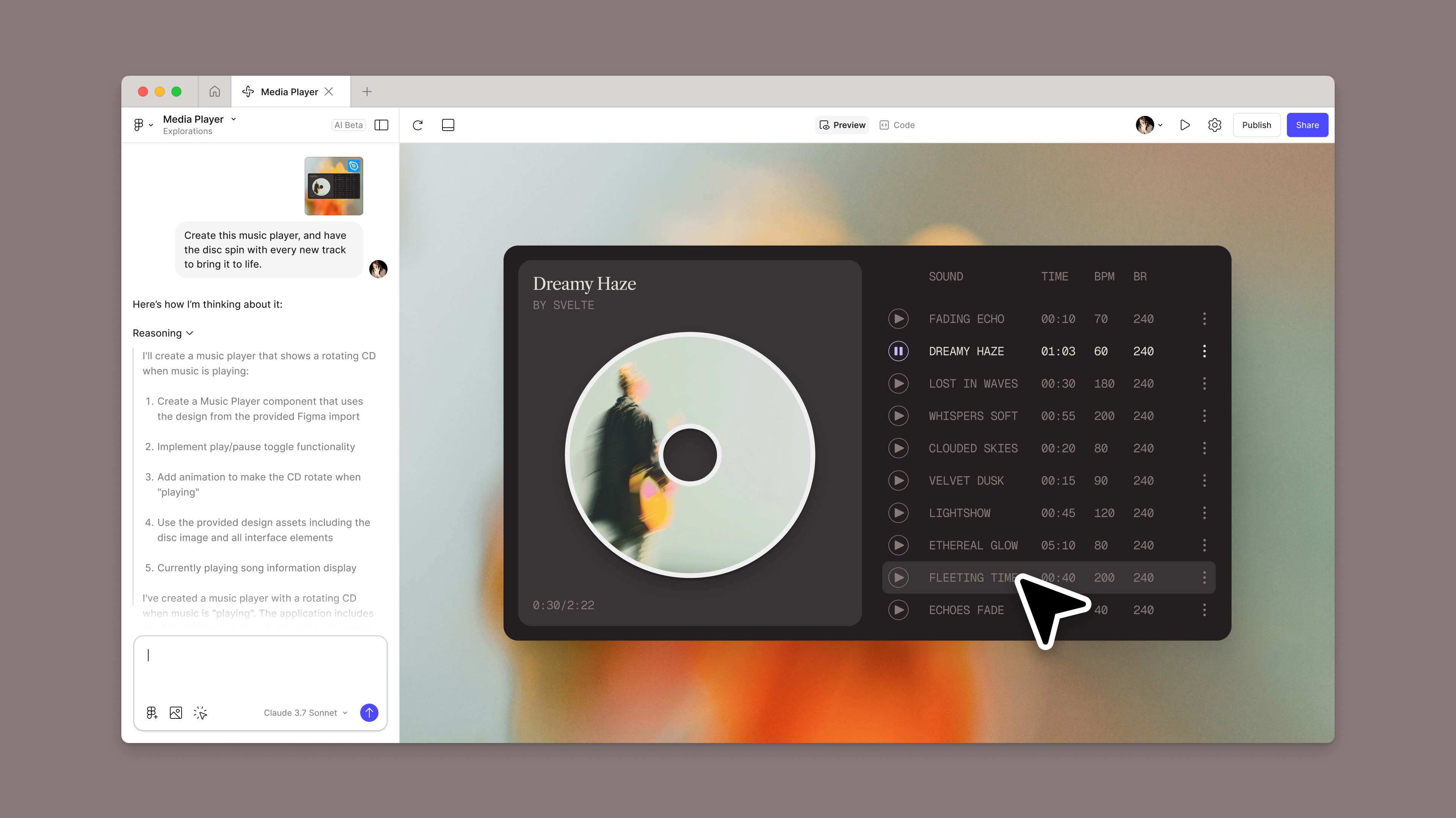
Introducing Figma Make: A new way to test, edit, and prompt designs
Version one: Single video playback
Facing a tight timeline, and knowing that a vast majority of marketing assets feature only one video, the team decided to support a single video to start. In an asset, that video may live behind a logo or a bit of text like “50% sale,” so instead of tying the playback UI to, say, the center of the frame—where it might obscure another element—they decided to fix it to the video itself. But since users can drag videos around on the canvas, they needed to account for multiple states: when the media is in frame, partially out, or completely outside the parent container.
There were other variables, too. What if a user enlarged the video so much that the playback controls awkwardly hovered somewhere else on the canvas, while the media itself was cropped to the frame? What if the user were working on multiple assets at once in grid view, and the controls overlapped with another asset? Natasha had an idea for containing the UI within the frame, and allowing it to fade in and out depending on video placement, but when she tried to explain this behavior to the engineering team, it wasn’t coming across. “This kind of design logic is nearly impossible to prototype directly in Figma Design, and building it in another tool would’ve taken hours,” says Natasha. “At this stage, I was executing. I needed to bring it to life.”
Natasha didn’t have to start from scratch. She brought in an existing Figma Design frame with the UI already mocked up, so Figma Make could build from a real starting point. Then she used this prompt:
Implement a draggable media frame with constrained playback UI and visibility logic.
Draggable frame behavior:Inner media frame should be draggable within and beyond a fixed parent.Any portion outside the parent fades to 20% opacity (no clipping).
Playback UI badge positioning:Badge stays pinned to the top-right of the media frame.If it would render outside the parent, reposition it to stay visible.
Badge visibility logic:If less than 20% of the frame is visible, fade out the badge.Fade it back in when visibility increases.
Use video source from: https://cdn.pixabay.com/video/2024/03/31/206294_large.mp4
With this prototype, Natasha achieved not just clarity, but also buy-in. “I could show working code, so the engineers could understand the scope and feasibility,” she says. “That transparency turned what could have been a vague ‘we’ll see’ into a prioritized feature. It helped me meet the team where they are, bridging the gap between design intent and engineering effort.”
That transparency turned what could have been a vague 'we’ll see' into a prioritized feature. It helped bridge the gap between design intent and engineering effort.
Midway through the project, however, the team got a happy surprise: After more technical investigation, the engineering team found that it wouldn’t be out of the question to support multiple videos in a single Figma Buzz asset—all in time for the target release date. “We wanted to give users as powerful a tool as possible, so we decided to go for it,” says Natasha. But, the tradeoff was that the team needed to rethink all the design decisions they’d made so far.
Version two: Playback on multiple videos
Say someone creates an asset with a collage of videos to tease a new clothing collection. In this case, should the user click to play each individual video, or click one button to preview them all at once? The team decided to go with one overall control to minimize the UI, avoiding the risk of covering up other design elements—and giving the user a more holistic experience. This meant moving playback controls back in-line with the parent container, instead of pinning it to individual media.
This then brought up the question of where those playback controls should live. To make sure they didn’t interfere with the design, a product manager suggested that the UI move to the space just above a frame, where metadata is displayed. “It was hard to articulate why I didn’t think it was the best decision,” says Natasha, “but I was trying to communicate that the tap target would be tiny since the surface area is so small.” Plus, if the user was zoomed out in grid view, the Figma Buzz convention was to remove the metadata, which would also remove the ability to play assets in this scenario.
Natasha spun up two prototypes in Figma Make: one to show the UI above the frame, and another to show the UI in the upper right corner—which led the team to choose the latter. “It’s not just about prototyping,” says Natasha, “but also about showing your work. Make gives me another tool to show that my design decisions are informed, thoughtful, and grounded in reality.”
Prompt for Option A:
Create a centered frame on a canvas with three stacked videos:
Top: https://cdn.pixabay.com/video/2025/05/04/276646_large.mp4Middle: https://cdn.pixabay.com/video/2025/06/17/286278_large.mp4 (64px below vertical center)Bottom: https://cdn.pixabay.com/video/2025/05/04/276624_large.mp4
Above the asset, add a unified blue #bde3ff header bar with rounded top corners, 300px wide plus 4px padding each side, positioned flush against the asset. Inside, place the asset name on the left and a 16×16px playback control on the right. Keep the header’s size fixed during zoom, move it with the asset, and hide it when zoom is below 15% (scale <0.3).
Playback controls should start, pause, and restart all three videos in sync. When a video ends, pressing play restarts it.
Zoom behavior:
Range: 3% (scale 0.06) to 100% (scale 2.0), default 50% (scale 1.0)Keep asset centered at all timesZooming should feel fluid and gradual, easing naturally in and out rather than jumping instantly
Add zoom controls styled as a compact vertical stack of dark gray rounded buttons with white “+” and “−” icons, tight spacing, hover effects, and percentage display.
Prompt for Option B:
Create a centered frame on a canvas with a background video fill and three stacked videos on top:
Top: https://cdn.pixabay.com/video/2025/05/04/276646_large.mp4Middle: https://cdn.pixabay.com/video/2025/06/17/286278_large.mp4Bottom: https://cdn.pixabay.com/video/2025/05/04/276624_large.mp4
Add a title “Instagram story post” outside and above the top-left of the asset with an exact 8px gap, counter-scaled so it stays the same size at all zoom levels without colliding with the asset. Inside the asset’s top-right corner, add a 32×32px playback control with exactly 4px margin, also counter-scaled. Playback controls should toggle between play, pause, and restart states, controlling all three videos in sync; when a video ends, pressing play restarts it.
Implement zoom functionality:
Range: 3% (scale 0.06) to 100% (scale 2.0), default 50% (scale 1.0)Keep asset perfectly centered at all timesZooming should feel fluid and gradual, easing naturally in and out rather than jumping instantlyHide playback controls when zoom <10%
Ensure the title and controls remain attached to the asset at all zoom levels, keeping consistent spacing and size while moving together with the asset.
Version three: Playback interactions
Once the team had pinned down where the playback controls would be, the next step was deciding how they would behave when the user hovered or clicked away. They looked at the way videos worked in Figma Slides and FigJam, but kept in mind that those heuristics wouldn’t necessarily translate. “We didn’t want to automatically inherit heuristics from our other products because Figma Buzz is a completely different use case,” says Natasha.
In Figma Buzz, for example, a user needs to move around the canvas and interact with multiple assets at once to get a full sense of a campaign. The team decided that videos should keep playing even if the user deselects the frame—but that the playback controls would fade out. “There was so much nuance with how the playback resets,” says Natasha, who used Figma Make to help fine-tune the heuristics with the engineering team. Now, the UI appears on hover, disappears when the cursor moves away, and reappears as a reset button when the video ends. But, if a user clicks away and clicks back, it becomes a play button again. “I love using Make at the refinement phase, when I’m tightening details that make a design sing. It gives me a way to shape and ship those details, not just prototype them,” says Natasha.
For this prompt, Natasha sent each section as individual prompts in sequence:
Create a centered canvas view with two assets side by side (100px gap), vertically centered in the viewport and not overlapping.
Left asset: “Instagram story 1”
Place the title outside the asset, top-left, with an exact 8px gap.Inside the asset, use three videos (stacked or positioned per your default layout):Top: https://cdn.pixabay.com/video/2025/05/04/276646_large.mp4Middle: https://cdn.pixabay.com/video/2025/06/17/286278_large.mp4Bottom: https://cdn.pixabay.com/video/2025/05/04/276624_large.mp4
Add a playback control in the top-right inside the asset with a 4px margin.When playing, show an expanded control (32px height) with current time / total time and a pause button; when paused show play; when ended show the restart icon in the same expanded control.Clicking play while ended should reset to 0:00 and start playing.Limit playback to 10 seconds (artificial cap); end and show restart at 10s.While playing, hide the control when the pointer is not hovering the asset; always show it when paused or ended.
Right asset: “Instagram story 2”
Background video fill using: https://cdn.pixabay.com/video/2024/03/31/206294_large.mp4.Place the title outside the asset, top-left, with an exact 8px gap.Add a playback control in the top-right inside the asset with a 4px margin.When playing, show the same expanded control (32px height) with current time / total time and a pause button; when paused show play; when ended show the restart icon in the same expanded control.Clicking play while ended should reset to 0:00 and start playing.Limit playback to 5 seconds (artificial cap); end and show restart at 5s.While playing, hide the control when the pointer is not hovering the asset; always show it when paused or ended.
Selection behavior (both assets):
Clicking an asset selects it; show the blue container treatment for the selected asset; clicking the canvas deselects.Selecting an asset must not auto-play video.If a video is playing and you deselect the asset, keep playing; only stop on pause or when it naturally reaches its (capped) end.If a video has ended, then you deselect and reselect the asset, the control should reset to the play state (not restart).
General:
Titles and controls are positioned relative to their asset; they should not collide with content.Use consistent icons across both assets (play, pause, restart) and identical control behavior.All time displays use MM:SS formatting.
The final version
The playback experience for videos in Figma Buzz speaks to the distinct needs of marketing teams—that is, to add motion to designs, preview assets, and move between altitudes. “Buzz is growing to match the reality of today’s campaigns, giving teams the ability to move at the pace of their ideas,” says Natasha.
Figma Make was instrumental in making the video interface feel intuitive. It helped to prototype complex interactions and sped up designer-developer handoff, but Natasha thinks her team is just scratching the surface of the prompt-to-app tool. “There’s something exciting about the open-endedness of Figma Make,” she says. “It invites teams to experiment, stretch their thinking, and come up with new ways of working.”
Figma Buzz With Figma Buzz, brand designers and marketers have a shared space to build beautiful, on-brand assets at scale. Today, all Figma AI features and products are moving out of beta, including Figma Make—which is now available for everyone to try. Here’s how teams are using the prompt-to-app tool to dream bigger, move faster, and work better together.
Figma Buzz is where design and marketing teams co-create

Prompt, prototype, perfect: Figma Make is now available to all users