The future of design systems is accessible


In the third part of our series, we talk to design system and accessibility experts about making inclusive systems a top priority. Previously, we covered complexity and automation.
Share The future of design systems is accessible
Hero image by Andreas Samuelsson.
As of 2022, only 3% of the internet was accessible to people with disabilities—design systems are ostensibly the best solution to move the needle upward. If everyone is using the same kit of parts and following the same set of rules, surely it should be easy enough to weave in accessibility guidance as well, right? (Right?)

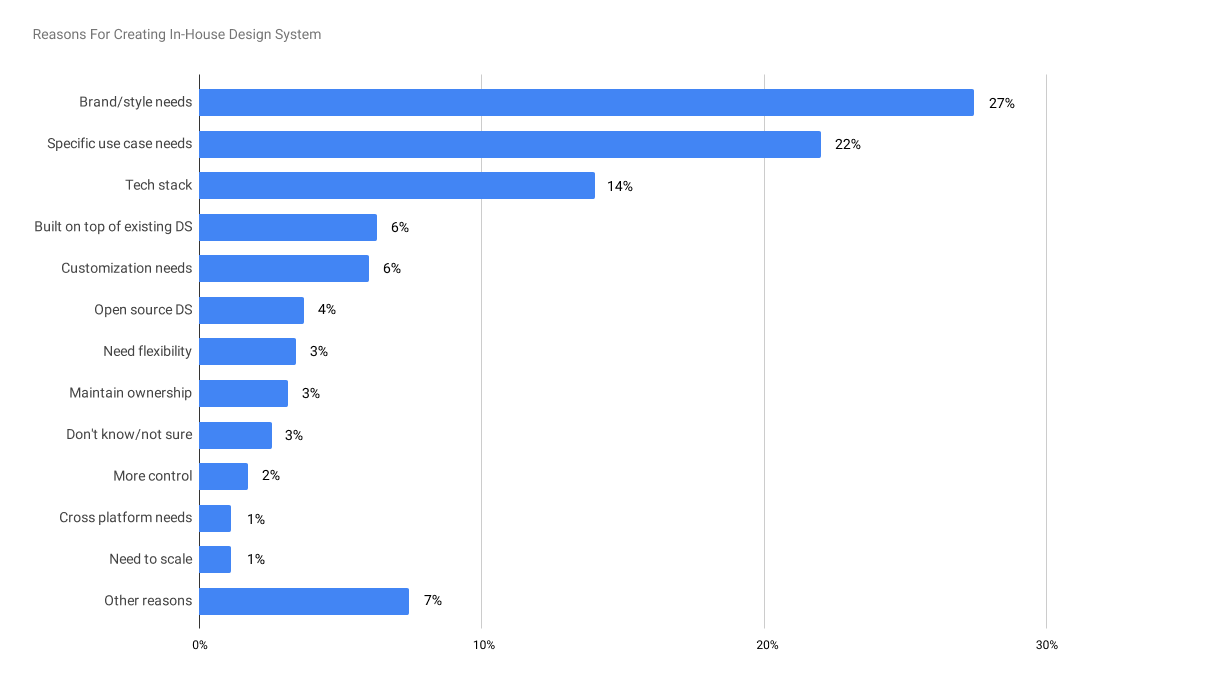
1. What drives in-house design systems creation?
Percentage of responses providing reasons for creating in-house design systems from Material Design’s State of Design survey (2020).
There’s reason to believe that this long-sought future is now closer than ever. More companies are investing in in-house design systems—up 22% in 20201 as reported in Material Design’s State of Design survey, and likely higher now three years later. One of the main motivations for this uptick is their ability to power accessibility efforts at scale. In that same survey, 47% of respondents2 say that their design system included accessibility guidelines—again, a substantial increase from the previous year, when accessibility was grouped under ‘Other’ (8.4%). Now that there are more tools, well-established standards such as the Web Content Accessibility Guidelines (WCAG), and ever-compelling legal ramifications, we may finally move that needle.

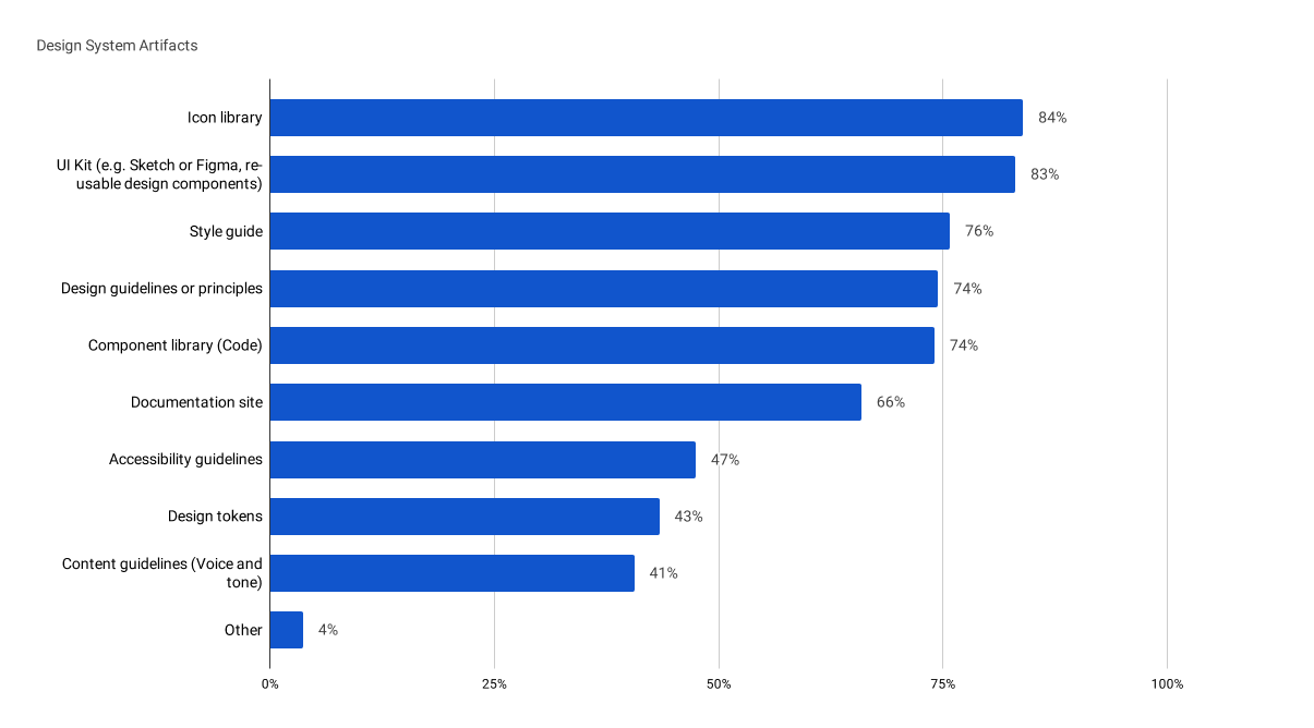
2. What’s included in a design system?
Percentage of responses for a specific artifact included in their organization’s design system also from Material Design’s State of Design survey (2020).
Design systems and accessibility: The perfect pair
With one billion people globally living with disabilities and holding $1.2 trillion in annual disposable income, accessibility is becoming increasingly hard for companies to ignore. Many organizations are starting to understand the importance of making their products accessible to all, what Forrester calls the “digital accessibility opportunity.” Creating accessible products is more than just a box to check—it's a chance to pave the way for growth, establish credibility, and build trust with consumers.
“Design systems are a perfect pair to accessibility,” says Anna Zaremba, Senior Design Lead at eBay. “Accessibility can be baked into every part of a design system, from carefully tested foreground and background colors to individual components.” By promoting consistency, thorough documentation, and ongoing feedback, design systems provide the perfect scaffolding for implementing accessibility best practices across an entire product ecosystem. They also make it easier to roll out changes at scale by propagating adjustments made at the system-level across all instances.


Responsible AI in accessibility
With the increasing ubiquity of artificial intelligence (AI), many design systems teams are turning to the technology to improve accessibility for users. The result is a new crop of AI-driven tools Plugins, widgets, and tooling—the second edition of our series on the future of design systems. Previously, we talked about navigating complexity. Here, we chat with folks across the industry on how plugins, widgets, and tooling are changing the landscape, and what they hope for the future.

The future of design systems is automated
Accessibility overlay
An accessibility overlay is JavaScript that is written with the goal of helping to fix accessibility issues on a website or web app. Overlay code is applied after the website or web app is rendered by the browser, to transform it.
AI can be a useful tool for automating certain aspects, but as we’ve seen with other use cases, it often falls short when it comes to tasks requiring human understanding and judgment. Many “plug and play” accessibility widgets and overlays negatively impact accessibility, leading to lawsuits for more than 400 companies who used them. In many of these cases, simply implementing a clear navigation structure and semantic code would have created a more inclusive product than the havoc wrought by these solutions.
VoiceOver
VoiceOver is a screen reader built into Apple Inc.'s macOS, iOS, tvOS, watchOS, and iPod operating systems. By using VoiceOver, the user can access their Macintosh or iOS device based on spoken descriptions and, in the case of the Mac, the keyboard.
Chancey Fleet, a blind library-based tech educator in New York, says there are some responsible implementations of the technology. She cites Apple's Screen Recognition which works in tandem with VoiceOver to detect the layout of elements in the user interface, including apps that haven't been optimized for the tool. “Apple really wants developers to engage in more accessible design and development practices. Screen recognition is something under the control of the user's discretion. They can enable it and see if it'll solve a problem,” Chancey explains. “It is not an attempt to siphon market dollars away from genuine accessibility efforts. It is a way to furnish the users with an extra tool.”
Accessibility tools have the power to make life easier and reduce friction, but can also foster new dependencies and new limitations.
With image recognition continuing to improve, Chancey is optimistic about AI’s potential for tackling unlabeled images and generating descriptions for people who are blind or visually impaired. “I don't think that AI is going to be able to deal with subjectivity or emotional valence anytime soon, but I do think it will be able to help interpret elements with a fairly controlled visual vocabulary, like infographics and bar charts,” Chancey says. “Accessibility tools have the power to make life easier and reduce friction, but can also foster new dependencies and new limitations. I am very hopeful that in the near future, AI and machine learning will continue to handle more things that right now require human intervention to ensure that a product is inclusive.”

The best products are born accessible
Building in accessibility from day one means beginning with a design system that’s accessible by default. By making sure that every design component and code element is aligned to accessibility standards at the outset, companies can prevent access issues further down the road. Lucy Greco, accessible technology evangelist for UC Berkeley and lead for University of California’s accessibility initiative, says teams must consider all aspects of accessibility when making inclusivity foundational to a design system. “Can a person with a disability use your design system without a mouse? Are components drag and drop?” she asks. “If they're drag and drop, can they use a mouse emulation keyboard to complete that action?”
That concept is what led eBay’s Anna Zaremba and several teammates to create Include, a plugin that makes it easy to integrate accessibility from the start. The tool takes aim at accessibility annotations, making them easier for designers to spec and for developers to understand requirements. “We wanted to figure out how to ensure that inclusive design is part of our design process,” says Anna. “We found that accessibility can be overwhelming, especially for newer designers who are just joining eBay and may not be familiar with industry-wide best practices.”

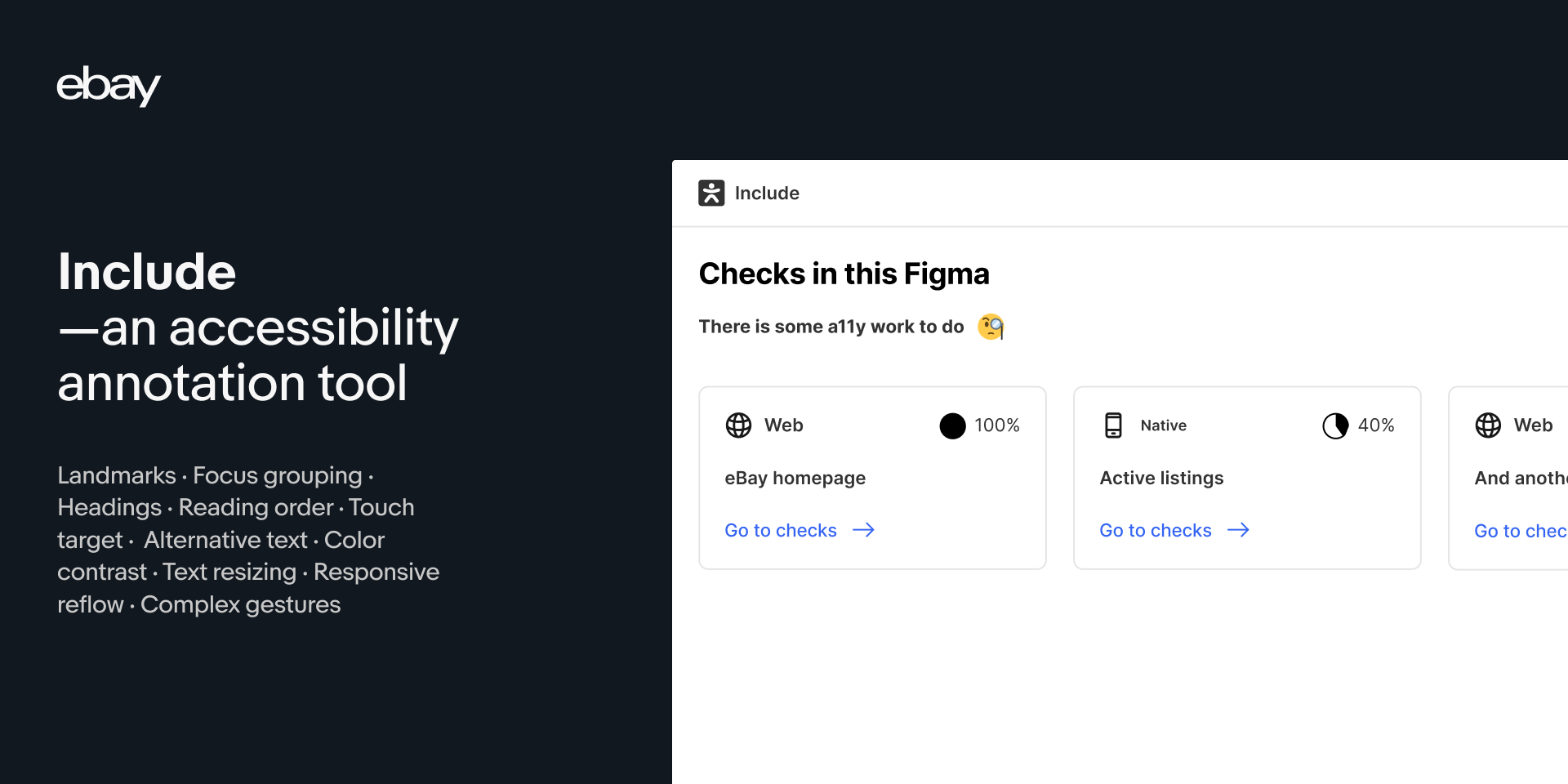
Include is a tool built to make annotating for accessibility (a11y) easier—easier for designers to spec and easier for developers to understand what is required. The intent is to have accessibility considerations included during the design phase of any project, and to help with the designer-developer collaboration. Ultimately creating digital experiences that anybody can use!
The team prioritized efficiency, choosing to build a plugin that could integrate into existing design and developer workflows. Using the tool, individuals can select a top-level frame within Figma and run the checker. From there, the tool returns a list of action items, including reasoning for each—such as a recommendation to add alt text to an image marked as informative. These recommendations were informed by commonly seen issues and bugs as well as accessibility priorities from different disciplines across eBay. “Everyone has to start somewhere, and I hope the plugin helps with making it easier,” says Anna.
Anna and her team decided to open-source the plugin, making it free for anyone via the Figma Community, as well as releasing the code on GitHub. “eBay has a strong culture of sharing our tools as a way to give back to the community,” says Anna. “We knew that making this tool open source could have a wider impact in helping others improve their products and create better digital experiences.” Open sourcing has other benefits, too: Not only does the team receive helpful feedback, it also opens the door for future contributions. Anyone can fork the code, build on top of it, and release it back into the community. “I'm really grateful to everyone who has spent time, tried it out, and took the time to write to us already,” says Anna. “The more people who engage with it, the better it will get.”
Accessibility is a top priority
So how can companies prioritize accessibility? Just as eBay’s plugin educates teammates, it’s important to create a culture where everyone has a working understanding of accessibility. To do that, people with disabilities need to be in the development and design pipeline, both as workers and as testers. “When you have a person with a disability on your team, you’re less likely to have an inaccessible product,” says Lucy. She adds that these teammates should be involved in all aspects of the creation process, beyond end testing, citing a well-known saying within the disability community: “Nothing for us without us.” Chancey recommends that, in addition to a robust program of compensated user testing, internal teams need authority to impose accessible practices, and block releases that make accessibility worse.

While these are moves in the right direction, there’s still a long way to go towards making tech more inclusive. Lucy says, “My hope for the future is that more design systems ensure that their component libraries are built to be accessible from day one, and that they’re tested by people and not just machines.”

For more design systems articles, check out DesignSystems.com.