The designer’s handbook for developer handoff


A tactical guide to collaborating with your developer counterparts, including common pitfalls, practical tips, and guidance on when to lean in.
Share The designer’s handbook for developer handoff
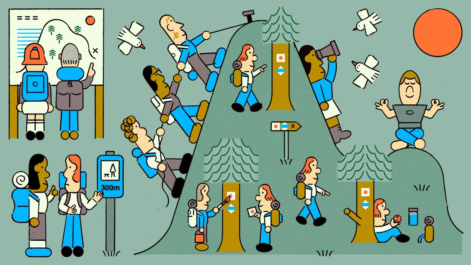
Illustration by Jay Daniel Wright
Effective collaboration between designers and developers is make or break for product teams—and the products they build—but it can be hard to align their different motivations, incentives, and skillsets. While developers prioritize performance and stability, designers optimize for consistent, elegant interfaces. Handoff, the process of going from design to build, is where these differences become most apparent.
In this 7 minute snippet, Jake shares a model for design-development collaboration at any scale. “Design is ‘what we want’ and development is essentially ‘what we have,’” says Jake.
Bridging the gap requires fostering curiosity, keeping an open line of communication, and having a point of view on what “good” looks like. But how do these principles translate to daily work? Based on conversations with teams across industries and of all sizes, we’ve distilled our learnings into four focus areas.

Dive deeper into the principles of effective design-development collaboration in our guide to redefining handoff.
1. Align on what you’re building
It’s never too early to bring a developer in. Whether it’s an initial wireframe or a gut check on feasibility, adding an engineering perspective (or two) can be an accelerant. Not only can developers flag technical logic that might make seemingly simple design decisions hard to build, but they can also play a more proactive role, identifying opportunities you may otherwise miss. This type of feedback is most helpful when your ideas are still pliable; the earlier the input, the easier to address.
Goals
- Align on scope
- Understand constraints
- Identify potential issues—or opportunities
Build out flows as wireframes
One of the best ways to get feedback on a design direction is to ground your ideas with illustrative wireframes, either in Figma or FigJam. Figma allows you to create more concrete visuals, while FigJam is ideal for when you want to keep things more gestural or provide a neutral ground for outside collaborators to give feedback. Plus, a departure from “realistic” visuals can help to maintain focus on the bigger picture and make cross-functional participation more attainable.
GitHub uses the code block tool in FigJam to align on component APIs in their design systems documentation and development workflows.
Ask the right questions
Developers are great at sniffing out redundant work. They can easily identify opportunities to consolidate or extend existing functionality to enhance designs with minimal engineering effort. But getting to this level of detail often requires some prompting—they won’t know what you don’t know, so a few pointed questions go a long way.
In practice: How to prompt your developer counterpart
- Ask about constraints, including potential friction at the data layer—one driver of complexity that often goes under the radar
- Have them flag the different states you might be missing when presenting a sequence of screens
- Nudge them to identify underlying patterns that you can reuse from other parts of your product
Plug into developer workflows
Developers are constantly context switching and trying to tap into the elusive flow state. One of the best ways to build trust—and get what you need—is to meet them where they are. Feel free to ask your developer counterpart about their preferred workflow, but regardless of what that looks like, embedding Figma in the other tools they use is a good start.
In practice: How to get asynchronous feedback
- Mention developers by name in comments
- Mark sections of wireframes as ready for dev
- Utilize audio chat in a file for quick syncs
- Send links to prototypes for more evolved drafts
- Embed prototypes into Figma Slides for an easier-to-digest artifact
2. Decide how to build it
It’s crucial that the way you’re thinking about a design is aligned with how developers are going to build it. After all, the output of a design process is not simply the design in a Figma file, but also an interactive user experience. In the same way that architects have a good understanding of the materials, cost, and tools that builders will be using, you too can recognize the frameworks, constraints, and opportunities that your developer counterparts work with.
Goals
- Align your thinking with how your developer will approach implementation
- Build for responsiveness and accessibility
- Make your designs differentiated
Understand the many forms your designs can take
The web is responsive by default, and designing something that can manifest in many forms is no easy task. For a developer, building a responsive layout doesn’t just come down to targeting specific breakpoints; it’s also about making sure designs render properly in the space between breakpoints. Something as simple as “25% width” might actually be far more convoluted based on context. One particularly thorny example is:
width: calc(25% - (var(--gap-size) * 3 / 4));
The above code describes the width of the item being “25% of the container, minus the width of three gaps split four ways.” In CSS, calc() allows developers to describe dimensions as calculations rather than specific values.
Now imagine that column is ⅓ on tablet, ¼ on desktop, ½ on mobile—the implications quickly add up. It’s best to think through this behavior carefully with the implementation complexity in mind. Often, half of the work of going from Figma to build is related to layout, so it’s better to understand and defer to existing systems where possible.

Annotations in Figma allow you to call out details that might make implementation more complex.
Anything a developer builds must exist in many forms, whether they are accounted for or not. While some user settings may be more common than others, there is nothing preventing a user from resizing their window, increasing their base font size, or even providing custom theming. This inevitable variance is one reason developers hold onto design decisions a bit more loosely. When designers size a parent frame, on the other hand, they are committing to a snapshot set of constraints for their design in order to focus, iterate, and make design decisions. In this context, it can be easy to lose sight of the bigger picture.
In practice: How to zoom out
- Consider how elements will transform between different breakpoints
- Be clear on non-negotiables versus nice-to-haves
- Create an annotation category specifically for layout
- Learn how features like aspect ratio lock and min/max dimensions influence development

Una Kravets and Adam Argyle share why responsiveness is bigger than breakpoints at Config 2023. They talk about an evolution to the concept that includes responding to user needs and preferences.
Anticipate the invisible states
We all know the impulse to make your mockups look as polished as possible with high-definition images or perfect snippets of text. Design intent breaks down, however, with the inevitable edge cases that come along with user-provided content, whether it be orphaned words, low-resolution photos, or partially filled out profiles.
Under certain constraints, even anticipated forms of content can feel different than expected, so it’s important to design with these variables in mind. How are you thinking about text wrapping revealing undesirable line heights, truncation, and user font size preferences? Anything you can do to bring the implications of build into your designs will ultimately improve quality and prevent backtracking post-handoff.
In practice: How to account for real-world implications
- Use content variables with modes for text samples across languages or text lengths
- Fill your designs with realistic content for text values with Figma AI
- Generate images that aren’t biased to fit in with the surrounding UI
Design with accessibility in mind
Accessibility is a fundamental pillar of good design. Beyond shared concepts like color, developers make decisions about the underlying structure of a design that consider the user experience as much as the visual layer. For example, the semantic nature of HTML means that large text may not always be treated like a headline by a screen reader, or in the context of a web page. In some systems, links in a block of text are actually distinct, functional components in code. A grid of cards may be expressed as an unordered list. While you may not explicitly call these details out in your design, your design decisions influence the way your developers build them. Awareness of these “invisible” concepts is important, and a great opportunity to engage with your developer counterparts.
Annotating the behavior of interactive elements can also aid accessibility. For a clickable element, the behavior of an HTML anchor element is different from that of a button. Anchors are used for URL changes, while buttons are used for other forms of interactivity. Having an understanding of these fundamental differences tells you what information to give a developer. You can annotate a link with the destination URL or add any information about analytics on click. If a card is clickable, it is best practice for none of its descendants to have different click events. This becomes increasingly clear when you begin to think about the tab order of elements you are designing. This is not simply a limitation of the browser context, but also an opportunity for you to bring more design intent to complex interaction flows.
In practice: How to be proactive about accessibility
- Use our new accessibility color picker to ensure proper contrast for readability
- Ask developers how concepts show up in code
- Edit annotations in Design mode and create an “Accessibility” category
Lean on developers as strategic partners
Thinking about implementation isn’t just about adopting a set of limitations, but also considering opportunities to differentiate your product. Developers can bring attention to web capabilities you may not be aware of. For example, colors and gradients are quite advanced on the web today, and developers may have some interesting takes on patterns around animations, typography, grid-based layout, and container queries.

In this memo on where the web is headed, Jake shares the technologies he’s most excited about, along with guidance on how we can tap into the browser’s creative potential.
In practice: How to harness developer expertise
- Ask developers about which concepts may be a design differentiator
- Be curious about new patterns and approaches to layout
- Prompt them to share which front end technologies are most exciting to them—a shift in constraints can create innovative approaches
3. Adopt a shared language
Aside from tools and workflows, different communication styles between designers and developers can lead to misalignment. Take something as seemingly simple as color usage. A designer might use the latest variables in Figma, assuming that they match the codebase, only to find that the colors look completely different in the build. Even if the developer applies the correct token, the underlying value may be outdated. Worse, they might manually choose a different token to match the design, only for future updates to break it again. How do we identify potential areas of misalignment early, ensuring that design concerns and existing code patterns are aligned before handoff?
Goals
- Lean on existing patterns and components to reduce unnecessary work
- Keep design and development in sync
- Align design and code
Leverage your design system as a foundation
Design systems exist to boost efficiency and reduce inconsistency, but they only live up to their promise when designers and developers use them as intended. Your system already includes common patterns with values aligned between design and code—whether in component names, properties, or variables. While they may not always appear as a 1:1 match, they are structured to provide the right information in the right context.
For example, in your Figma library you may use groups or slash-naming to sort and apply variables more easily, or use instance swap component properties in combination with booleans. In code, these would translate differently—the boolean and swap instance might be handled by a single prop and only appear when true, while variables would be formatted differently to correctly apply styling. However, by leveraging features like code syntax and Code Connect, the system ensures that designers see what they need in Figma while developers get the structured data they need in code, bridging the gap between both worlds.
But what happens when an existing component or pattern doesn’t completely meet the needs of the design? If it requires a small change, consider modifying an existing component, and be sure to follow the process your design systems team outlines to make that change. For a larger change that requires a new design and build, collaborate with your developer to determine what system resources it can leverage, and if it should be included in the system or stand as a one-off solution. Document the use case, proposed changes, and how to best contribute both the design and code assets.
In practice: How to map to your design system
- Use code syntax or Code Connect to link design-friendly names with existing code
- Default to modifying existing components, rather than creating something new
- Collaborate with the design systems team for larger changes
Lean into existing conventions
When you’re doing freeform design work, look for opportunities to align with existing spatial systems for consistency and a more straightforward implementation. These may exist in Figma as grid styles or a template component you copy and detach. If not, there’s a good chance that there are existing layout conventions in code—like containers, stacks, or grids—that can help inform your design decisions.
In practice: How to leverage patterns
- Use relevant published Layout grid styles or templates from your Figma libraries
- If styles do not exist, check for documentation around ratios and spacing
- Talk with developers about existing layout conventions you can bring into design
- If you do need to create something from scratch, work with them on the best approach
Simple Design System, a UI kit from Figma, contains a flex component to handle auto layout-like flows with default responsive behavior, and a section component for full bleed page sections. Many systems use component language to describe patterns like these.
Address differences between design and code
Text styles do more than just set a font family, size, or weight—they help establish structure. For example, you may have text styles like heading, subheading, and title in your Figma library. It can be tempting to tweak a style or deviate from the appropriate one to control visual weight, but try to refrain. Each style serves a purpose.
When it comes to translating the text styles to code, text objects like headings impact accessibility and the hierarchy of the page. If it’s not already clear how a style maps to code, this is an opportunity to discuss and align with your developers—and potentially your design systems team. Should that title in the design map to an H1 or H3? Or should it use a typography abstraction with a specific prop?
What about inline elements, like links, where text can introduce another layer of misalignment? A Figma style might apply an underline, while in code, a dedicated link component may handle the interactions. What happens when a heading also needs to be a link? Without clear alignment or guidelines, there’s room for inconsistencies to creep in. Align on expected behaviors early, and document how they translate between design and development to help everyone stay on the same page.
In practice: How to reduce re-work
- Use styles from the design system as intended, and verify how they’re implemented in code
- Align and document intended mappings or behaviors
- Remember that code implications could impact accessibility and hierarchy
4. Clarify intent with the developer experience in mind
By working together with a shared language, designers and developers can avoid misalignment, reduce re-work, and confidently build a well designed and technically sound product together. When it finally comes to handing off a design, there are a few concrete ways to ensure developers have everything they need to accurately translate it into code. Even if you’ve collaborated closely throughout the design process, taking these additional steps to clarify design details and intent can eliminate ambiguity, leading to a more efficient handoff and build.
Goals
- Prepare for build by giving developers all the information they need
- Reduce back-and-forth discussions
Prepare your design file
A tidy, well-prepared file sets a solid foundation for translating the design to code. This is where naming your layers—either manually or with Figma AI—can help provide clarity at a glance. Developers rely on layer names when inspecting a design and building out the structure in code. A name like “Frame 123” connotes a generic div—a basic container with no inherent meaning—and asks a developer to interpret the intent of the layer. Even naming your main layout layers—like a feature callout, main content, or a related aside—allows developers to use proper tags or attributes. Removing any unnecessary layers also minimizes confusion.
When working with visual assets like images, icons, or illustrations, pre-set the export settings for the sizes and formats the developer will need if they’re pulling details directly from the file. Be sure to communicate this as part of the handoff. If they need a different size or format, they can always add additional exports or access the raw image through Dev Mode.
In practice: How to practice good file hygiene
- Name your layers manually or with Figma AI
- Remove unnecessary layers and consider hierarchy in the layer panel
- Pre-set export settings for visual assets to be used from the file
- Annotate when objects should be used from external resource links
Check for consistent design system usage
Double check that you’ve used the correct styles and variables from your design system for things like typography, fills, and spacing, along with component properties and variants. If you’ve used the design system assets as intended, they are likely already self-documenting, often with prop alignment, code syntax, and perhaps even Code Connect. However, if you’ve deviated from the design system or detached components, be sure to share why. Component details for detached components will still be available in Dev Mode, and a comment thread can be helpful to have an asynchronous conversation about the deviation. You can also document the final details with an annotation for easy reference.
In practice: How to document components and deviations
- Ensure you’ve used the right style and variables from your design system
- Share the reasoning behind detached components
- Start a comment thread or add annotations for asynchronous notes
Annotate for better visibility in Dev Mode
Switching into Dev Mode allows you to see your design from a developer’s perspective. Make sure to annotate any key details and ensure they don’t get lost in translation.
In practice: How to give developers all the information they need
- Add spacing details, provide measurements, and state if something is a fixed value, and whether or not it’s responsive
- Identify properties that need extra attention or context with annotations so they stand out in the main Dev Mode view
- Annotate where assets are located, whether it’s an image that needs to be pulled from a CMS or taken directly from the design
Mark designs as ready for dev
After preparing and reviewing your designs, tag the relevant sections or frames with the Ready for dev status. This serves as a clear visual indicator of what’s finalized on the design side. Before handing it off, do one last review in Dev Mode to see exactly what your developer will see. If everything is clear and detailed, share the Dev Mode link with them and be available for any initial questions.
In practice: How to be ready for dev
- Add additional comments about anything that changed after the initial handoff with Dev Mode statuses and notifications
- Be available to collaborate with developers and answer any questions that may come up
What we’ve outlined here may not fit every team. Whether your process follows clear, linear stages or embraces a more fluid, iterative approach, what matters most is that you align around shared goals while respecting each other’s unique perspectives. The most successful teams don’t just focus on one handoff moment, but on gradually building a shared understanding and space for designers and developers to shape products together.