


Making the move to UI3: A guide to Figma’s next chapter


On April 30, we’ll be fully transitioning to UI3, our redesigned interface that puts your work center stage. Here’s what you need to know about the change, along with tips for a smooth transition.
Share Making the move to UI3: A guide to Figma’s next chapter
On April 30, we’ll be retiring our previous interface (UI2) as we move toward a more streamlined, powerful future for Figma. With Config right around the corner, we’re building exciting new features and experiences that will only be available in UI3, making this the perfect time to complete the transition.
We’ve been listening closely to your feedback on UI3, and we’re addressing several key improvements before the shift. These updates include replacing the “Reset others” icon to avoid redundancy, simplifying strings for boolean operations, deduping actions in the overflow menu, updating the mask icon for clarity, and reverting to a tidy up experience more similar to UI2. After the transition, we’ll be focusing on the Properties panel, building on the refinements we’re making now.
Embracing UI3
As someone who’s used Figma for years, I’ll admit—when UI3 was announced UI3 clears space on the canvas for you to bring your creative vision to life. Here’s a behind-the-scenes look at how we landed on a more streamlined and adaptable interface.Inside the redesigned Figma, where your work takes center stage
I’m not alone in finding that UI3 quickly feels like home. As Product Designer Lilit Bala notes on Twitter, “[It] honestly felt really natural to slide into. Got used to it within a couple hours.” For Digital Product Designer Joshua Guo, the change took “about one week,” he shares. “There was some muscle memory that took a while though. I pretty much love the UI3.”
Here are five improvements that changed how I work in Figma for the better, plus some additional refinements worth exploring. Whether you’re a power user or just getting started, these thoughtful updates do more than just move things around—they make Figma more intuitive and efficient.
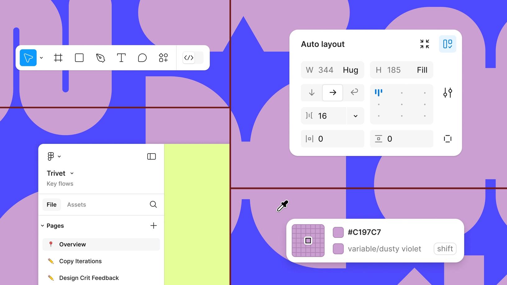
Smart eyedropper selection
The eyedropper (I) works the same way it always has—we’ve just made it smarter about variables.
The redesigned eyedropper tool has quickly become one of my favorite features of UI3. It stays with you while inspecting the canvas, lets you tab between different color models (like Hex, HSB, RGB), and now detects styles and variables. Just select an element, grab the eyedropper (I), and hover over any instance of a color, style, or variable—Figma will automatically show the style or variable used instead of just the hex value.
Why it works for me
This change keeps my focus on the canvas. Instead of navigating over to the design panel and searching for a variable, I can select a layer and use the eyedropper to inspect an existing instance and quickly apply it to my selection. As a bonus, if there’s not yet a variable for a color, I can use a shortcut (shift+cmd) to create and automatically apply a variable or style right from the canvas.
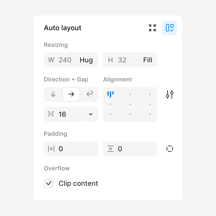
Logical layout controls
The design panel has been reorganized to group controls more logically, reducing the need to jump between different sections. Set auto layout values like width and height right alongside resizing behavior, layout direction, alignment, and spacing. Everything for managing an auto layout frame lives together—as it should.
Why it works for me
In UI2, I often found myself jumping between different panels to achieve what I wanted—resizing behavior here, auto layout spacing and padding there. Now it all flows naturally in one place. I also find it helpful to have all component details appear at the top of the design panel when selected, making it easier to manage variants and properties from one consistent place.
Minimize UI that works with you
UI3’s Minimize UI feature isn’t just about hiding panels—it’s about maintaining focus while keeping essential tools within reach. When I’m working on components or editing variants, I don’t usually need to see the layer hierarchy or list of pages. With Minimize UI, the toolbar stays handy, and the design panel appears only when needed, then disappears once I deselect.
Designer Advocate Miggi Cardona shows off some helpful UI3 shortcuts like:
Minimize UI panels: Shift \
Hide all UI: ⌘ \ or Ctrl \
Rename (while UI is min or hidden): ⌘ R or Ctrl R
Why it works for me
This approach is especially valuable on small screens where every pixel counts. It lets me focus on my work while still having quick access to essential controls when I need them.
Actions menu for everything
Power users, rejoice: Your muscle memory stays intact. The new Actions menu is similar to quick actions in UI2 and launches with the same familiar shortcuts while providing a more organized home for everything from library assets to plugins, widgets, and new AI features We’re introducing a suite of AI-powered features to help you push past creative blocks and bring your best ideas to life.
Meet Figma AI: Empowering designers with intelligent tools
Why it works for me
Think of Actions as keyboard shortcuts for, well, everything—even things that don’t have traditional shortcuts. Not sure if Figma can do something? Need to find a specific setting? Just open Actions and start typing rather than hunting through menus. Whether you want to perform boolean operations, set aspect ratio lock, or turn on property labels, it’s all a few keystrokes away. It’s like having a universal remote for Figma that responds to plain language. I can work at the speed of thought, discover features I didn’t know existed, and rarely need to reach for my mouse.
AI features that enhance your workflow
Figma’s AI features in UI3 help streamline your process, from generating placeholder content to rewriting text and automating tedious tasks like layer naming. These tools have been designed to enhance your workflow without disrupting your creative process, helping you work faster and focus on the design decisions that matter most.
Pro tip: You can search using not just images, but also rough sketches drawn with the pencil tool.

Read more about how we built AI search in Figma.
Why it works for me
- Visual search helps me quickly find existing designs and components across files by simply uploading a screenshot or selecting an area on canvas. No more hunting through endless files trying to remember where I saw that one component.
- Make image allows me to generate placeholder images that feel realistic and contextual to my designs, saving me time searching for stock photos or creating illustrations from scratch.
- Rename layers has been a huge timesaver for my workflow. What used to be a tedious cleanup task now takes seconds—just select your layers and let AI suggest contextual names instead of being stuck with “Frame 14353411.”

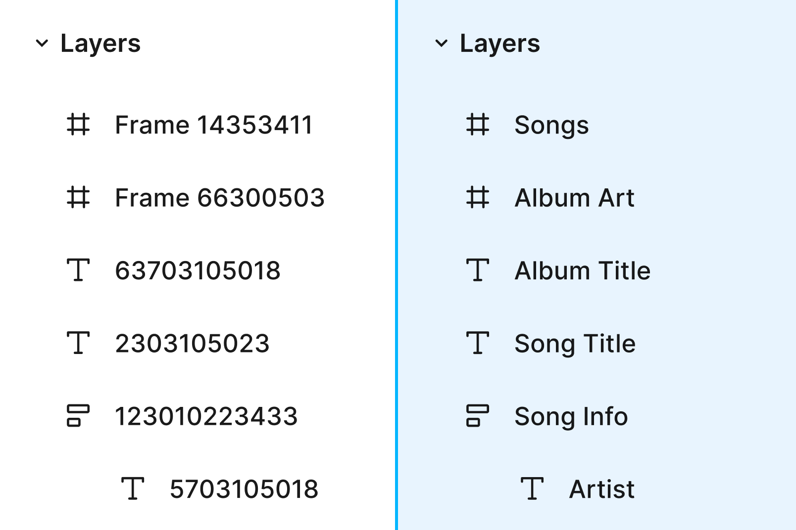
Keep your files squeaky clean with a single click by auto-renaming layers with contextual titles.
More UI3 improvements worth exploring
While I’m still discovering everything UI3 has to offer, here are some additional improvements that are already showing promise:
Designer Advocate Miggi Cardona walks us through new frame improvements in UI3.
- Smarter frame handling: Frames now auto-position at (0,0), remember your last size, and make duplicating or adding frames effortless. As a fan of starting my designs at 0,0, it saves me time when I’m iterating quickly.
- Better branch reviews: UI3 clearly shows changes to variable fields in branch reviews and flags potential conflicts before they become problems.
- Flexible panels and modals: Resizable panels and horizontal scrolling make it easier to navigate complex files, and the refreshed libraries modal allows you to browse and add libraries faster.

To turn on property labels, click the dropdown menu next to the 100% zoom percentage in the properties panel and select Property labels.
- Optional property labels: Turn them on for additional clarity when you’re learning the new UI, then toggle them off when you’re ready.
- Bottom toolbar: Moving the toolbar to the bottom of the screen frees up more canvas space and standardizes that muscle memory across all Figma products. And sure, it puts tools closer to where your hands naturally rest—but if you’re a power user, you probably haven’t clicked the toolbar in years. That’s what keyboard shortcuts are for (and yes, all your favorites still work in UI3).
Making the move
Change can be hard—but it can also be exciting. Many of these changes are small adjustments that add up to a more thoughtful, efficient interface. To help you prepare for the transition, here are some tips to make the switch smoother:
- Start with property labels on. Open the Actions menu and search for “Property labels.” They helped me locate familiar controls while getting oriented.
- Give yourself time to adjust. Focus on your most common tasks first before exploring new features.
- Try working without shortcuts initially. Spend a day or two using the UI to understand where everything lives before relying on keyboard shortcuts.
- Keep the help docs handy. Reference our Figma Learn article on Navigating UI3 to see where controls have moved.
- Be patient with yourself. Breaking old habits takes time, but the new workflows quickly become second nature.
The best advice I can give? Start making the switch now and give everything that UI3 offers a proper try! The more you dive in, the more you’ll discover how these changes improve your workflows.
Learn more about the design language of UI3 with this Figma Community file, which features the styles, components, and variables our team uses to build products. We hope it helps you explore ideas, develop plugins or widgets, or even create your own UI kits in Figma.
Want to learn more about the thinking behind UI3? Check out our deep dive into the redesign process Overhauling Figma’s interface meant reimagining how designers work. From docked panels to a new labeling system, here’s how we shaped UI3 by balancing user feedback with our vision for the future.
Figma on Figma: Our approach to designing UI3
