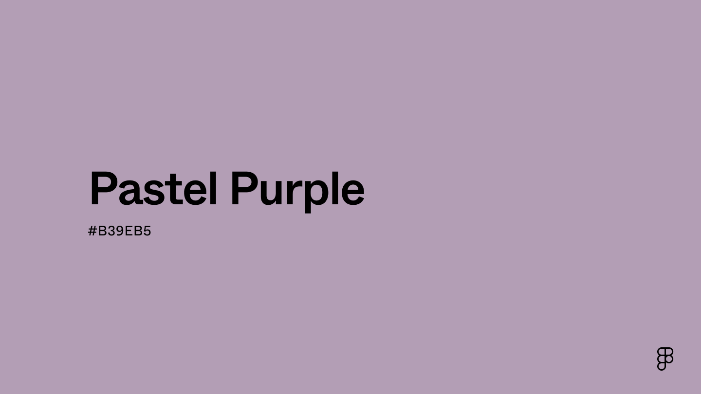
Pastel purple is a soft, calm color with a mix of blue and red tones. It sits between blue and violet on the color wheel. This gentle hue resembles shades like lavender and lilac. Perfect for creating soothing designs and evoking tranquility in projects.

Color variations
Shades
Tints
Tones
Hues
Color harmonies
Complementary
Split
Monochromatic
Analogous
Triadic
Square
Custom palettes
Whimsical Lavender
Lilac Grove
Wild Herb
Pastel Purple is defined by the following color codes and values to ensure consistency across various digital platforms and devices.
- Hex Code: #B39EB5
- RGB value: 70.2% red, 62.0% green, 71.0% blue
Accessibility considerations play a crucial role in UX and UI design color choices. Figma offers plugins in the Community to make sure your designs meet Web Content Accessibility Guidelines
For variations within the same spectrum as Pastel Purple, consider:
- Lavender (#d3d3ff): Shares a similar light hue with a soft, calming effect that resembles Pastel Purple's gentle nature.
- Light Purple (#dab1da): Mirrors the pastel quality with its soft and muted tones, creating a harmonious and subtle appearance akin to Pastel Purple.
- Mauve (#e0afff): Features a pale, delicate shade that aligns closely with Pastel Purple's gentle and airy vibe.
- Lilac (#a47dab): Offers a slightly muted purple tone, maintaining the soft and tranquil essence that defines Pastel Purple.
To complement Pastel Purple, consider pairing it with:
- Mint Green (#ADEBB3): This soft, refreshing tone balances pastel purple's muted vibrancy, creating a soothing and harmonious palette.
- Light Yellow (#FFFFC5): Its cheerful brightness contrasts well with pastel purple's subtlety, enhancing a playful and uplifting atmosphere.
- Coral (#FF8559): This warm hue adds a lively pop of color, complementing pastel purple's cool undertones and offering a dynamic yet cohesive look.
- Champagne (#F7E6CA): With its soft, neutral elegance, champagne provides a sophisticated backdrop that highlights pastel purple’s freshness while maintaining an understated charm.
While pastel purple is soft and gentle, it may clash with:
- Neon Green (#2CFF05): Its intense brightness can overpower pastel purple's subtle nature.
- Bright Yellow (#FFED29): The vividness of bright yellow creates a stark contrast, overshadowing the calm of pastel purple.
- Crimson Red (#B22222): This bold, deep hue can create visual tension against pastel purple's soft tones.
- Cobalt Blue (#0047AB): The strong saturation of cobalt blue may dominate and clash with the muted softness of pastel purple.
Contrast checker
Contrast 2.48
- Large Text
#B39EB5
- Normal Text
How you design, align, and build matters. Do it together with Figma.
| Category | ||
|---|---|---|
Fail | Fail | |
Fail | Fail | |
Fail | Fail |
Contrast 8.47
- Large Text
#B39EB5
- Normal Text
How you design, align, and build matters. Do it together with Figma.
| Category | ||
|---|---|---|
Pass | Pass | |
Pass | Pass | |
Pass | Pass |
Color simulations
Protanopia
Deuteranopia
Tritanopia
Achromatopsia
The hexadecimal color #B39EB5, known as Pastel Purple, has RGB values of R:179, G:158, B:181 and CMYK values of C:1, M:13, Y:0, K:29.
| VALUE | CSS | |
|---|---|---|
| HEX | #B39EB5 | #B39EB5 |
| RGB DECIMAL | 179, 158, 181 | RGB(179,158,181) |
| RGB PERCENTAGE | 70.2, 62.0, 71.0 | RGB(70.2%,62.0%,71.0%) |
| CMYK | 1, 13, 0, 29 | |
| HSL | HSL(294.8, 13.5%, 66.5%) | HSL(294.8, 13.5%, 66.5%) |
| HSV (OR HSB) | 294.8°, 12.7, 71.0 | |
| WEB SAFE | #204153204 | #204153204 |
| BINARY | 10110011, 10011110, 10110101 | |
| iOS - SwiftUI | Color(red: 0.702, green: 0.620, blue: 0.710) | |
| iOS - UIKit | UIColor(red: 0.702, green: 0.620, blue: 0.710, alpha: 1) | |
| Android - Compose | Color(0xFFB39EB5) |