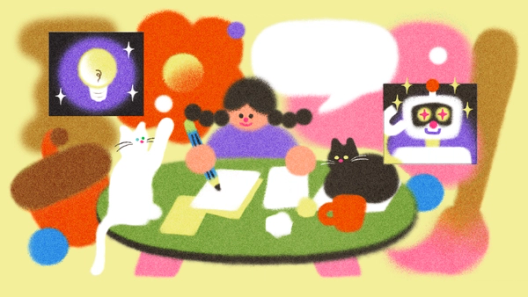
Why everyone can (and should) be a great storyteller


The best products, designs, and ideas come from people who can clearly articulate their vision, regardless of their role. Here’s why writing matters—and how to be a storyteller who brings ideas to life.
Share Why everyone can (and should) be a great storyteller
Lettering by Kurt Woerpel
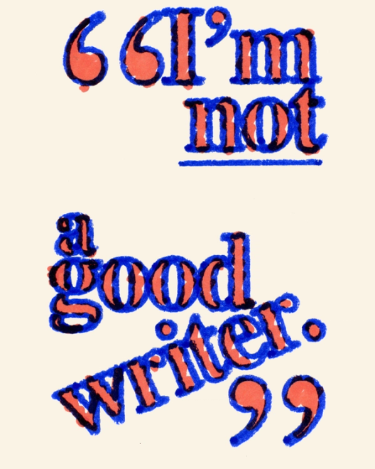
“I’m not a good writer.” As a content strategist at Figma, I hear this often—right before watching those same people expertly describe technical architecture, present new features, or pitch product roadmaps. In most cases, my work is to translate their already articulate thoughts into an article for this blog. And every time, they’re delighted to discover that they were wrong about writing.

In the words of one of my favorite poets Mary Ruefle on Shakespeare: “Yet there is one hard cold clear fact about him, a fact that freezes the mind that dares to contemplate it: In the beginning William Shakespeare was a baby, and knew absolutely nothing. He couldn’t even speak.” (The same goes for you, too.)
So why do so many of us believe we’re bad writers? Often, it’s because we’re comparing our messy first drafts to polished final pieces. Every writer starts somewhere—and that somewhere is usually pretty rough. The difference between “good” and “bad” writers is their willingness to embrace feedback, work with editors, and put in deliberate practice. It’s a muscle. Like most things, effort over time yields results.
Why storytelling matters now
The ability to articulate ideas has never been more valuable. In today’s rapidly evolving landscape, we need more people willing to think deeply and share their insights clearly. At Figma, we’ve seen how effective storytelling bridges the gap between imagination and reality—it’s also a core part of how we work. Engineers draft docs on new technical approaches. Designers present the rationale behind decisions. And product managers pen PRDs to align teams around shared goals.
This isn’t unique to Figma. Companies like Microsoft and Slack have famously embraced writing We turned six big ideas percolating around the Figma office—written from the perspective of devs, designers, analysts, writers, PMs, card-carrying generalists—and put them on record. Here’s a look at what’s on our minds for 2025.

Six memos for the future of digital creation
Think about the last feature or product you loved. Behind it was likely someone who could tell its story convincingly: why it needed to exist, who it was for, and how it would make their lives better.
Breaking down the “bad writer” myth
I get it, the blank page can be intimidating, especially with that cursor blinking back at you. But if you can think, you can write. Writing is organized thinking, a way to structure your ideas and work through problems. Writing can help clarify your thoughts and arrive at better outcomes.

And if you’re still struggling to improve your writing—try picking up a book! Read magazines, cereal boxes, really long reddit threads—anything you can get your hands on.
But getting those ideas onto paper? That’s where people often get stuck. As computer scientist Leslie Lamport puts it: “If you’re thinking without writing, you only think you’re thinking.” Here’s how to move past common blockers:
- You’re stuck in your own head: Start by explaining it to someone else verbally. (Or record yourself talking aloud.) You’ll often find your natural way of speaking is clearer than your first written attempt.
- You’re trying to say everything at once: Focus on one core message. What’s the single most important thing your audience needs to understand?
- You’re not getting enough feedback: Share early drafts with colleagues. At Figma, even our most experienced engineers and designers regularly workshop their ideas with others.
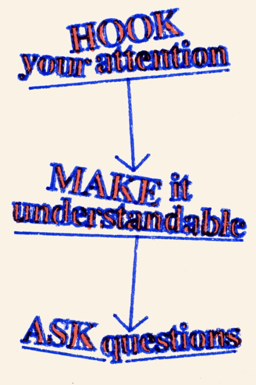
Grabbing your readers’ attention
You may have noticed, but there’s a lot of content out there. With AI generating hundreds of words at the speed of a click, that number is only ticking upward. To break through the slop, you need to give people a reason to care. The key isn’t asking “What do I want to say?” but rather “What does my audience need to understand?”
That means beginning a piece, not just introducing it, writes Verlyn Klinkenborg. Think about your favorite storytellers. They don’t start with background and context—they drop you right into something interesting. Maybe they tap into a universal emotion, begin with action, or focus on a vivid detail that captures attention. Your first sentence should raise questions that the next one answers, creating a chain of curiosity that pulls readers through.
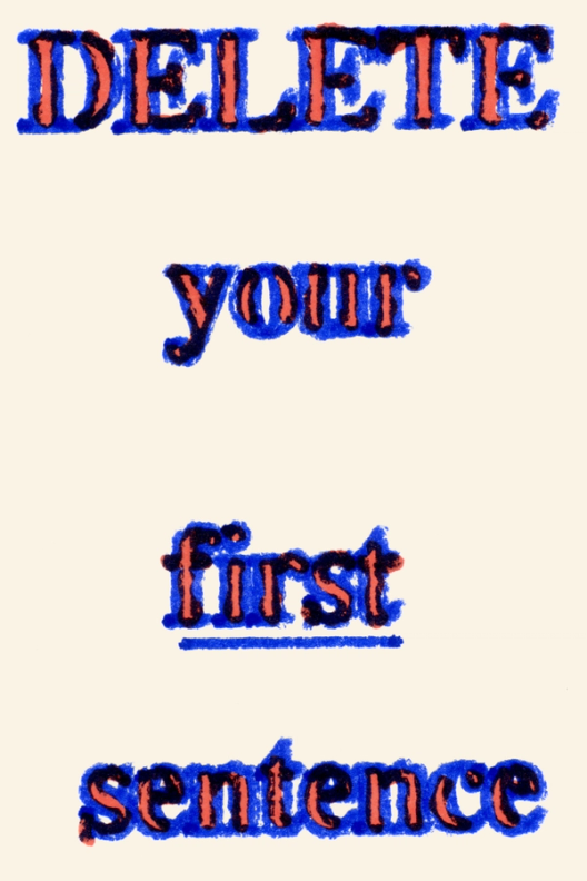
Pro tip: One of the best editing tricks is to delete your first paragraph entirely. Those opening sentences are often just you warming up—the real story usually starts later.
When our engineering team wrote about horizontal sharding Our nine month journey to horizontally shard Figma’s Postgres stack, and the key to unlocking (nearly) infinite scalability.
How Figma’s databases team lived to tell the scale
Making complex ideas accessible
At Figma, we frequently write about technical topics like server-side sandboxing In this three-part series, our security engineering team shares practical tips for deploying and operating application sandboxing techniques. First up: evaluating the many sandboxing options, and how to think about the trade-offs between them. As Figma expands to include tools for all product builders, our community has evolved—and so has our brand. We’ve overhauled our entire visual identity from color palette to illustration style, and even commissioned a new typeface.
Server-side sandboxing: An introduction
Just our type: The story of creating Figma Sans
Thierry points to the expression of the word Reality, which embodies this balance of simplicity and quirk. In an earlier version of the typeface, the capital R had a nonfunctional kink in the bottom leg that’s typical of many sans serif typefaces like Helvetica. Later, this was ironed out.
Instead of getting lost in technical jargon, she points to specific examples—like how removing a “kink” in a capital R’s leg demonstrates simplicity in action, or how adjusting the ‘g’ affects the rhythm of other letters As Figma expands to include tools for all product builders, our community has evolved—and so has our brand. We’ve overhauled our entire visual identity from color palette to illustration style, and even commissioned a new typeface.Just our type: The story of creating Figma Sans
Metaphors and analogies help make new or nuanced ideas more broadly accessible. We also sprinkle in definitions, marginalia, and hyperlinks to let readers dive deeper, should they choose. I love the idea that an article we publish could be a reader’s entry point to a new topic or field—and who knows where that might take them next. Sometimes, we’re also encountering a topic for the first time. In these (not infrequent) cases, we embrace the role of outsider confidently, knowing that it helps us ask the fundamental questions that our readers might share.


Creating a clear structure
Strong writing needs a clear structure to guide readers through your ideas. On our team, we think about structure in terms of hierarchy and flow. Whether we’re organizing a case study or crafting a product announcement, start with the basics: What does your reader need to understand first? What naturally flows from there? Group related ideas together and create clear relationships between sections.
A few principles we follow:
- Use clear signposts: Headers and subheads help readers navigate, just like labels in an interface
- Build logical flow: Each paragraph should lead naturally to the next
- Keep ideas focused: One main point per section
- Create rhythm: Vary sentence and paragraph length to maintain engagement
Remember that structure isn’t just about organization—it’s about making your ideas understandable and engaging. You do want people to read them, right?

From thinking to shipping
The root of the word essay comes from the French essayer, meaning “to try.” Like design, writing is inherently iterative—a series of attempts to refine ideas and communicate them clearly. Here’s an approach to getting ideas out of your head and onto the page:
In the words of my own editor for this piece, Jenny Xie: “It’s rare that you hit the structure right—or even fully understand what you want to say—on the first try. Feedback and revision is a cycle—but that should make each draft less painful and less precious! Because you know each pass is getting it closer! Just like product building!”
- Organize your thoughts: Map out the key points you need to convey.
- Get it down: Write a rough version without self-editing.
- Step away: Give yourself time to gain perspective.
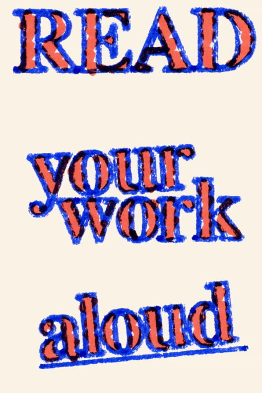
- Review and revise: Read it aloud, notice where you stumble.
- Get feedback: Share with colleagues who can pressure-test your thinking.
- Revise again: Take a look at structure and whether you’re hitting the right notes. This isn’t sentence editing, this is moving paragraphs around, slashing out extraneous prose. Zoom out, before zooming in. We typically do two rounds of edits with another editor on our team before something is ready for polish.
- Refine and polish: Phew! Finally, focus on clarity and flow. Is every sentence doing the most it can?

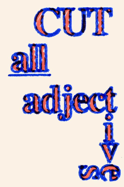
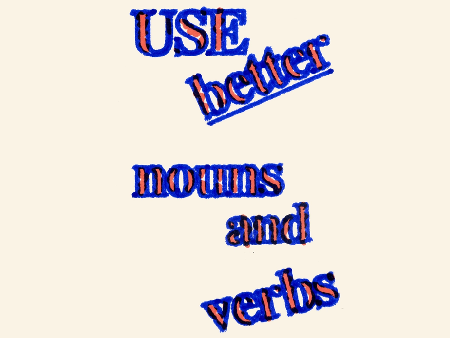
When polishing, be ruthless. Cut unnecessary adjectives. Replace weak verbs with stronger ones. Experiment with structure—sometimes your conclusion makes a better beginning. Always ask yourself: “Would this make sense to someone who isn’t already an expert?””


At Figma, we embrace this mindset in everything we do. We believe everyone has ideas worth sharing and perspectives that can shape better products. Keep your ears open for interesting details, ask good questions, and don’t be afraid to share what you know. The world of product development has enough challenges—but with more thoughtful voices like yours in the conversation, we can make understanding each other easier.
This article was originally an internal talk I gave at Figma. It uses a tweaked version of Figma Slides’ Paper Pieces template—enjoy!