The anatomy of a summer campaign: How Instacart staged a sick ’90s throwback


Fish-eye lens, oversize tees, and a free concert with Third Eye Blind—here’s how Instacart’s creative studio and marketing teams pulled off a nostalgic summer campaign featuring our favorite snacks from 1999.
Share The anatomy of a summer campaign: How Instacart staged a sick ’90s throwback
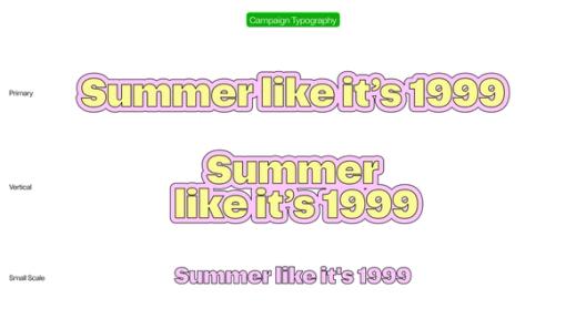
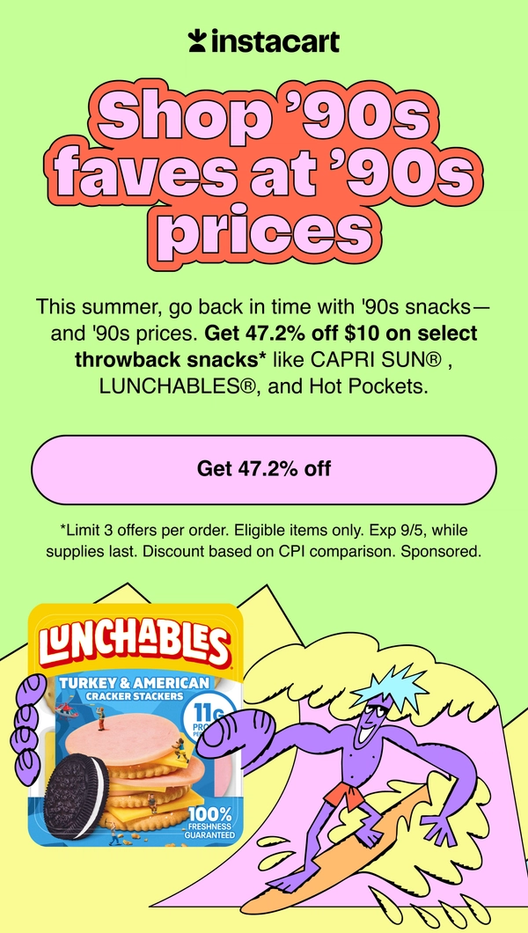
There’s no denying that the ’90s are having a moment. Whether it’s butterfly clips and choker necklaces, or baggy jeans and bucket hats, today’s fashion trends reflect our nostalgia for the carefree days of Saturday morning cartoons and dial-up internet. “People are pining for a simpler time,” says Taylor Erin, executive creative director at Instacart. So, the delivery app delivered just that—by rolling back prices on iconic snacks like Bagel Bites, Capri-Sun, and Otter Pops to what they were in 1999 as part of its “Summer Like It’s 1999” campaign. By matching bygone grocery prices, Instacart brought back that easy, summer feeling. And, it all culminated with a free Third Eye Blind concert in New York City.
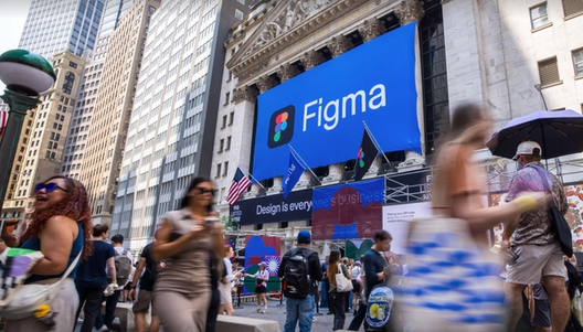
Pulling off an immersive campaign with dozens of touchpoints stretching from the app icon to the splash page, and from TV commercials to billboards, meant that every team needed to work in lockstep. “Figma was a central hub of creative work for the brand, performance, and commercial marketing pillars, as well as the app itself,” says Taylor. “It’s where we made sure everything was cohesive and held live creative reviews where we were making changes in the moment. It’s not only a platform for creatives; it’s also a platform for marketers to see what’s happening.”
Instacart’s summer campaign captures the exuberance of the ’90s with things like chunky typography, vivid colors, and fish-eye photography, while still feeling on-brand. Here’s how it came together.
An all-in-one toolkit
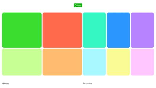
“We needed to create a system that screamed ’90s while still feeling like it was inherently Instacart,” says Taylor. “That was a really tricky balance.” To find that balance, the in-house creative studio held daily meetings to align on typography, color, illustration, photography, and logo and lockup treatments—everything that would inform the toolkit given to internal and external partners. They pulled references from far and wide to guide their explorations. “We went down a rabbit hole of ’90s design elements, way far outside our brand comfort zone, and then stripped it back to the essential parts to find the thread that was bringing these things together,” says Taylor.


The process brought together the creative team, the marketing team, and the Consumer Packaged Goods (CPG) co-marketing team to make sure that both internal and external stakeholders were on board. “At Instacart, we have a one-team mentality,” says Taylor. “There aren’t ‘ta-da’ moments of hand-off. The marketers have access to Figma, so we can have micro check-ins and be very open about the messy middle. When you move so quickly with so many different teams and people, you have to have that openness and fluidity.”
When you move so quickly with so many different teams and people, you have to have that openness and fluidity.
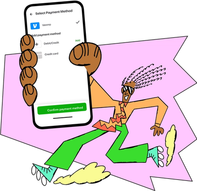
Once the cross-functional teams aligned on a toolkit, it became a living file that guided creative executions for both internal and external partners. The fact that it was housed in Figma also allowed the campaign to grow and evolve. “You never know what the toolkit is going to have to encompass until the very end of the campaign,” explains Taylor. “It was helpful to have a source of truth so people could continue to create within guidelines, and still be super expressive.” For example, when Instacart needed to promote a Venmo partnership, the team drew from established typography, illustration, and photography guidelines to create assets, including a creative ad that recalled the ’90s movie theater experience. “Having this north star toolkit made that tentacle of the campaign a lot easier to execute,” she says.
A picture-perfect photo brief
To capture the right vibe, the photography brief would need to get granular—not just about what was being shot, but also how. As the team built the art direction and shot list in Figma, they kept the campaign’s hero CPGs in mind. “We had to be specific about how the products were being featured because the brief had to go through a lot of different stakeholders,” says Taylor. “We were also weaving in illustrations, typography, and textures on top of the photography to ensure a cohesive campaign, so that added another layer of complexity.”

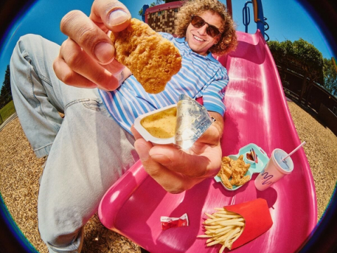

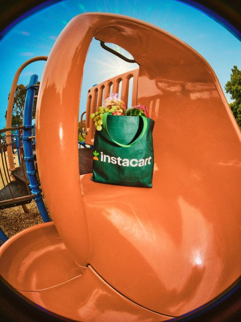

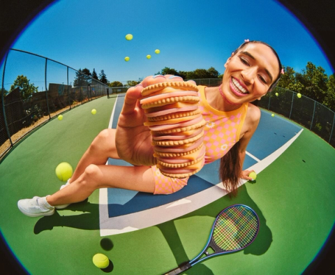

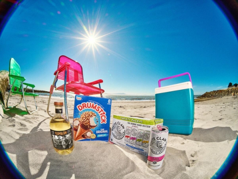
The resulting photos highlight the specific ways people enjoyed their treats in 1999: biting the chocolatey tip of a Drumstick, for example, or drinking a soda through a red licorice “straw.” Decked out in a casual ’90s wardrobe, characters explore grassy lawns and playgrounds—places that evoke the carefree spirit of being a kid in the summertime. Fish-eye lenses and low angles recall old-school music videos and skate tapes, while a sepia undertone and grainy texture complete the throwback effect.
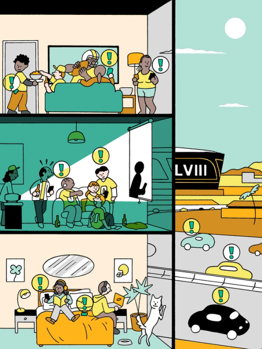
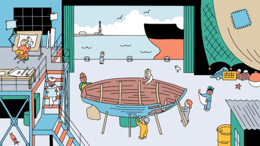
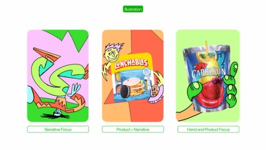
Cartoon-inspired illustrations
In some aspects of the campaign, the team got to push further than what they were accustomed to. “As our brand shifts, our illustration system should also evolve,” says Taylor. “So there was a no-holds-barred feeling to this campaign, and we went far, far away from what would be traditionally Instacart.” Drawing from the world of Saturday morning cartoons, the illustrations use forced perspective and showcase people and animals in fun, adventurous scenarios.


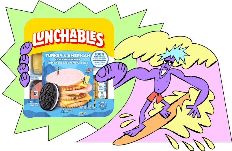
As with the photography, the team considered how illustrated scenes, typography, and accents would interact with CPGs and background textures. This meant considering visual compositions as a whole: how illustrated sticker placements, borders, angled headlines, and images would come together. “What made everything feel like Instacart, though, was the consistent color palette and level of nuance,” says Taylor.
Breaking new ground with CRM
Finding the edges of the type and illustration systems translated to some boundary-breaking moments for Customer Relationship Management (CRM) efforts, too. Instacart’s engineers usually pull from templatized designs in Figma, so “it’s a really fluid process” to build emails, says Belinda Jimenez, program manager of marketing ops at Instacart. “For this campaign, we definitely broke the mold.” Using Figma as a shared space, the CRM design team worked closely with developers to make sure designs would be feasible to build and met ADA requirements.


They had to rethink how banners and ad placement units would look across desktop and mobile, too, which is usually dictated by the existing design system. By creating new components, they found ways to quickly flex. “Figma allowed us to create many different ad units based off of one design by changing the messaging or price points,” says Robert Paige, creative director at Instacart.
Third Eye Blind as the headliners
Hosting a free first-come, first-served Third Eye Blind concert in New York City was not part of the original plan. But some of the band’s hits were featured in Instacart’s TV commercials, and frontman Stephan Jenkins loved them so much that he floated the idea of playing a concert with a setlist of songs released in 1999. “It snowballed from there,” says Taylor. That seed of an idea grew into an immersive experience with snacks, drinks, and even a ’90s-inspired makeover station featuring frosted tips, butterfly clips, and spiked gel.

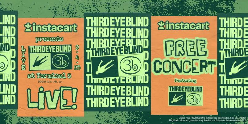
The broader toolkit, however, didn’t feel quite right when it came to promoting the concert. “We went from a more playful, innocent ’90s to a grunge aesthetic that was more in line with what a concert would’ve been in 1999,” says Taylor. They referenced actual Third Eye Blind concert posters, band tees, and type treatments, and landed on some distinct fonts that had angst and edge. An electric orange and green palette pulled it all together while upholding the Instacart brand. As a grand finale, the concert got people together to celebrate summer IRL, just like we did in the ’90s.
In the end, bringing users back to 1999 was less about any one font or illustration style—it was how countless design decisions worked together to create an undeniable vibe. “The ’90s are so important to people right now, and we wanted people to open the app and be flooded with memories,” says Taylor. On that front, they’ve succeeded with flying colors: “We’ve gotten so many organic reactions. It really hit home.”