All your questions about variables answered (and a few you didn’t even know you had)


Our latest updates to variables bring design and code even closer, and an unprecedented level of customizability to your designs. Product Manager Jacob Miller unpacks the new features and answers your questions.
Share All your questions about variables answered (and a few you didn’t even know you had)
People are using variables in ways that we could’ve never predicted, ranging from pragmatic applications In a world that can often feel stressful, Headspace, the meditation company, has given us reason to pause with its flagship app, which has made meditation and its benefits on sleep, mental health, and happiness more accessible.
Building a design system that breathes with Headspace


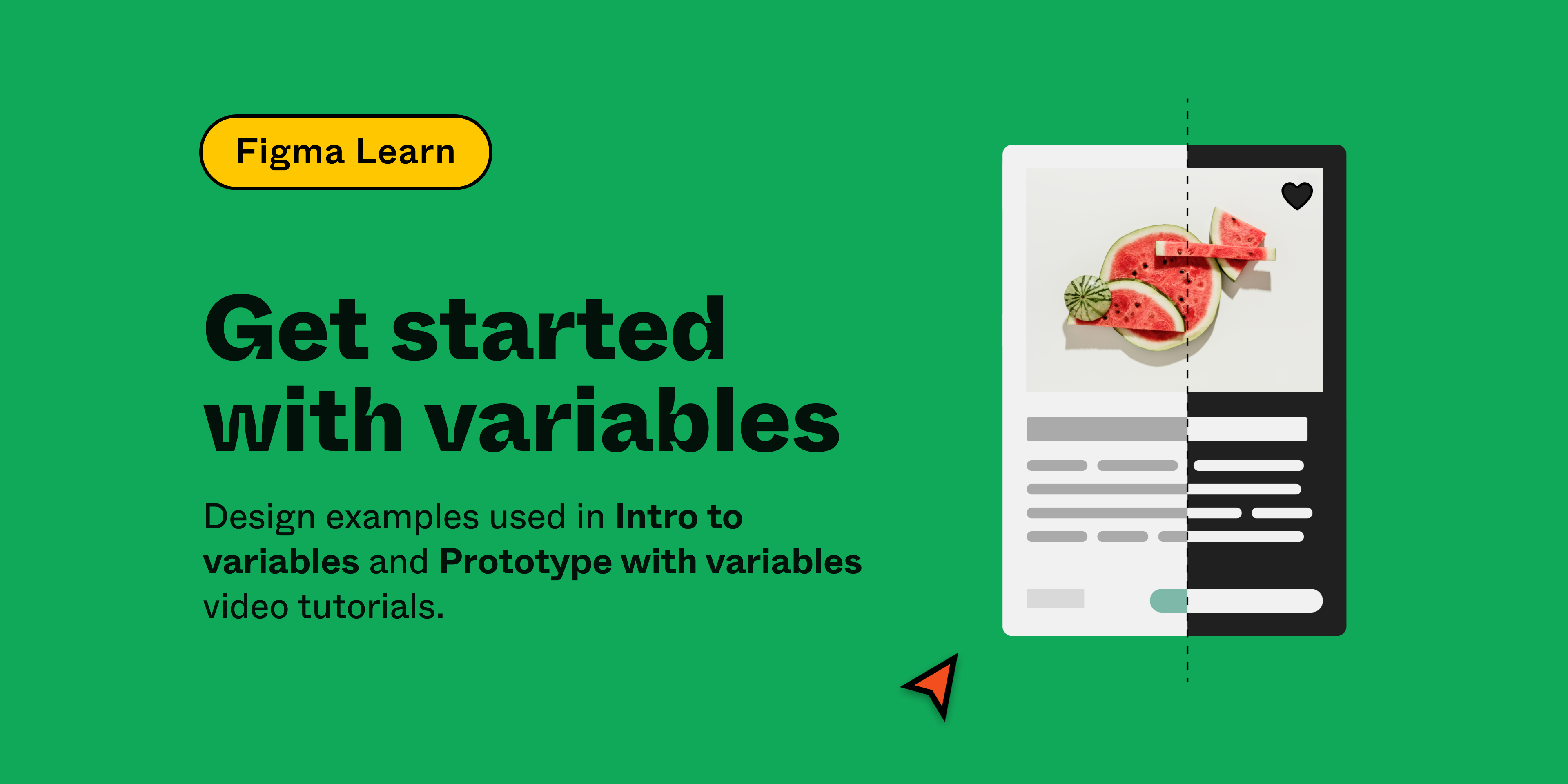
Just getting started with variables? Check out our beginner’s guide.
Our latest updates to variables in Figma allow for even more flexibility with updates to stroke weight, effects, layout grid, and layer opacity, along with nested instance variant binding. These upgrades not only boost design customization, they help align design and code like never before. Here, we share an overview of what we’re shipping with variables, how to use them in your current workflow, and where we’re going next with typography.
What’s new with variables?
- Reactive effects for modes: Now, you can bind variables to all aspects of effects, including blur sizes, drop shadow colors, and offset distances, making effects responsive to different modes.
- Dynamic stroke weights: Manage varying stroke weights for different platforms like desktop and mobile.
- Layer opacity control: Layer opacity can now be bound to variables, offering more nuanced control by right-clicking the opacity field.
- Adaptable layout grids: Layout grids have been updated to adapt between modes such as desktop and mobile, ensuring pixel-perfect designs across devices.
- Individual corner radius binding: Though recently introduced, the ability to bind individual corner radii to variables provides more detailed control over element appearance.
- Nested instance variant binding: Apply variables to component instances within components, enabling complex and customizable design structures.
How will these updates impact the use of styles?
Variables and styles work better together. Effect and grid styles can now contain variables, amplifying these styles and allowing them to react to modes and contexts. We’re continuously evolving both styles and variables, focusing on using styles for grouped values and variables for singular values that change between modes.
To draw a comparison to code, you can think of styles as CSS classes and variables as CSS custom properties. Most users will utilize effect or layout styles with embedded variables, simplifying the design process while maintaining flexibility for creators.
What’s happening with typographic variables?
A variable font is a font file that is able to store a continuous range of design variants. An entire typeface can be stored in such a file, with an infinite number of fonts available to be sampled. (Source: Wikipedia)
Typography is our next big focus, where the wide spectrum of font weights and variable axes presents unique challenges and opportunities. Take, for example, variable fonts, which allow creators to define their own sliders to adjust font properties like size, weight, and leading. That capability alone has garnered over 19k variable font axes in Figma, each controlling distinct traits from font weight to font MORF. (We’re still not quite sure what MORF does, but we definitely want to make sure it’s supported by variables.) Our aim is to support this diversity and make specifying font weights intuitive across various font families.
Explore the dynamic world of variable fonts with insights from Thierry Blancpain, co-founder of Grilli Type, an independent font foundry. Variable fonts offer a continuous range of design variants, allowing infinite font possibilities.
Why not just use styles to achieve similar results?
At their essence, atomic tools are modular, mirroring atomic design principles. Composed of smaller interconnected pieces, they collaborate to form a cohesive whole.
A question we often get is why not just allow styles themselves to have themes. Opting solely for style-based themes would’ve been simpler to execute but a lot less versatile for complex use cases. We prefer an atomic approach to building tools to better ensure longevity and adaptability across a broad range of use cases no matter how complex.
For example, if you have a header that changes font size across desktop and mobile, but a font family that changes between brands, a single-theme axis will be insufficient. Variables, when bound to atomic elements inside the style, allow multiple axes to be changed independently. It also means that they’ll be compatible with other features moving forward.
What’s happening with design token import and export?
We’re approaching import and export in two ways:
- First, we’ve empowered plugins through our Plugin API to support hundreds of output formats, adhering to our atomic design ethos of building the building blocks first.
- Looking ahead, we aim to support native design token interoperability, aligning with the W3C community group’s ongoing standardization efforts. One of the major pieces we’re still working on is how modes and themes work within their spec. While we could launch our version now, we prefer to wait for a unified industry consensus to avoid fragmenting the space with conflicting standards.
What does good look like for variables right now?
Our ultimate goal is to provide an experience that allows for infinite customizability, but also one that “just works” for design system users right now. We envision a design environment where complexities, like typography variables, are managed automatically, allowing designers to focus on creativity without being bogged down by technicalities. While we’re still in open beta, we’re eagerly incorporating your feedback to refine this vision.
We’re excited to see how you use these new updates and look forward to your feedback! Have more questions? Reach out to me on Twitter.
Jacob Miller is a product manager for Figma leading the design system features of the product. Previous to this Jacob lead Atlassian’s design system and tooling teams, where he honed his passion for each of these domains. In his spare time he codes and designs on his side projects, and looks for the next cool place in the world to move to.