How Loblaw Digital built a federated design system for 14 brands with Figma
How Loblaw Digital built a federated design system for 14 brands with Figma
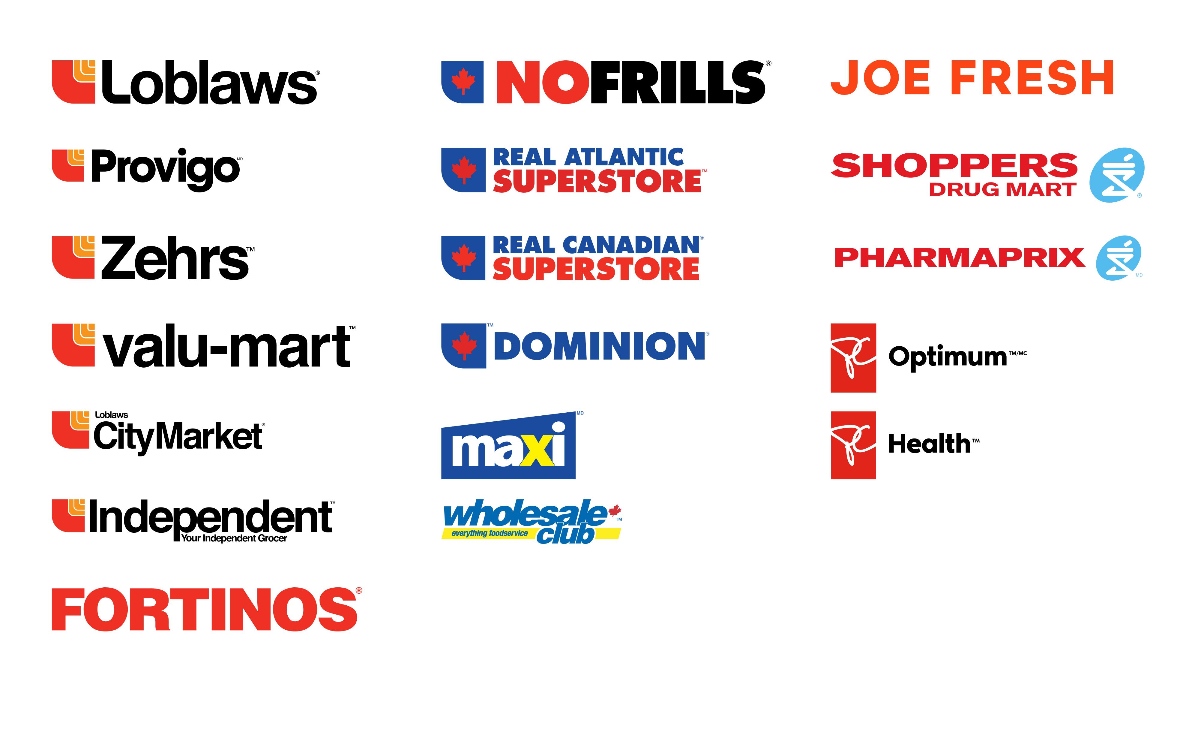
Loblaw Digital is the digital engine powering one of Canada’s largest grocers and pharmacies, the apparel brand Joe Fresh, and a growing set of health and loyalty services The team supports over 40+ websites, 4 apps, and 3,000 physical locations across 14 store brands, interacting with over 80% of Canadians weekly.

Loblaw Digital’s goal is to deliver cohesive, end-to-end experiences that bridge physical and digital touchpoints. From BOPIS (buy online, pick up in store) to pharmacy refills, to loyalty programs reaching nearly half the population, their digital team supports it all.
To meet that scale, Loblaw Digital had to unify fragmented workflows and create consistency across platforms—all without sacrificing quality, brand identity, or accessibility.
By centralizing design and development with Figma’s Organization plan, Loblaw Digital now builds faster, smarter, and more collaboratively than ever before. As a result, a homepage that used to take three months to build was done in just two weeks using reusable components and faster handoff in Figma.
Challenge: Supporting a vast digital ecosystem without the bloat
Loblaw Digital didn’t begin as a product-first organization. It was built as a service partner for its 3,000+ physical stores, working within their constraints, like legacy systems and brand-specific workflows.
As the team matured, it became clear that the existing toolset couldn’t keep up with the scale or complexity of what they were building. “We didn’t say, ‘Let’s build a digital-first version.’ We said, ‘We’re going to service these stores,’” says James Harrison, Staff Product Designer at Loblaw Digital.
That complexity is deeply rooted in the trust Canadians have in their local Loblaw banners. “Our banners are household names, and that trust is something we have to respect,” James adds.
That decision meant inheriting the friction that came with siloed teams and a patchwork of design tools that made consistency difficult and duplication inevitable. “Why are we building the same store locator five times?” James remembered asking.
Even minor changes could take days to implement, slowing teams down and making iteration painful. Internal apps used by store pickers and customer service teams were particularly hard to update, often requiring manual workarounds or retraining.
Solution: One platform, built to scale with Figma
In 2021, Loblaw Digital made the call to consolidate its fragmented design tool stack into a single platform with Figma’s Organization plan. The transition was swift and decisive.
We just said, ‘Get all your stuff out of there by this date and put it into Figma.’ We trained for two months, cleaned up our files, and made the leap. Adoption was seamless.
— James Harrison, Staff Product Designer, Loblaw Digital
The switch replaced four tools with one. Figma Organization allowed teams to mirror the structure of the business itself—organizing teams by brand and product, with tailored permissions, shared libraries, and scalable fonts built in.
Figma’s multiplayer capabilities also supercharged collaboration. With around 1,600 users, feedback flows in real time—from inline comments to cross-functional workshops. “We use Figma like a workspace and collaborate in real time with cursors moving around files all the time,” says James.
Building Helios: A flexible, federated design system for 14 brands
With 14 banners operating under one digital roof, Loblaw needed a design system that could flex for brand-specific needs without compromising speed, consistency, or compliance. That balance is exactly what Helios delivers.

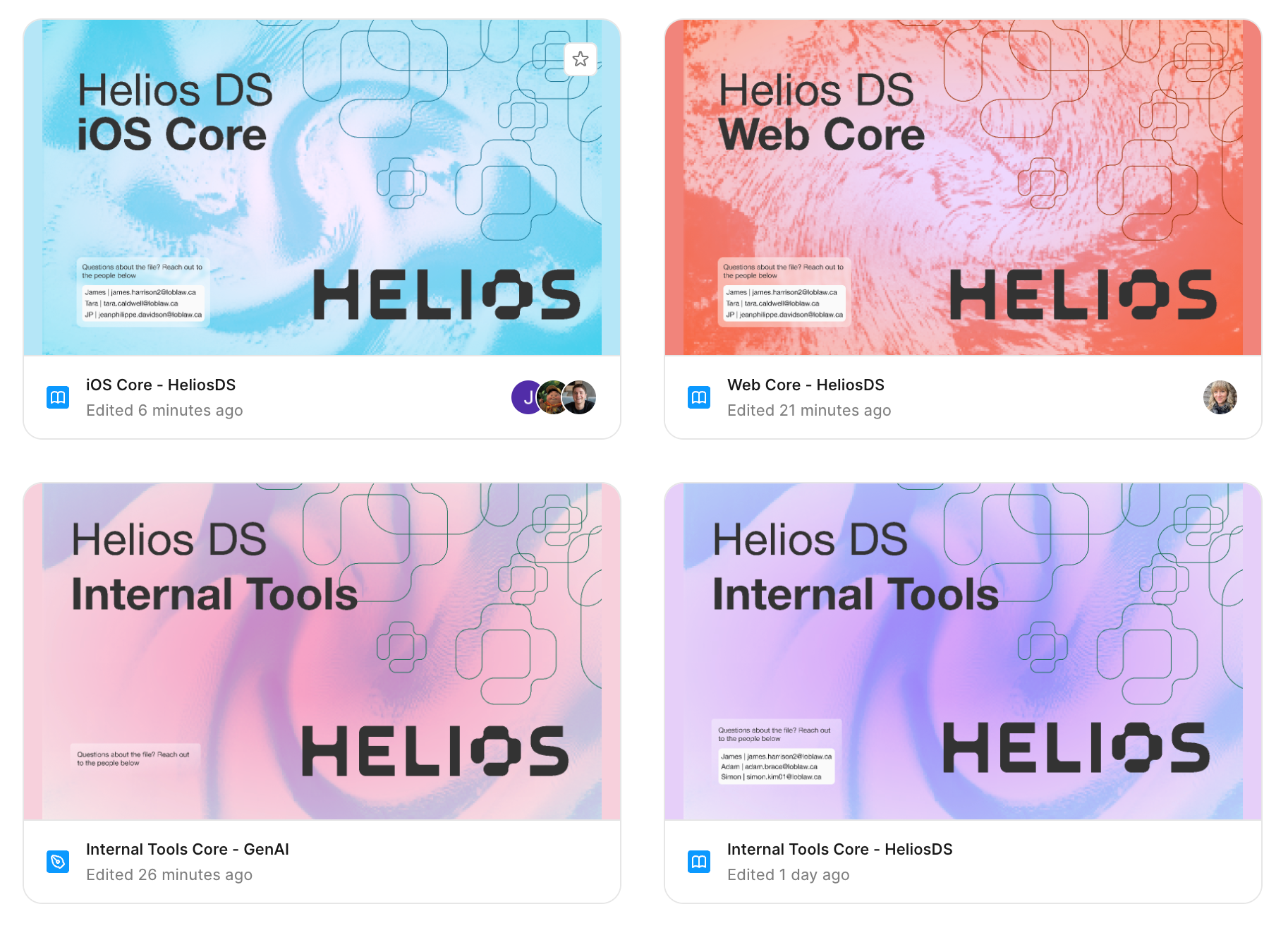
Helios operates under a federated governance model, allowing squads to contribute and extend components within a shared structure. This structure makes it easy to reuse patterns across experiences while respecting brand identity through token-based overrides. “Tokens do the styling. Designers control look and feel without waiting on a dev,” says James.
There’s a structure to how deep a component can go, how it should behave, and how it gets themed. That gives us consistency without blocking people from moving fast.
— James Harrison, Staff Product Designer, Loblaw Digital
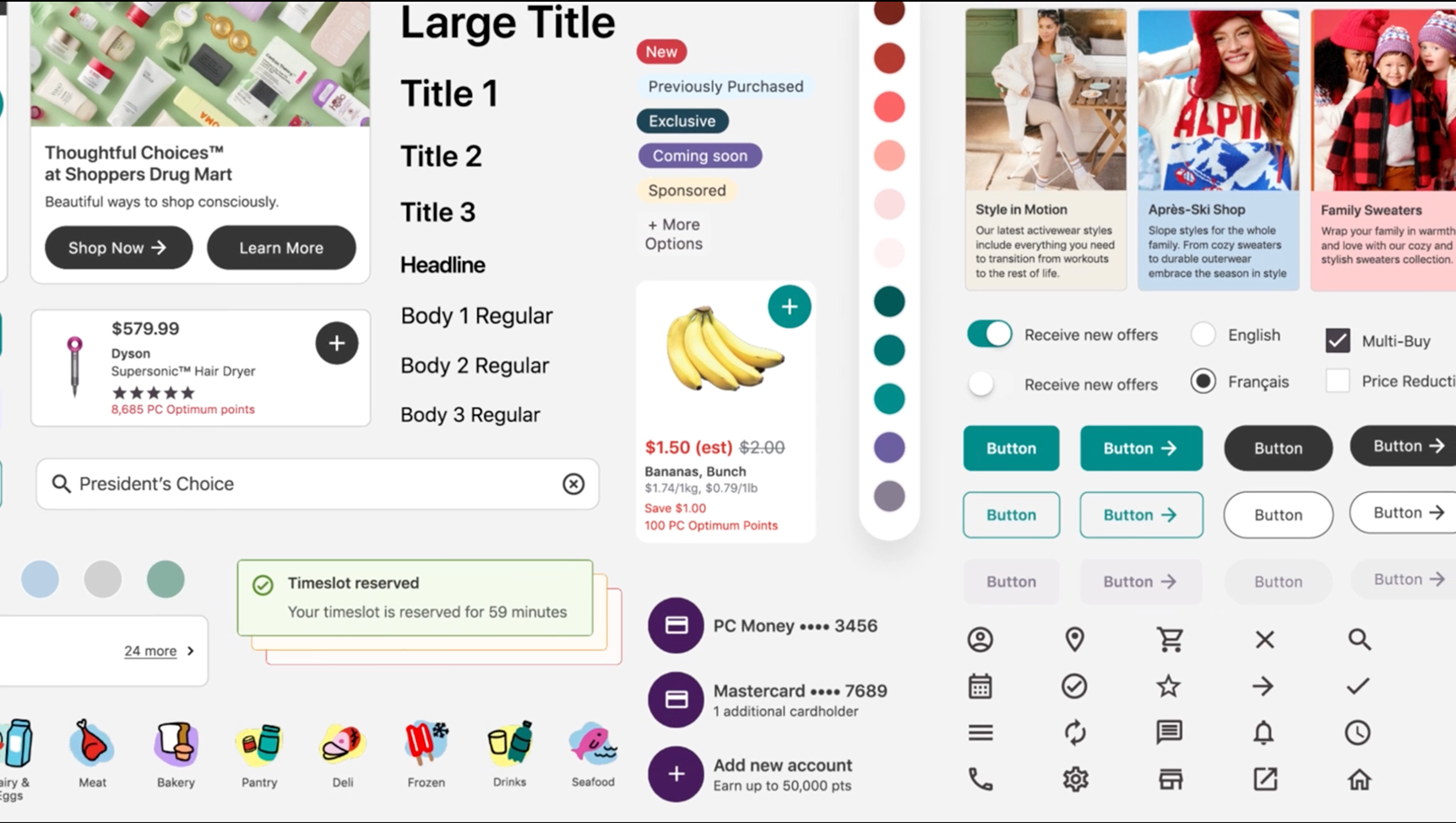
With Figma Organization, Helios now supports 51 teams with reusable components that are fully tokenized and themeable by brand. Each team works from the same component library but adapts it with brand-specific overrides for color, typography, and spacing—without needing to fork or rebuild.
The average theme today runs on roughly 2,000 tokens, with significant reuse across brands. Loblaw’s web design files contain over 400 components, which map to about 150 components in code—giving teams a rich, well-documented system to build from.
The impact has been measurable. When building a new homepage experience, the team went from a three-month build down to just two weeks by reusing and adapting Helios components. “Being able to reuse and repurpose has allowed us to accelerate and move again,” says James.
Instead of starting from scratch, anyone building something new can leverage what’s already there. “The faster we can ship, the faster we can respond to our customers, to the business, and to whatever comes next,” James adds.

Helios isn’t just designer-friendly. Every component is engineered to be code-readable, using standardized props, neutral defaults, and built-in documentation. Accessibility and compliance—particularly important in regulated areas like pharmacy—are reviewed early and documented inside the system. “You’re not translating design into dev. You’re speaking the same language,” says James.
Clear specs, faster shipping with Dev Mode
With Dev Mode, the handoff process became radically simpler. Every component comes with an annotated sheet, documenting supported states, token usage, and accessibility guidance.

When Dev Mode first rolled out, Loblaw ran an informal pilot with ten developers. James gave a quick tour of the key features, including component inspection, token visibility, and code generation, and he let them explore. The feedback was instant: requests for more upgrades started pouring in.
While the team doesn’t track developer velocity down to the minute, James estimates Dev Mode saves about 5% to 10% of a designer’s time on annotation and the same on the engineering side by reducing the cognitive load of interpreting documentation.
Engineers and designers now work from a single source of truth—reducing ambiguity, eliminating redundant documentation, and accelerating time to build. As Loblaw migrates to its V2 component libraries, now built on Tailwind, Dev Mode’s inspect and code-gen capabilities allow engineers to scaffold directly from tokenized components.
Our handoff now is really just sending somebody a link in Figma. That includes documentation around accessibility, usage, and how the component works in code.
— James Harrison, Staff Product Designer, Loblaw Digital
The team is also starting to explore how MCP Server can reshape their handoff entirely. The goal is to pull designs straight out of Figma, attach tokens, and output production-ready code, no extra translation step required.
Before MCP, even with a mature design system, handing off work meant some level of manual interpretation between design and engineering. That left room for small discrepancies and slowed down delivery. Connecting directly via MCP could eliminate those gaps, tighten accuracy, and cut handoff time significantly.
Code Connect: Building from atoms up
Code Connect is another piece of the puzzle that’s steadily gaining momentum. Loblaw started by connecting the “atoms” in their web component library. That groundwork is now helping developers interpret how larger, more complex components are built, encouraging reuse instead of reinventing.
“We’ve run trials where you generate something, and it’s already connected to our system. So, you’re not starting from scratch. You’re building on top of something that’s already structured,” says James.
With Dev Mode, Helios’ standardized architecture, and the MCP server, Loblaw is preparing for the next wave of workflows where components can be assembled with prompts. The team’s disciplined component architecture is ready for AI tooling, whether through Figma Make, Code Connect, or other generative AI workflows.
Looking forward, James sees the future in co-building with non-designers and product owners through Figma Make, building on the same foundations the team has put in place with Dev Mode, MCP Server, and Code Connect.
The earlier pilots have shown how much faster and clearer handoff can be. Figma Make adds another layer, which is the ability to assemble those same building blocks with a prompt, in order to move from idea to structured design in less time.
James adds, “We’re moving into a world where the question isn’t ‘Can you code?’ It’s ‘Can you express your idea?’” And when that happens, Loblaw Digital will be ready for it.
See how Figma can help you scale design
Great design has the potential to differentiate your product and brand. But nothing great is made alone. Figma brings product teams together in a fast and more inclusive design workflow.
Get in touch to learn more about how Figma can help companies scale design.
We’ll cover how Figma can help:
- Bring every step of the design process—from ideation, to creation, to building designs—into one place
- Accelerate design workflows with shared company-wide design systems
- Foster inclusivity in the product team process with products that are web-based, accessible, and easy to use